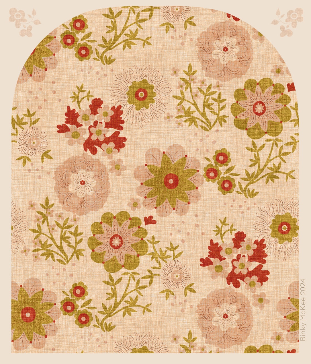
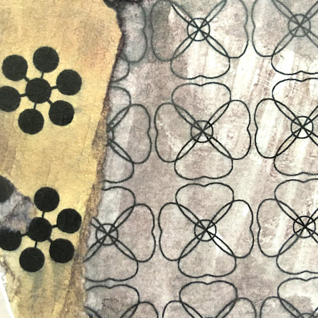
 A more spacious pattern using elements from Yay Flowers, based on the lower left image in last week's collage. I thought this would be an easy thing to do because the pattern setup was already in place, but moving things around, redrawing and balancing various parts naturally led to problem-solving, and took more time than I anticipated. It's an activity I really enjoy, though, and now this quiet, relaxed pattern might be nice for curtains and cushions, or even as an upholstery fabric for a lovely old chintzy sofa. I like the way some colours are stronger than others, suggesting dyes of differing fugitivity on a vintage material - a satisfyingly vintage cottage mood.
 Daylight began its return this week with the sun's angle bouncing up 10 degrees higher than it was at the winter solstice, and a sudden marked increase in daylight both in the mornings and evenings. It is a joy to see, and to hear the birds waking up with tootling and whootling precursors to the dawn chorus. When the sun comes out, it really feels as though spring is just around the corner.
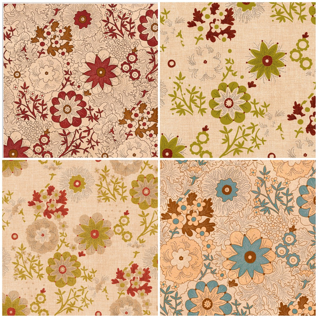
With this is mind, take a look at these screenshots of recent Yay Flowers work in progress: some pretty details come along while making colour separations, and these looked just like spring to me. I'll be taking a closer look at these, and maybe making some new patterns based on them soon. 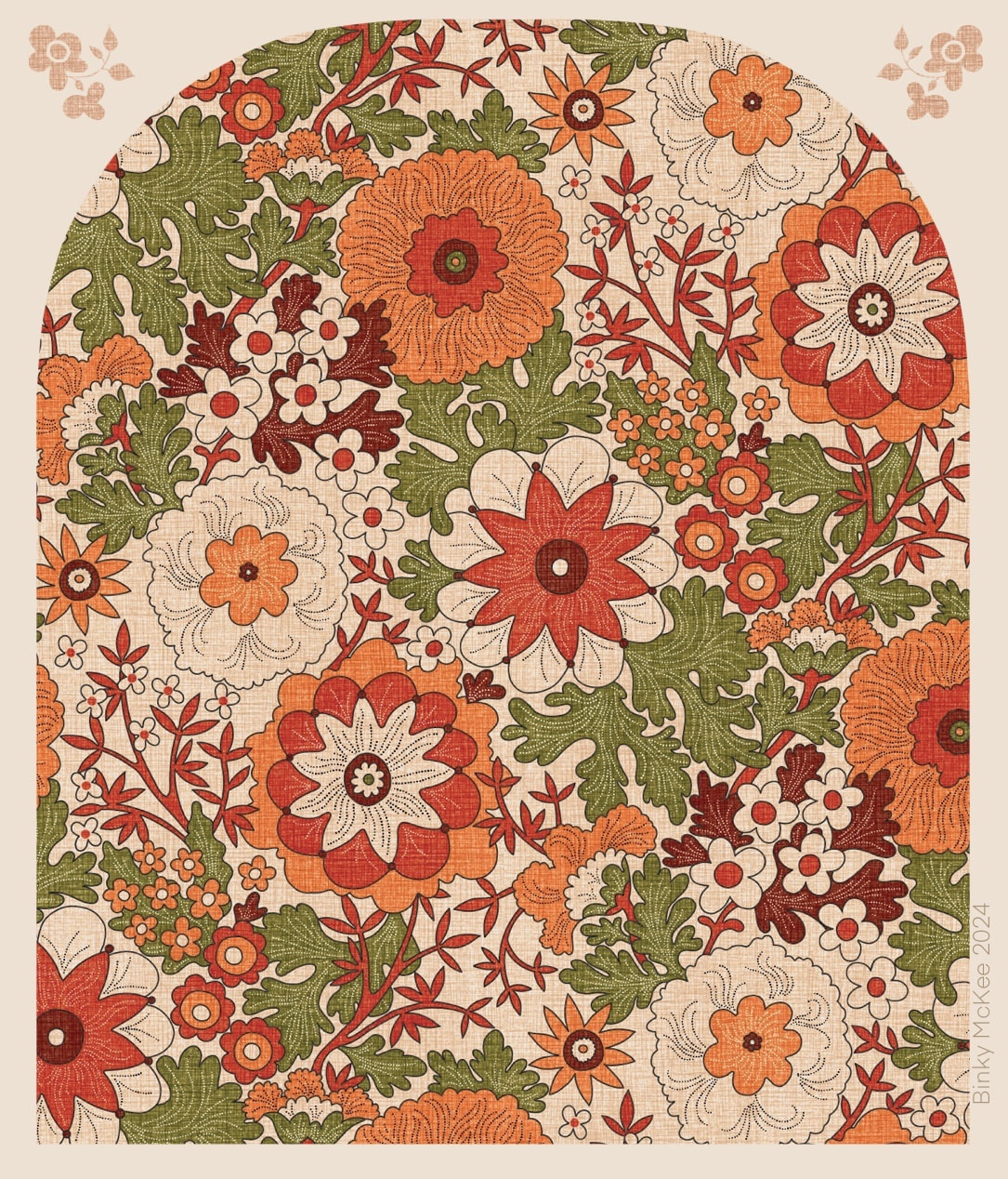 I finally got a linen texture to work with the new Yay Flowers half-drop pattern by resizing the Peru linen colourway tiles I made last September, making the 'weave' tighter to better suit complex designs like this. Above you see the outline version, which enables the background colour to be used within the pattern itself, providing a fresh and spacious appearance. Here I am using the vibrant colours based on a Peruvian hand-knitted cardigan I bought in London's Camden Lock, when I was living close-by in Belsize Park during the late 1980's and early '90's. (The cardigan is still going strong, in spite of its age!) I used the coloured textures in October for my fruits and blossoms design. 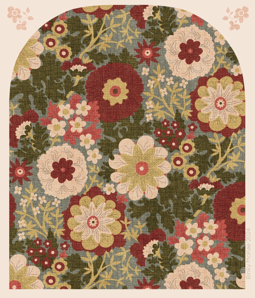 Loving the faded chintz look on this version! Also using the resized Peru linen texture, the colours have been toned down slightly in this one for a softer, more antique look. This is the version without outline, using only a few of the stipple details on the main flowers.
See also this pattern I made in October using the original Peru linen texture. The permutations of a five or six colourway are apparently endless. 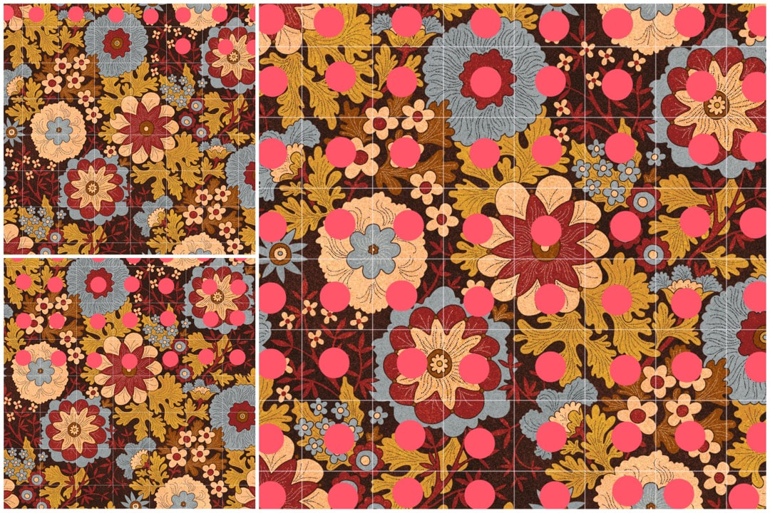 Checking for flaws in the pattern Lots of fun and fails this week while experimenting with texture overlays and colourways. I discovered big textures didn't work with this pattern because there's already a lot going on in it, so I made a completely new autumn palette based on a favourite Crazy Daisies colourway with a more even, close speckle which looked fine. In the process I involved the original outline drawing, with the result I now have two versions: one using outline, and the other without, each with 5 colour separations.
The screenshots above show the progress of final checks on the outline version after I played around with the colours. When I make these checks I save a jpeg to iPad's camera roll, and open it in Procreate next to the original psd artwork. Using the drawing guide grid (seen above in white) I check one square at a time, blown up to fill the iPad screen, looking for any imperfections or mistakes which I then correct in the pattern artwork layers. I put a large pink dot in each square of the jpeg image once it has been checked, so I know where I am. I'm sure most of the corrections I make wouldn't even show in print, but the weird thing about printing is that it can either hide or emphasise even the teeny-weeniest halo or shadow - so it's better to be safe than sorry when it comes to paying for proofs. During the process I noticed a couple of the speckle texture colour layers didn't tile as well as I thought, so amending those is next on the list. |

~~~~~~~~~~~~~~~~~~~~~~
Welcome to my illustration and patterns blog.
I illustrate under the pen-name of Binky McKee, McKee being my mother's maiden name. Binky was the name of every single cat my great-grandmother kept - allegedly about 40 of them during her 94 years of life. I changed the website address a few months ago, so some older links on previous posts are broken. If you click one of those and it takes you to a strange page, simply replace the .co.uk after the binkymckee. with weebly.com and it will work again. I hope you enjoy your visit! ~~~~~~~~~~~~~~~~~~~~~~
~~~~~~~~~~~~~~~~~~~~~~
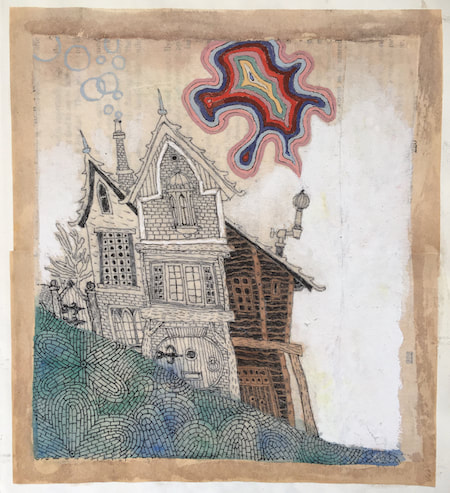
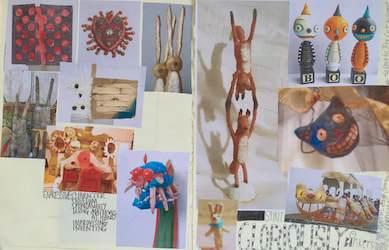
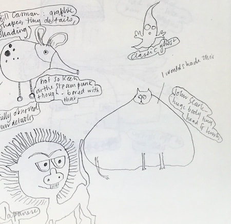
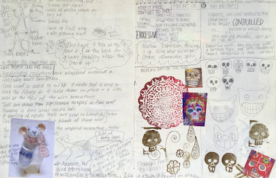
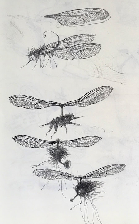
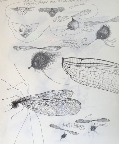
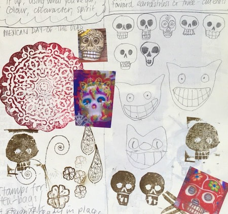
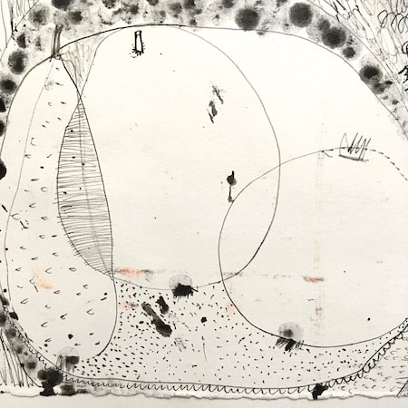
I keep lots of scrapbooks and sketchbooks where I develop ideas and design little creatures. Here's a peek inside one ...
~~~~~~~~~~~~~~~~~~~~~~
~~~~~~~~~~~~~~~~~~~~~~
As you may know, I am also known as Heather Eliza Walker.
Click the image if you would like to find out more and visit my other website. ~~~~~~~~~~~~~~~~~~~~~~ ~~~~~~~~~~~~~~~~~~~~~
~~~~~~~~~~~~~~~~~~~~
April 2024
~~~~~~~~~~~~~~~~~~~~~~
~~~~~~~~~~~~~~~~~~
All
~~~~~~~~~~~~~~~~~~~~~~
~~~~~~~~~~~~~~~~~~~~~~
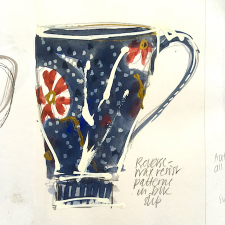
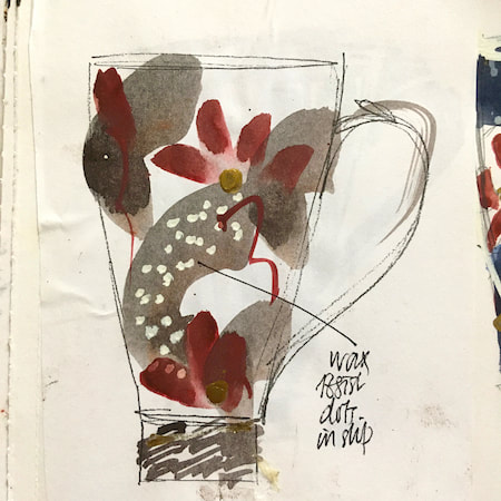
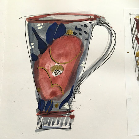
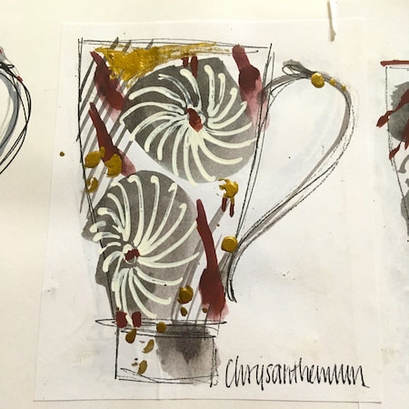
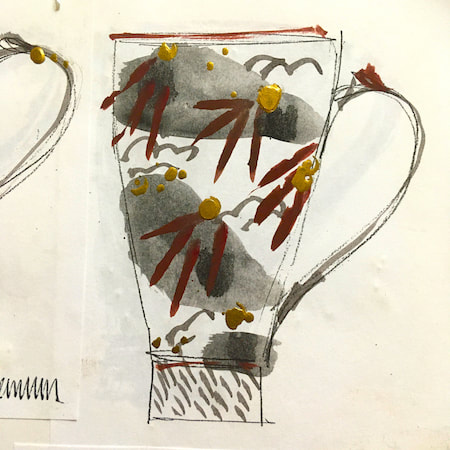
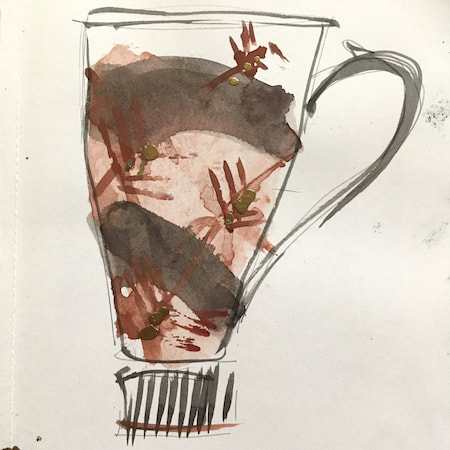
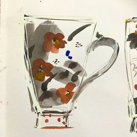
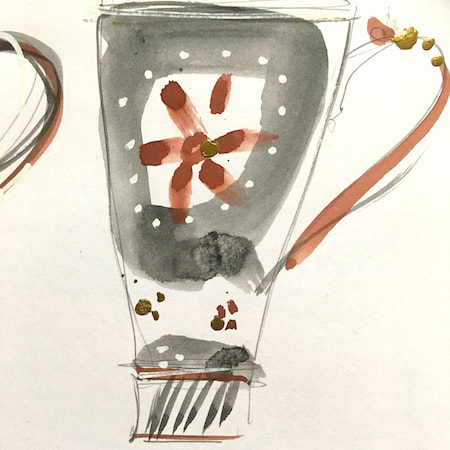
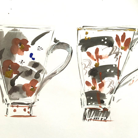
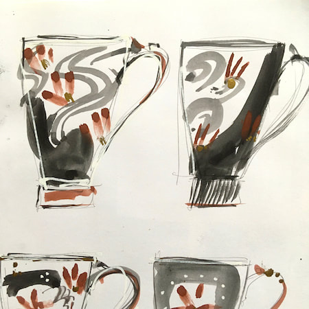
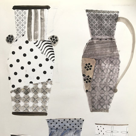
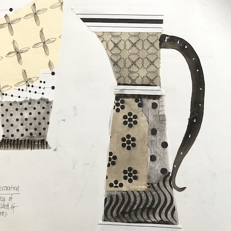
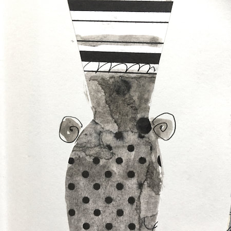
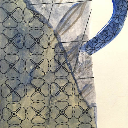
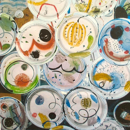
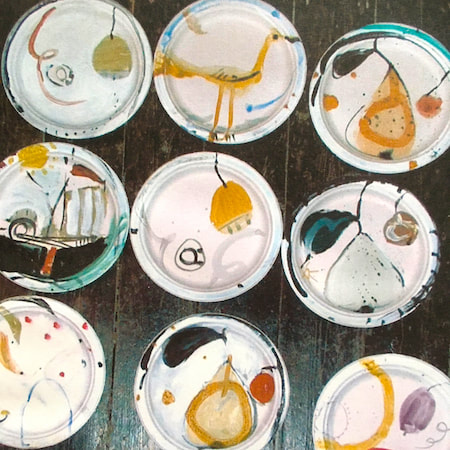
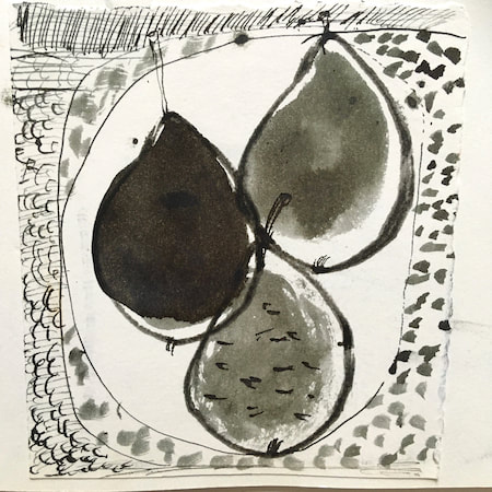
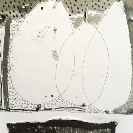
This time, take a peek into my ceramic design sketchbook. I actually made some of the mugs, but I kind of prefer the drawings! The plate designs are painted on paper plates, a most liberating process.
~~~~~~~~~~~~~~~~~~~~~~
~~~~~~~~~~~~~~~~~~~~~~
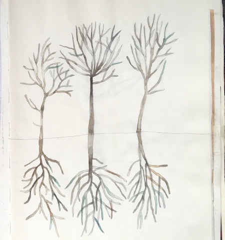
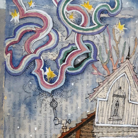
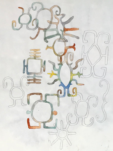
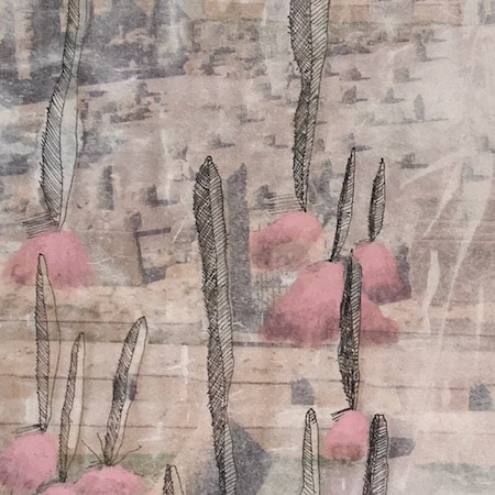
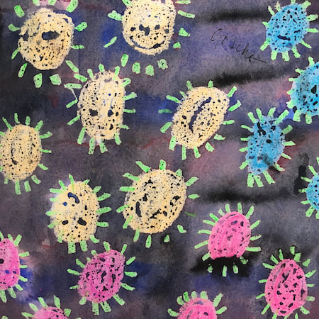
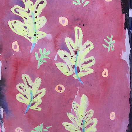
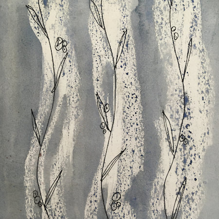
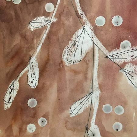
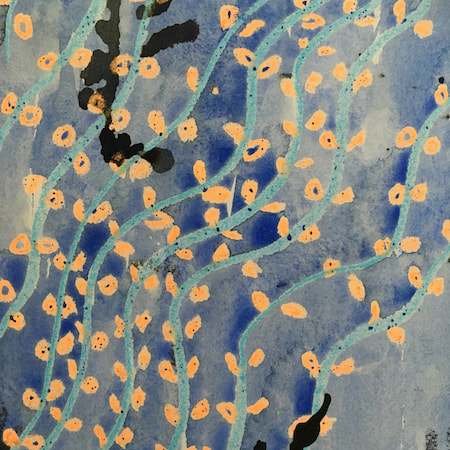
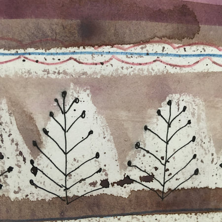
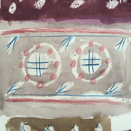
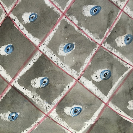
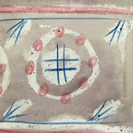
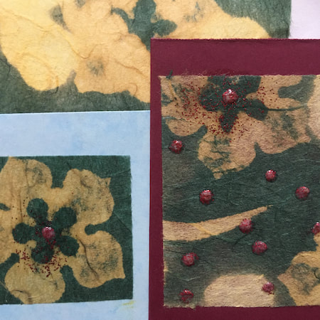
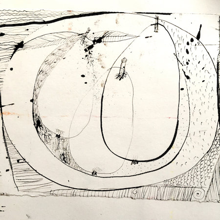
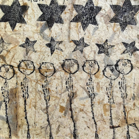
These watercolours are from my pattern sketchbook. I used coloured wax crayons to resist the washes of watercolour, also home-made rubber stamps dipped in bleach then printed on crêpe paper - the bleach takes out the paper dyes.
~~~~~~~~~~~~~~~~~~~~~~
~~~~~~~~~~~~~~~~~~~~~~
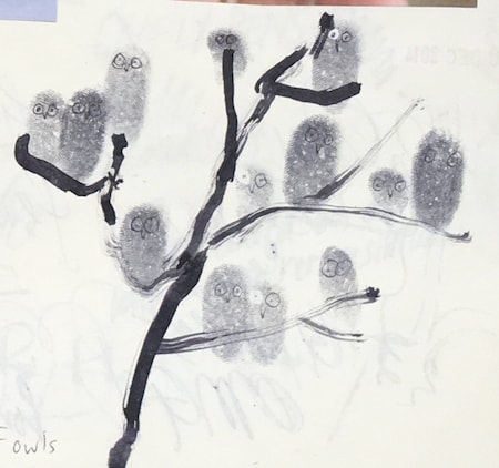
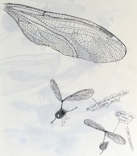
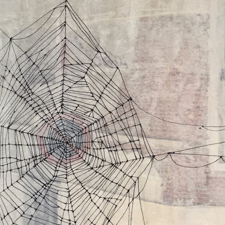
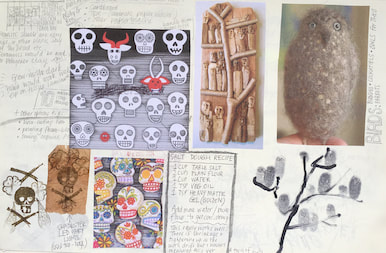
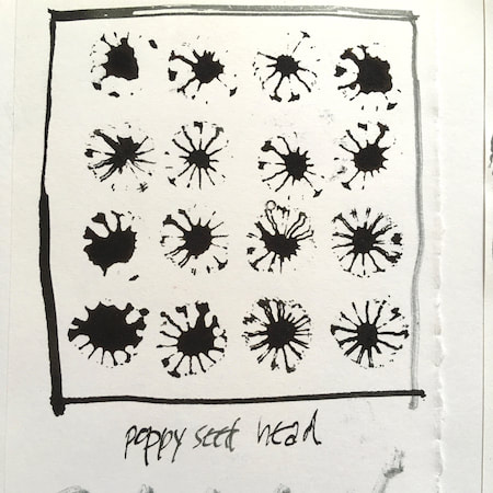
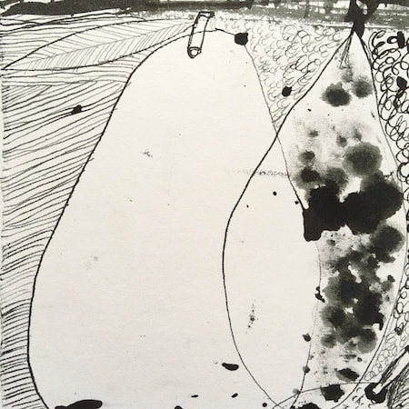
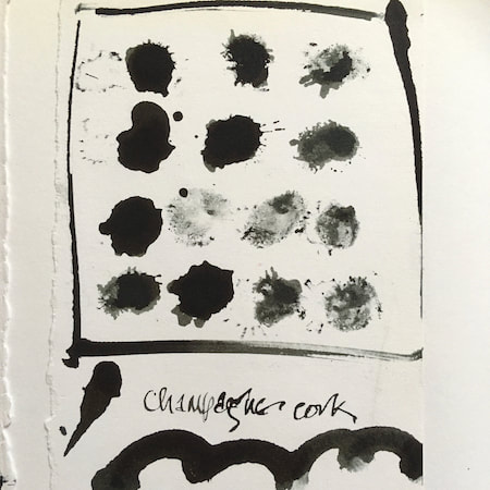
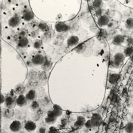
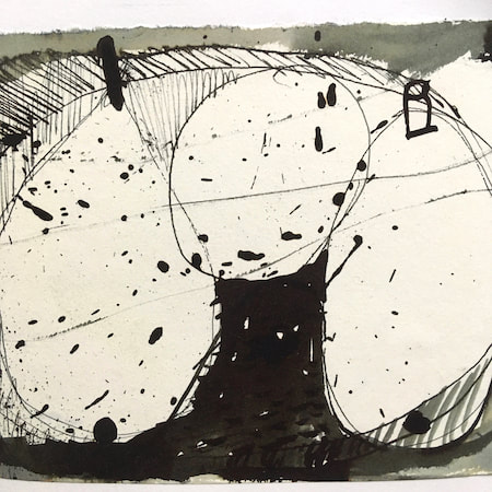
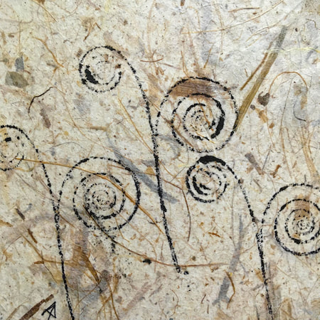
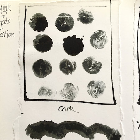
A sketchbook I used for mark-making with unusual objects - corks, seed-heads, feathers, home-made rubber stamps, my fingers and lots of flicky things ...
|
 RSS Feed
