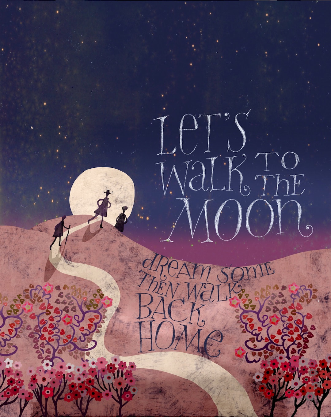
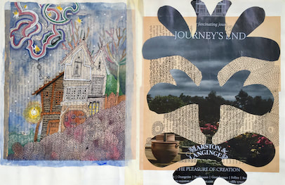
 A bit of blatant escapism in the face of world situations getting worse instead of improving, and peace seeming to slip further away - all because of one, single, solitary man.
I have been working solidly on the children's book this week, this is a spin-off from one of the book pages. It doesn't give anything away about the book's contents and it's useful for me to see the chronology of the book's development in these adaptations of some of the illustrations; I posted another one today on my Heather Eliza blog. I'm working so flat-out on the book there hasn't been time for any new HEW drawings, but the aesthetic is so close to my drawings I decided to post it there. Thanks for visiting, see you soon! 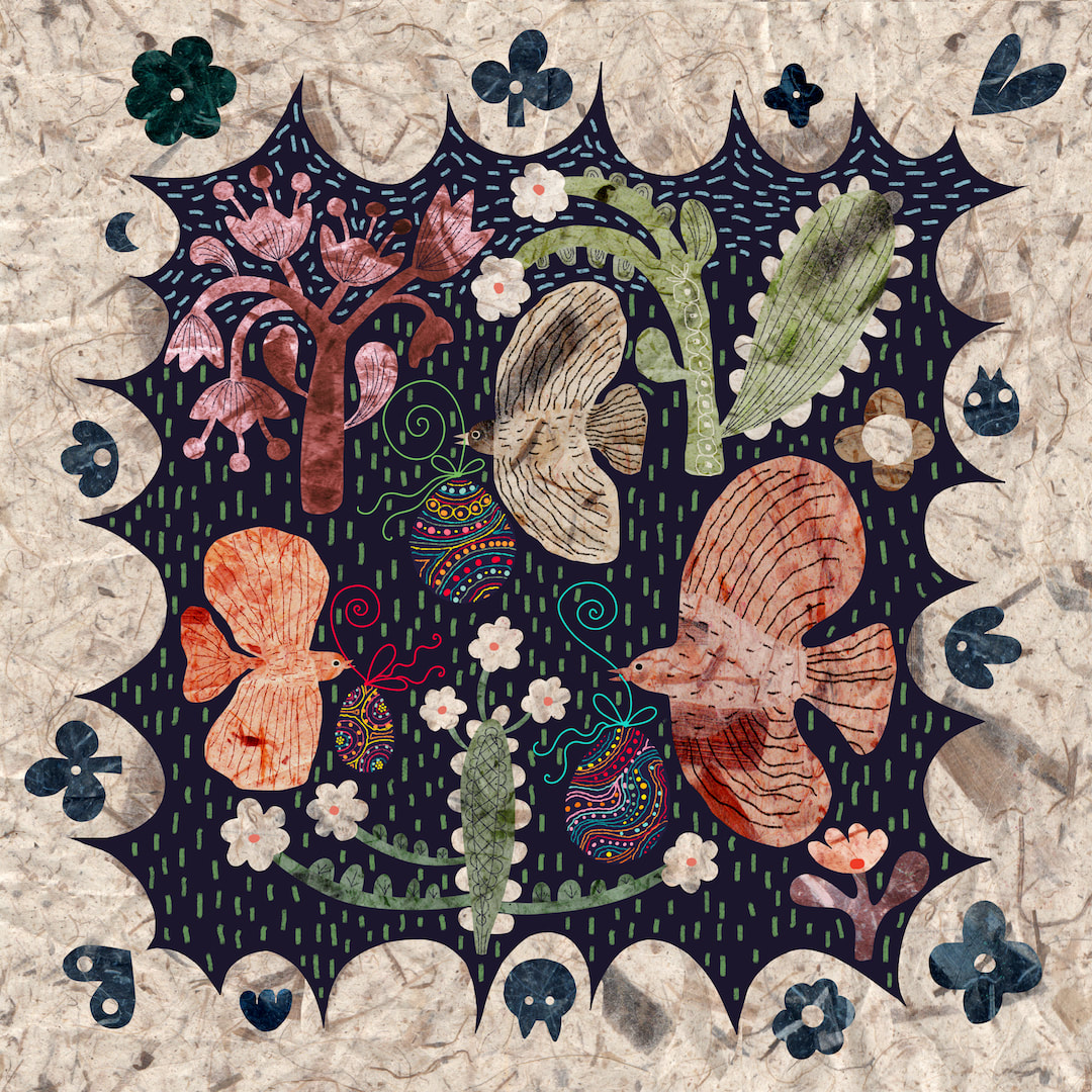 I liked the folksy Caturday collage so much I rejigged it, together with the Easter egg birds collage, into a square with a folksy border. 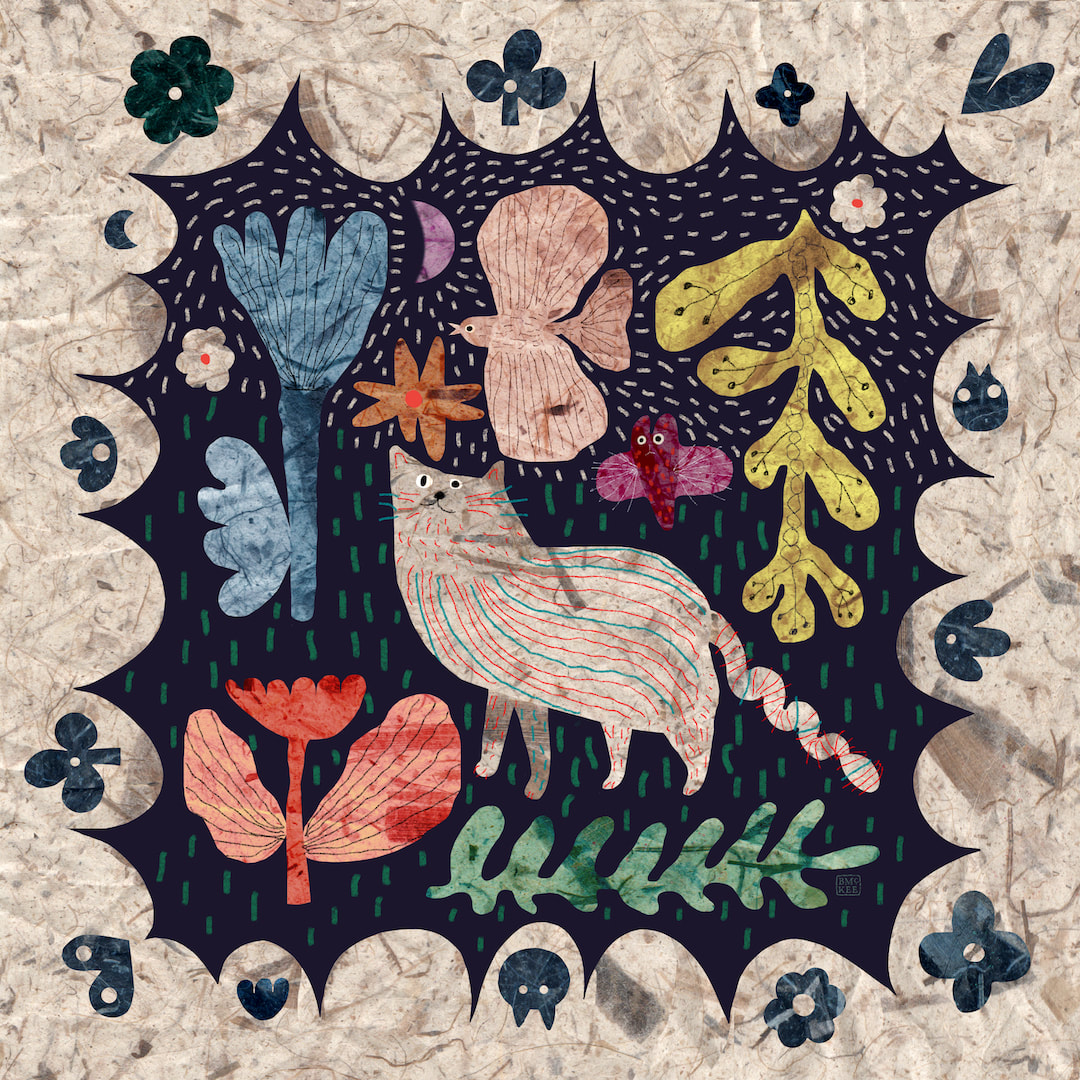 I especially had throw pillows in mind, but both designs look super on the products I selected! I still get a big thrill from seeing my work on Redbubble's products. 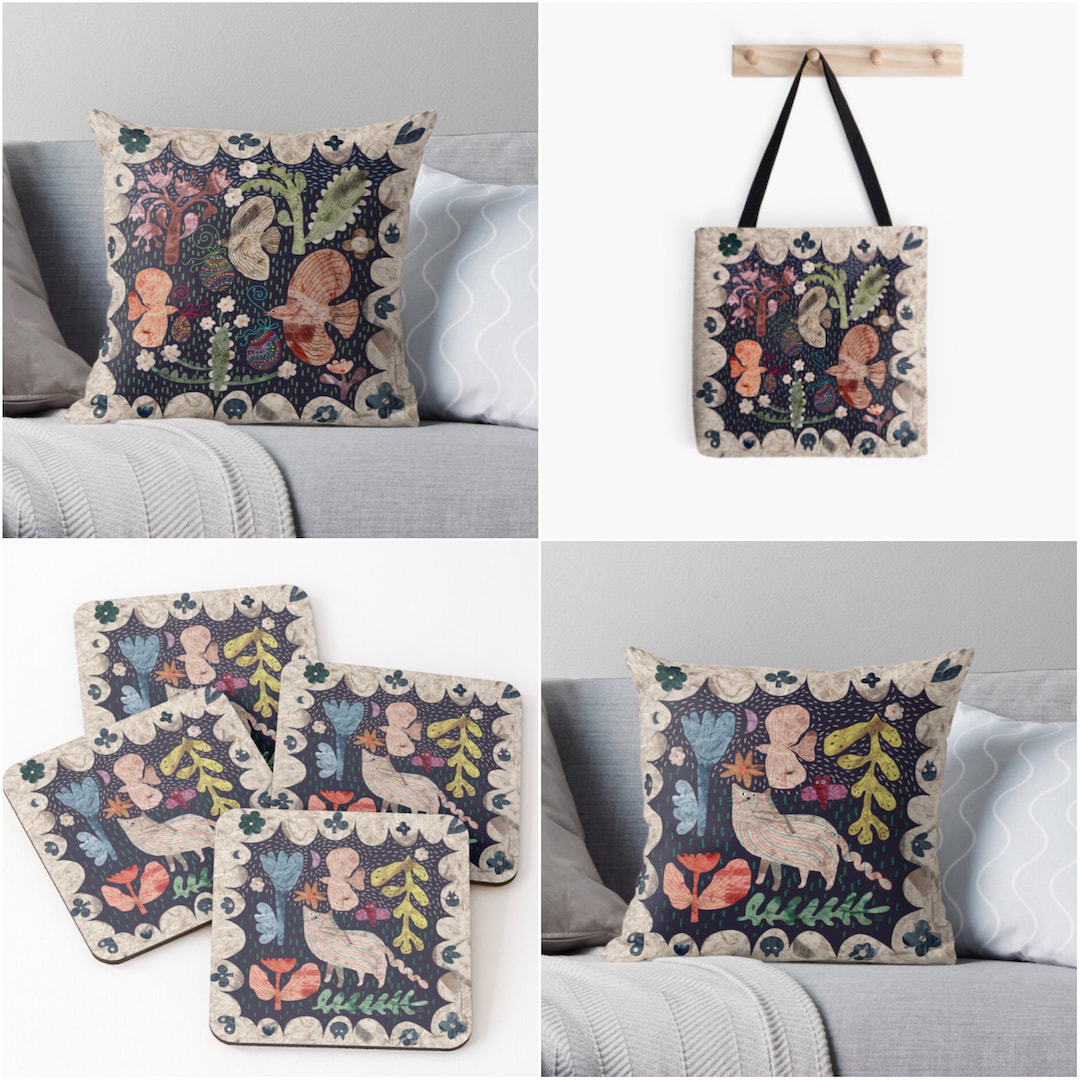 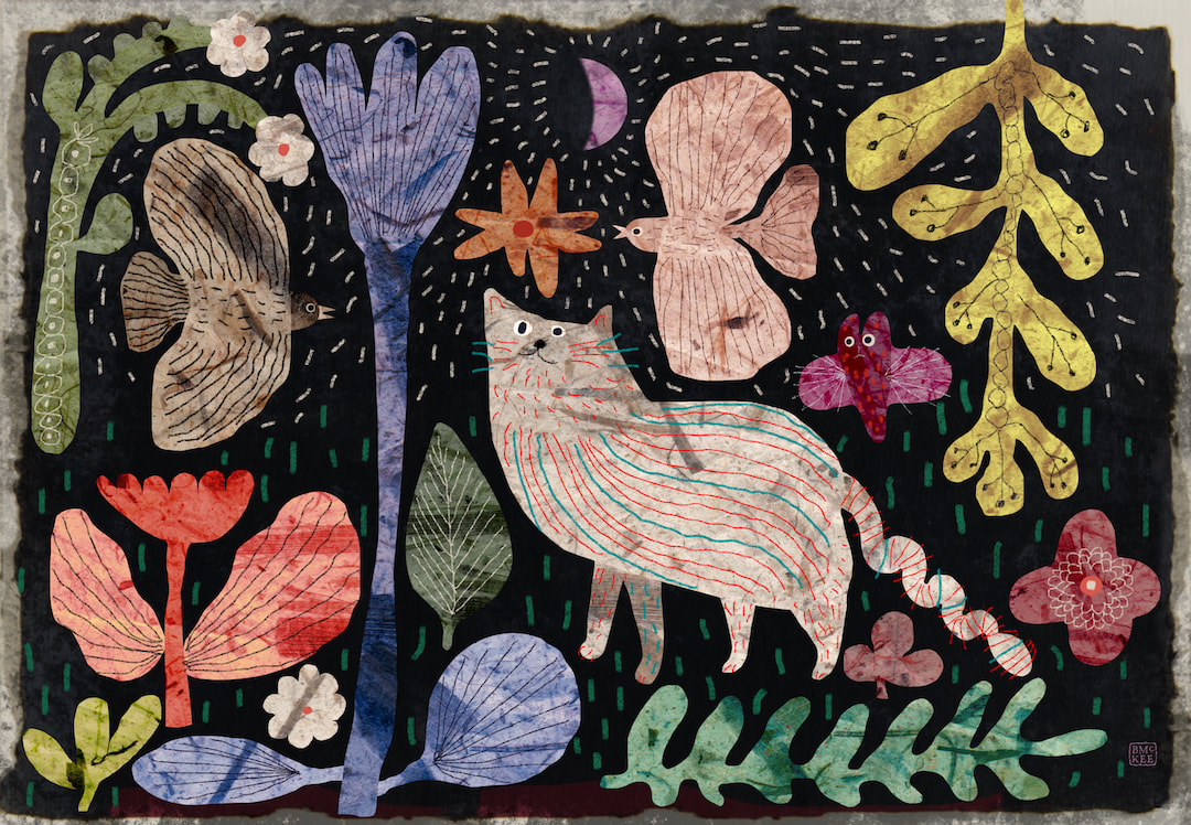 I called this "A twist in the tail" (sorry!) - it is another Instagram post for Caturday which began as a square format but I reckoned it would make lovely art prints and cards, so here is a landscape version and how it looks as a framed print. I was so pleased with this I went on to redesign the Easter eggs birds in a similar fashion to make a matching pair. This is currently work in progress in my spare time as I push on with the children's book, which is going extremely well and I am sure it will not be long until I can begin sharing some of the work. 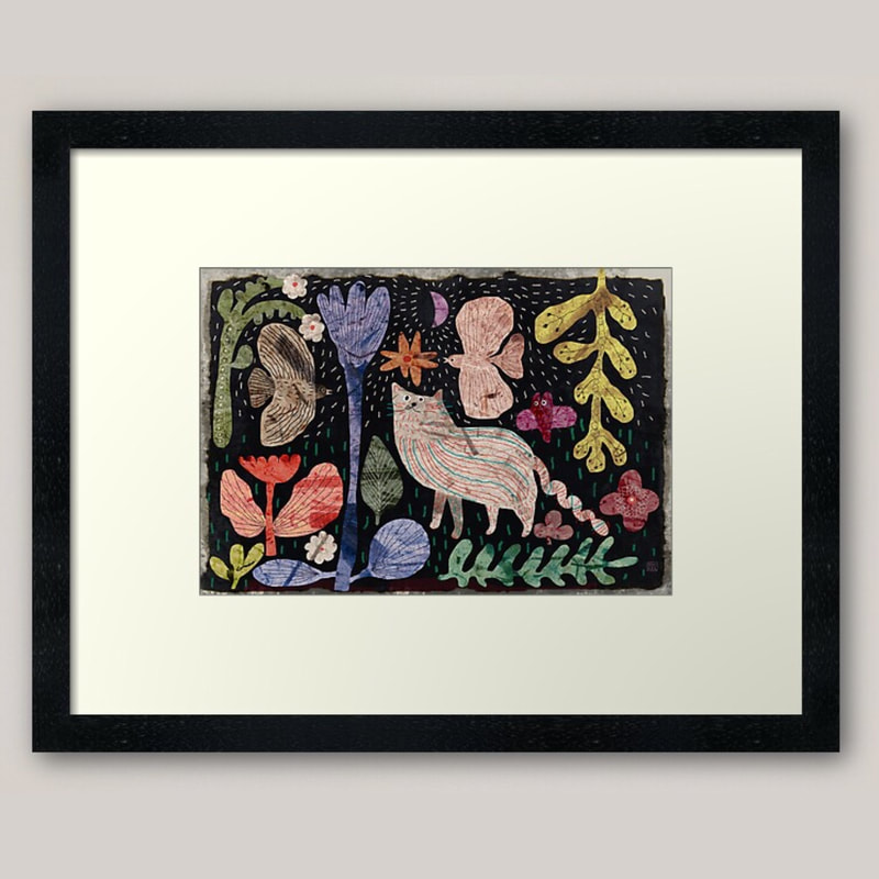 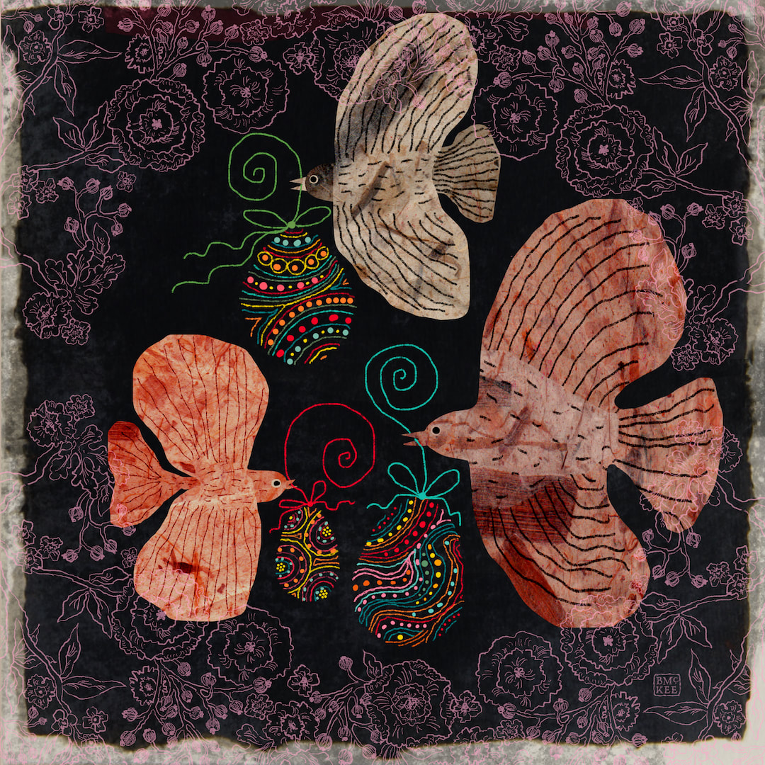 I have been cutting out a lot of bird shapes in mulberry paper in Procreate recently, so I quickly collaged this together for an Easter post. - birds bringing Easter eggs. A very Happy Easter to you! Such a lovely time of the year, the days are getting longer and the sun is out and blossoms and buds are happening.
Thanks for visiting, see you soon! 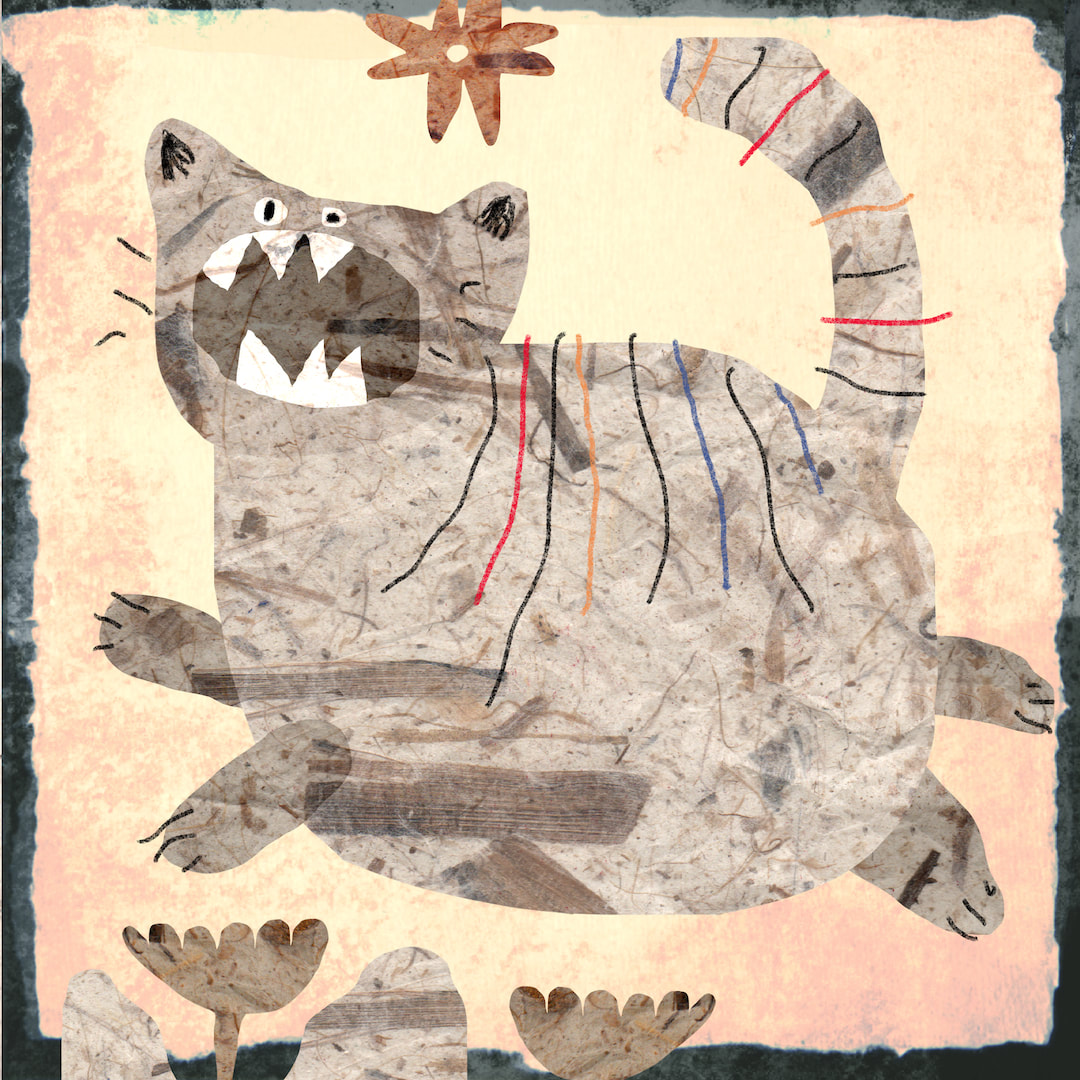 Feeling his inner tiger for Caturday, still inspired by those children's playground drawings; and working on colour schemes. I started with this hot spice palette because I thought it would be the hardest, and yes, it did present some problems but I thoroughly enjoyed the work. I always imagine mixing and matching duvet covers, pillows and cushions when I 'm doing this - I'd love to see it in real life. 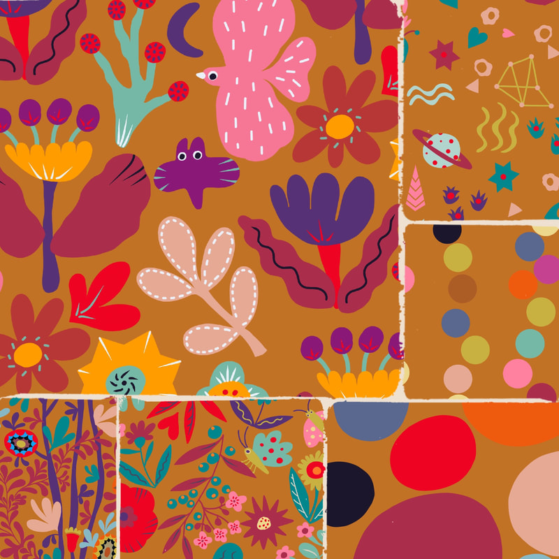 Thanks for visiting, see you soon!
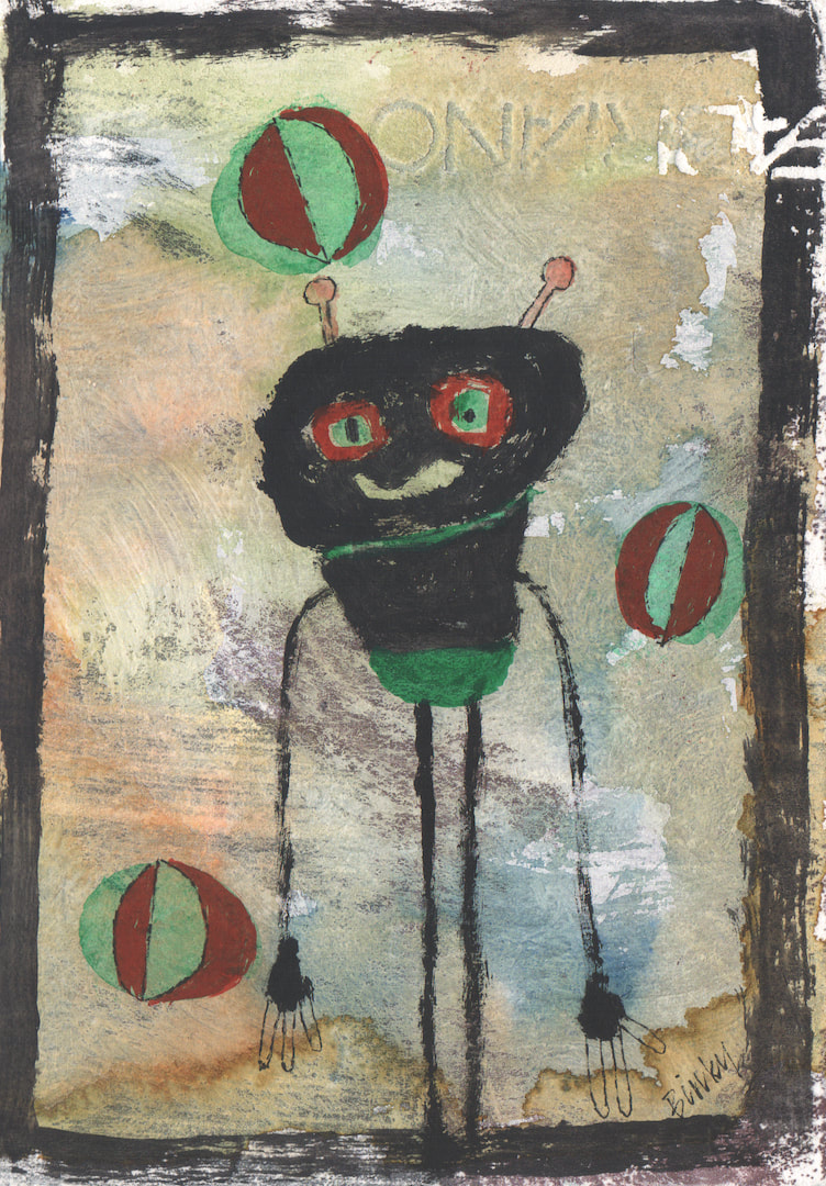 Something about Ben's birthday brings out the monster in me! Not sure why, but last year I made him a monster popup card and this year it's a reversible card of ... monsters. There is no back or front, so Ben can chose whichever side to have on view - two cards in one. 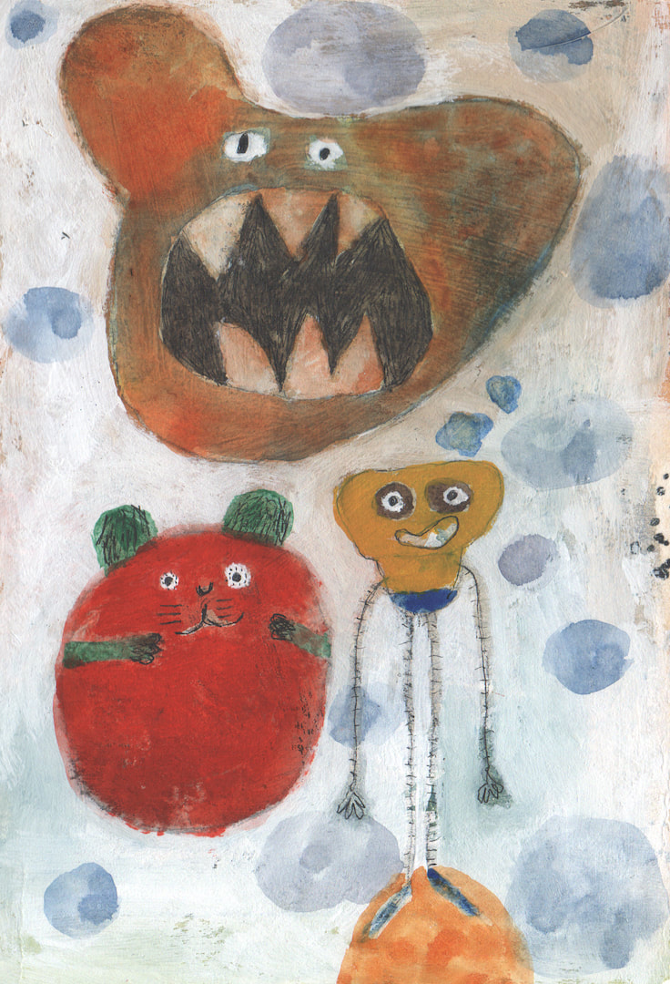 I think Ben likes monsters - I hope he does, anyway. He is a YouTuber specialising in gaming videos, not something I'm au fait with, but I know he has a taste for the ghoulish and creepy. Not that my monsters are particularly either of those things, they look far too friendly and benign, and in fact these ones were inspired by children's chalk drawings I saw on the local primary school playground when out walking the dog. 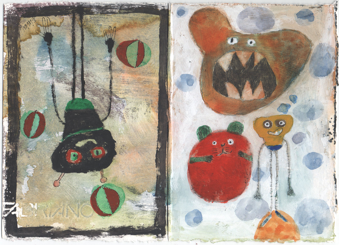 The rain soon came along and washed them away but my favourites were captured in my imagination - not as wild and reckless as I remember the children's ones, and it was harder than I had supposed to capture the spirit (hence all the over-painting) but so much fun and I do love them! (I wonder if I could make a pattern from them?)
Thanks for looking, see you soon! 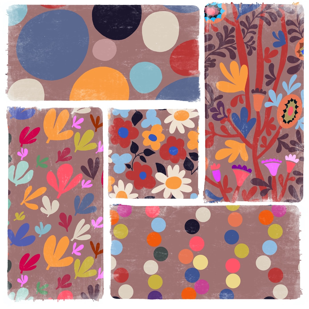 This is a proper catch up session. I moved my blogs to publish on Wednesdays because I get through a lot of work over the weekends which I finalise at the beginning of the week, so it makes more sense; but now I have 10 days worth to talk about. 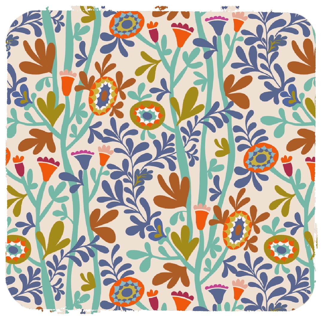 The headlines since my last entry are a new pattern (above), reworks of old patterns (top image and below) and a major reorganisation of my files and iPad. Reworks were mostly to create half-drop patterns from old grid ones, having decided I don't really want to make grid patterns in future because of their 'bang-bang-bang' appearance which works well for some designs, but my recent work suits either half drop or brick repeats. 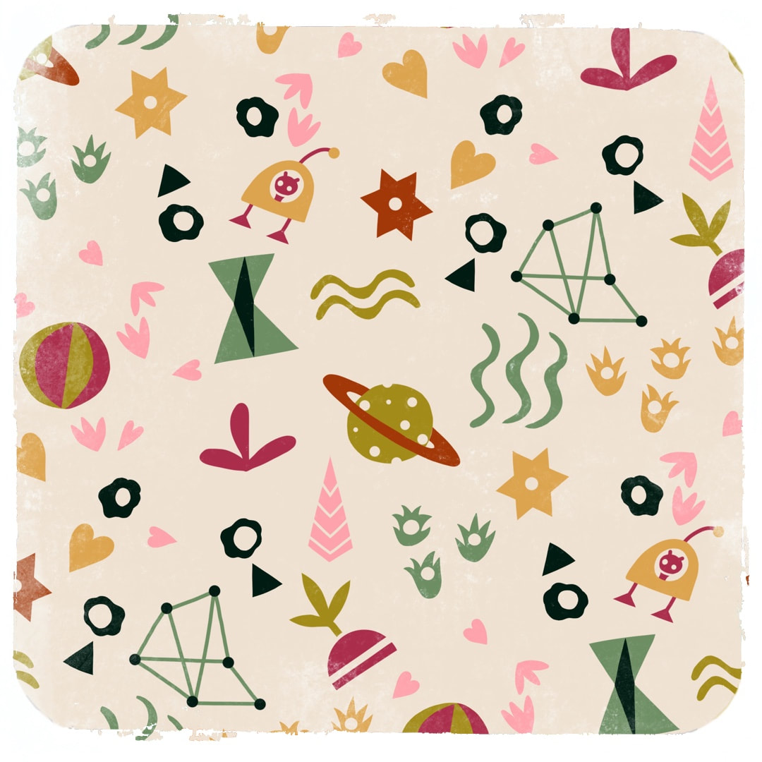 For this rework I replaced some elements with ones I am interested in at the moment - so now it has constellations, planets, stars and a flying saucer instead of big round flowers and circle shapes. I have also made sure that I keep colour separations for changing colourways using clipping masks; previously I was relying on colour drop, but I have found there are good days and bad days for its success in iPad. On a good day all looks fine, but on a bad day the dropped colour creates a halo, omits pixels and renders edges shaggily on even the clearest and simplest shape. It's a bit rough and I require reliability and quality, so now I use colour drop only for quick sketches to see how a colour might work.
My major reorganisation was to create folders (stacks on iPad) for colourways so I can clearly see how designs work together in a set colour scheme. It was getting rather bitty and confusing, and I was losing track of what I had and hadn't done with each palette. It also makes it easier to offload work onto MacBook to free up space on iPad, then retrieve designs to continue work in another palette on iPad, where each stack now has its own 'header' image with its colourway clearly displayed. It's a great feeling to clear everything down and establish order. Thanks for visiting, see you next Wednesday, if not sooner with more catchups! |

~~~~~~~~~~~~~~~~~~~~~~
Welcome to my illustration and patterns blog.
I illustrate under the pen-name of Binky McKee, McKee being my mother's maiden name. Binky was the name of every single cat my great-grandmother kept - allegedly about 40 of them during her 94 years of life. I changed the website address a few months ago, so some older links on previous posts are broken. If you click one of those and it takes you to a strange page, simply replace the .co.uk after the binkymckee. with weebly.com and it will work again. I hope you enjoy your visit! ~~~~~~~~~~~~~~~~~~~~~~
~~~~~~~~~~~~~~~~~~~~~~
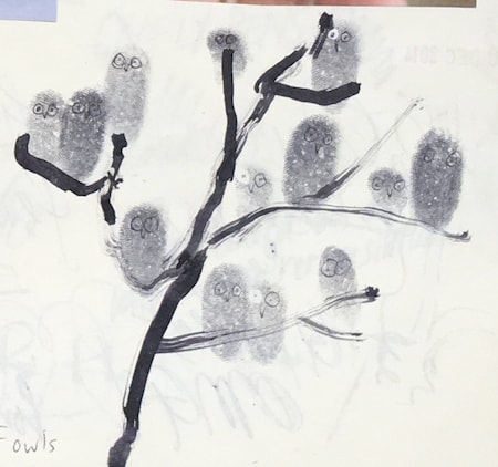
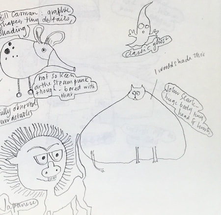
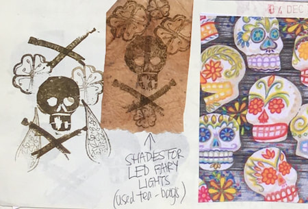
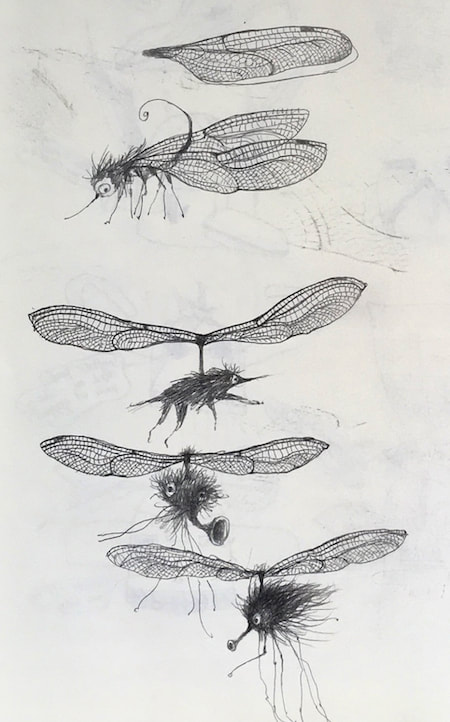
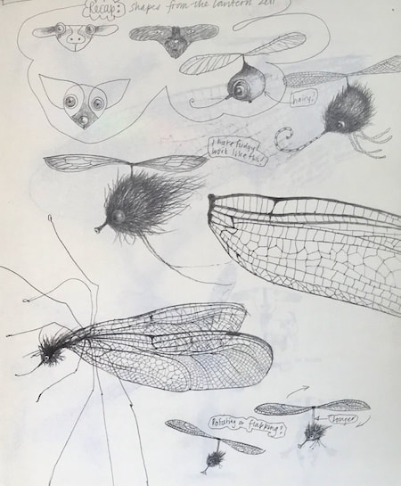
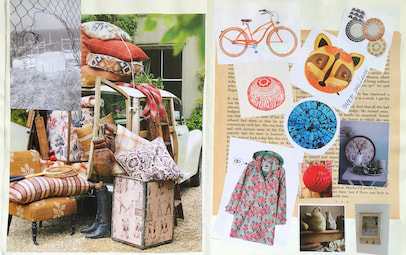
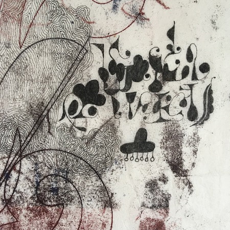
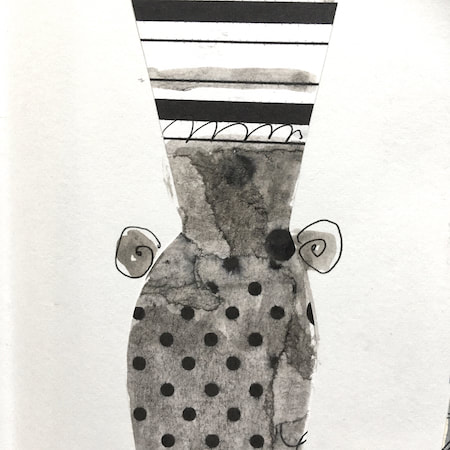
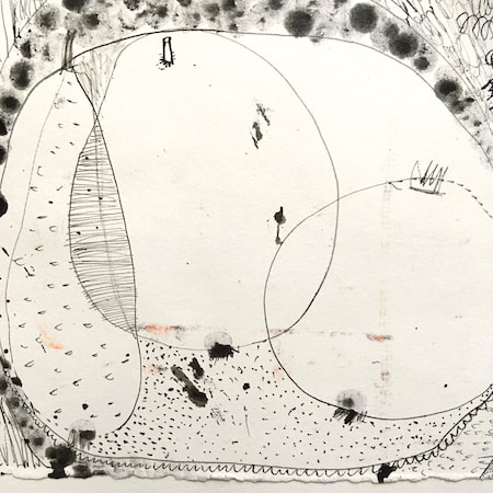
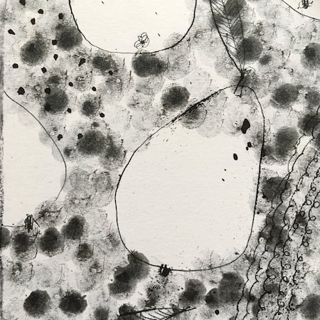
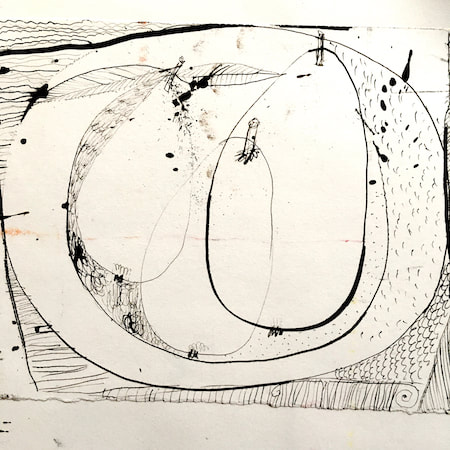
I keep lots of scrapbooks and sketchbooks where I develop ideas and design little creatures. Here's a peek inside one ...
~~~~~~~~~~~~~~~~~~~~~~
~~~~~~~~~~~~~~~~~~~~~~
As you may know, I am also known as Heather Eliza Walker.
Click the image if you would like to find out more and visit my other website. ~~~~~~~~~~~~~~~~~~~~~~ ~~~~~~~~~~~~~~~~~~~~~
~~~~~~~~~~~~~~~~~~~~
April 2024
~~~~~~~~~~~~~~~~~~~~~~
~~~~~~~~~~~~~~~~~~
All
~~~~~~~~~~~~~~~~~~~~~~
~~~~~~~~~~~~~~~~~~~~~~
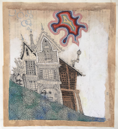
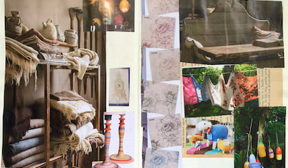
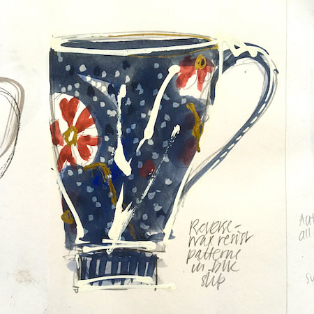
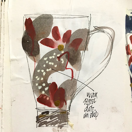
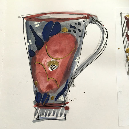
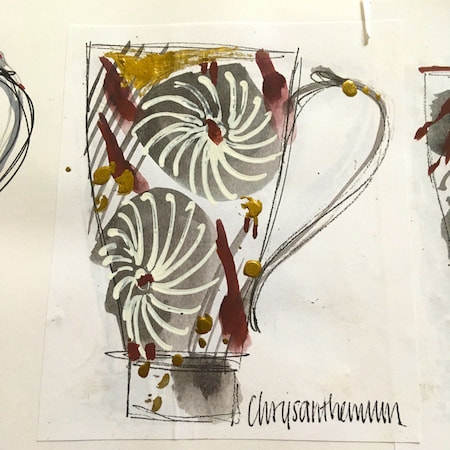
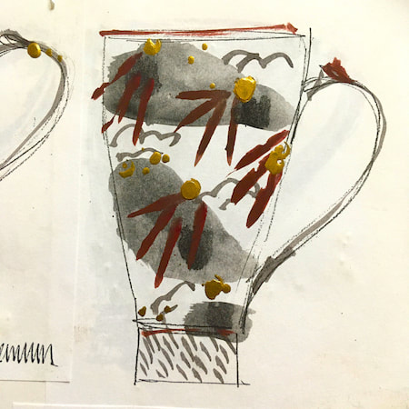
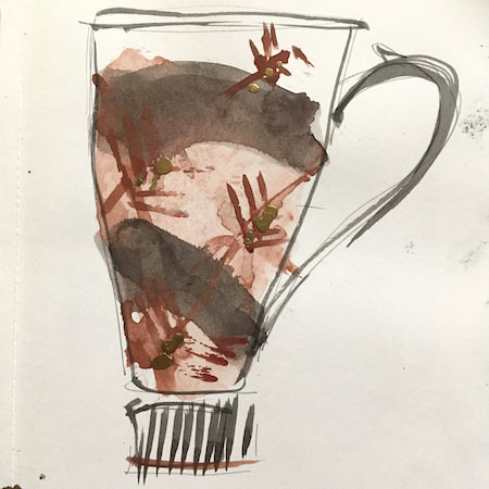
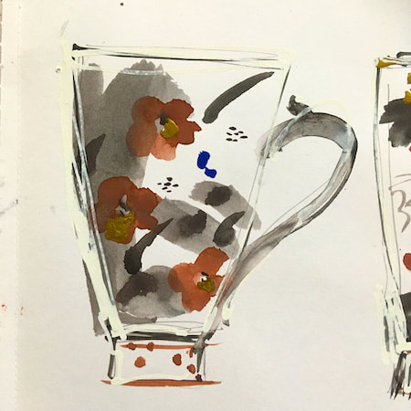
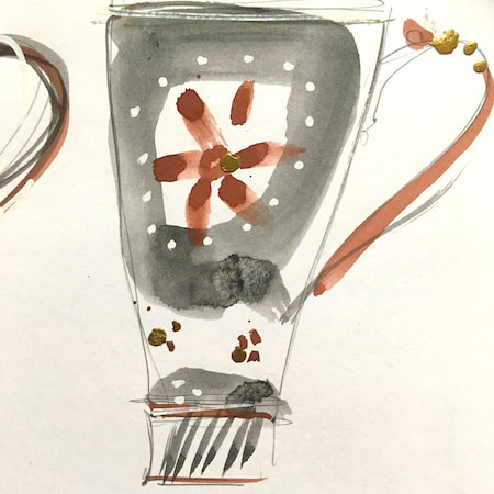
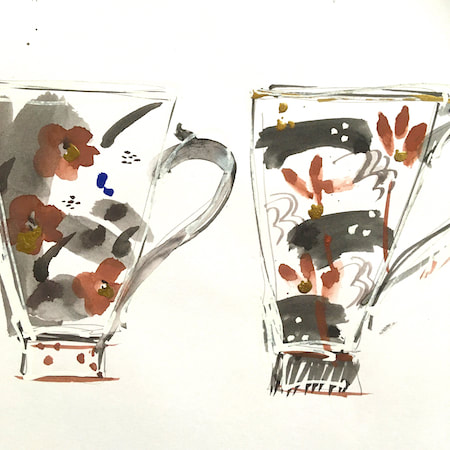
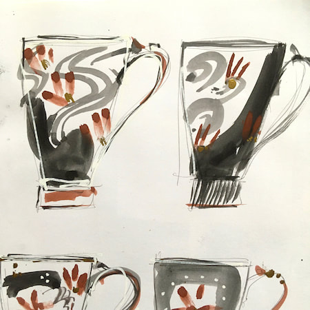
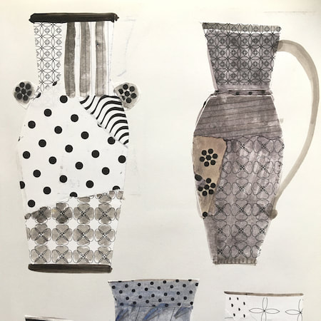
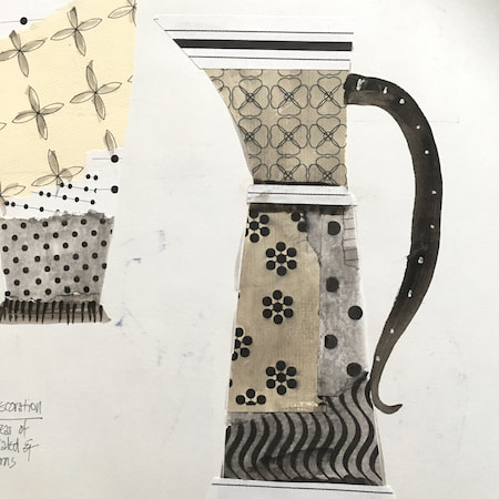
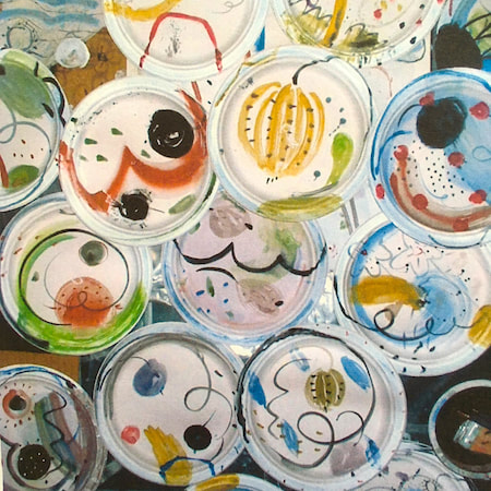
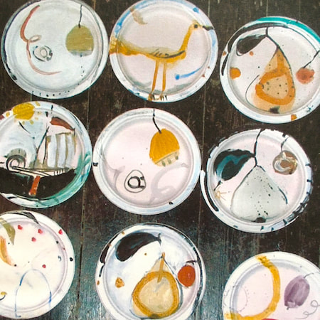
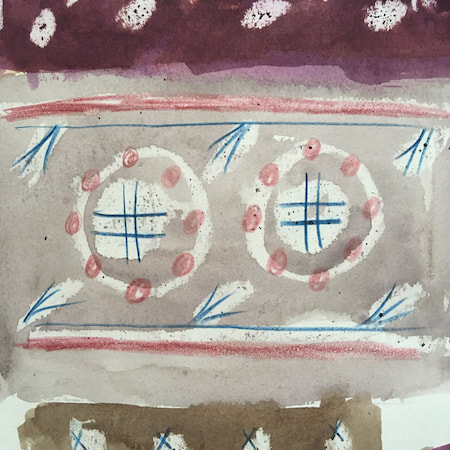
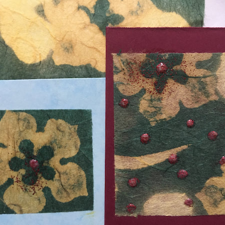
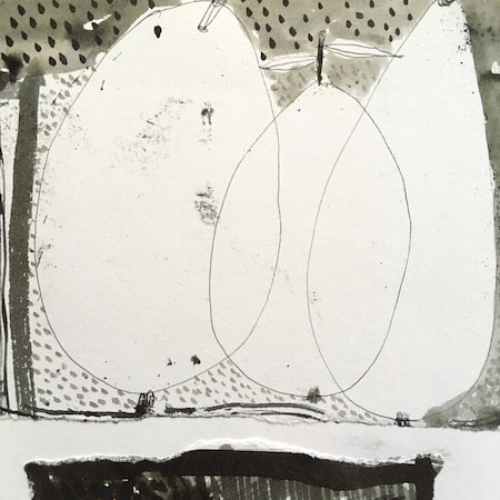
This time, take a peek into my ceramic design sketchbook. I actually made some of the mugs, but I kind of prefer the drawings! The plate designs are painted on paper plates, a most liberating process.
~~~~~~~~~~~~~~~~~~~~~~
~~~~~~~~~~~~~~~~~~~~~~
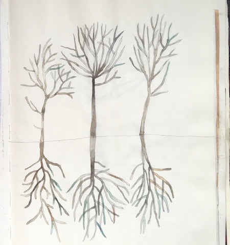
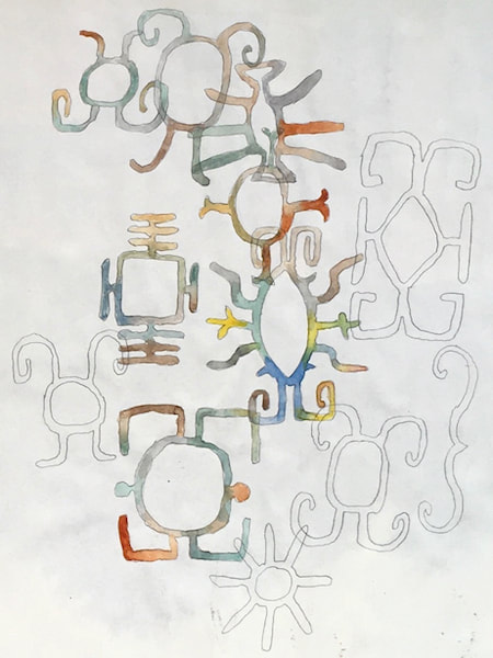
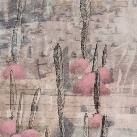
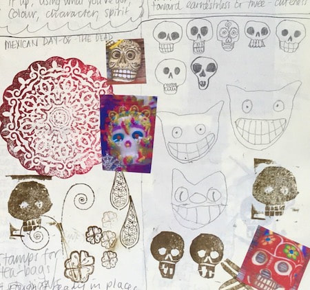
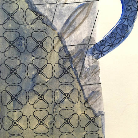
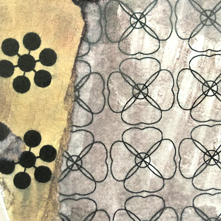
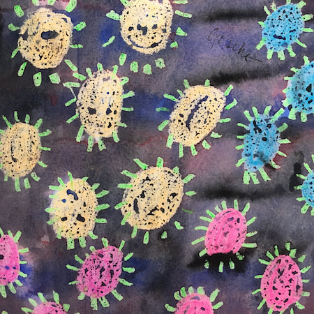
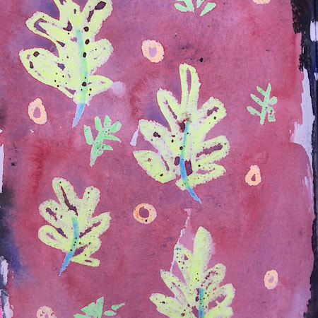
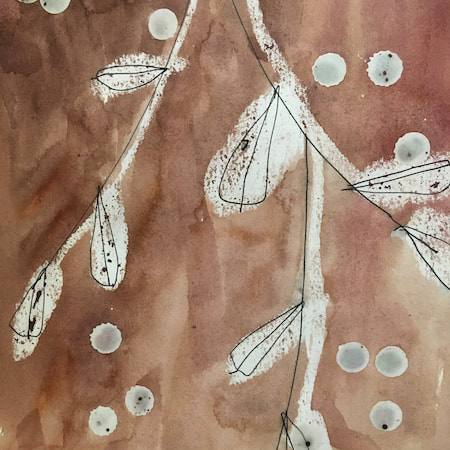
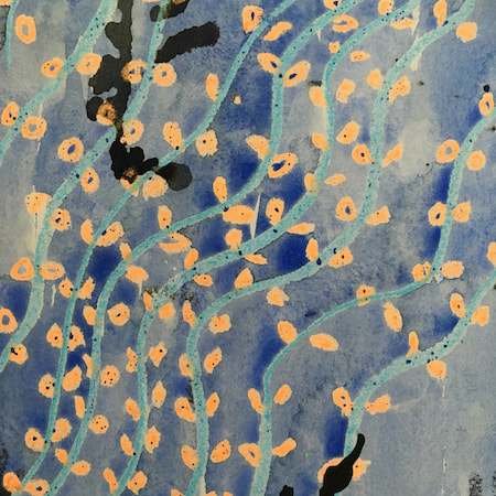
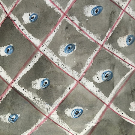
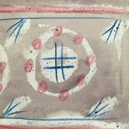
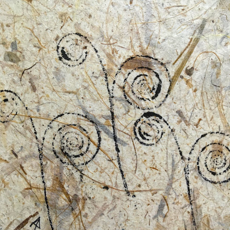
These watercolours are from my pattern sketchbook. I used coloured wax crayons to resist the washes of watercolour, also home-made rubber stamps dipped in bleach then printed on crêpe paper - the bleach takes out the paper dyes.
~~~~~~~~~~~~~~~~~~~~~~
~~~~~~~~~~~~~~~~~~~~~~
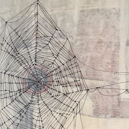
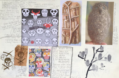
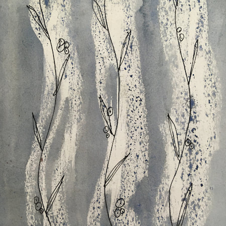
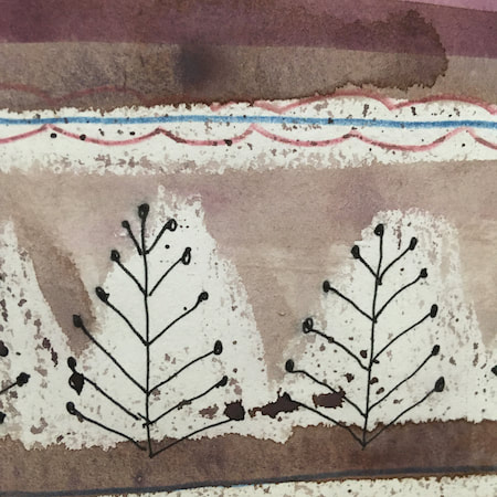
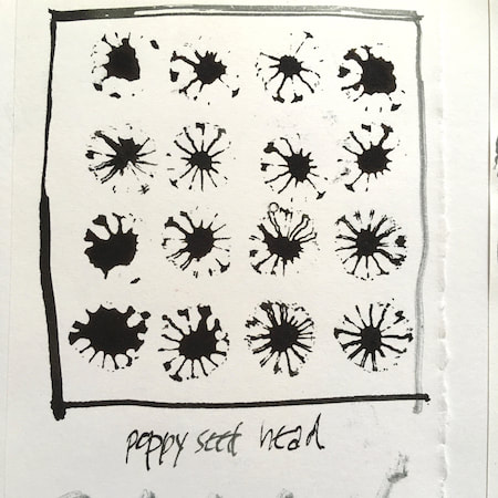
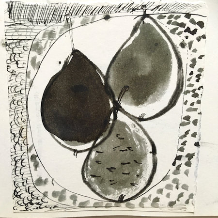
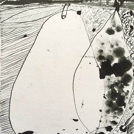
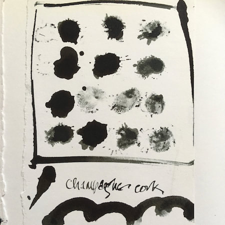
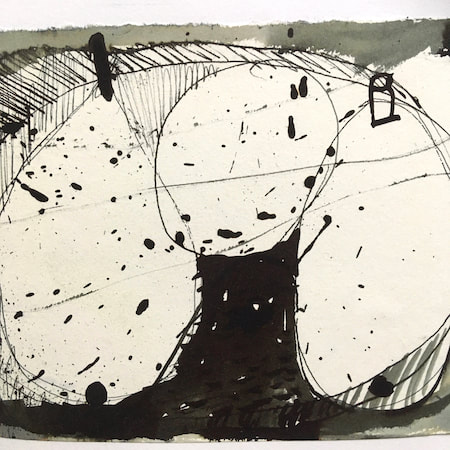
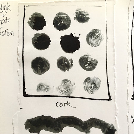
A sketchbook I used for mark-making with unusual objects - corks, seed-heads, feathers, home-made rubber stamps, my fingers and lots of flicky things ...
|
 RSS Feed
