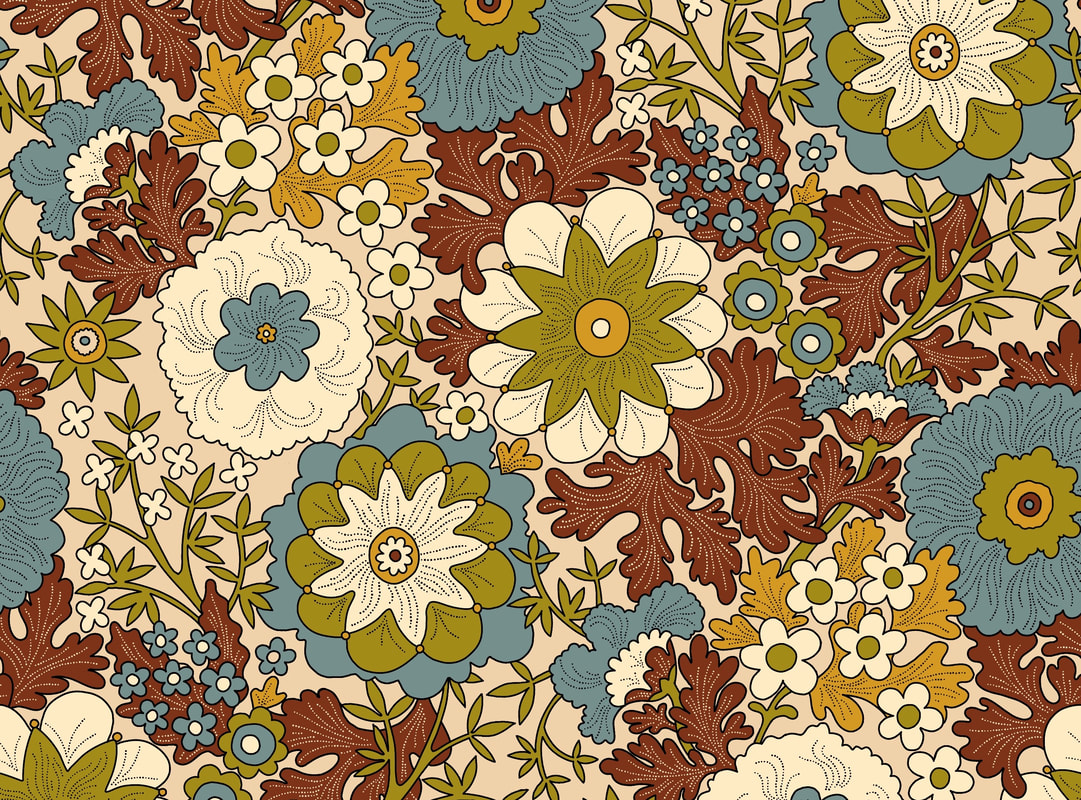
 I moved my blogging day from Sunday to Friday, so there is a bit of catching up to do here. Continuing with the Yay Flowers half-drop rework, I altered the outline drawing to the brown colour shown above so that leaves crossed the skinny stems of the two cupped flowers, eliminating an irritating whippy movement in the pattern. At the same time I changed the direction of the green stem in the top left flower. Next, I filled the outlines with colours. It was a nice, clean finish, but took a long time, and the potential of filling the repeat details in the wrong colours was high. I realised that in the long run it would be better to create colour separation layers for consistency in the balance of the design, not only for making speedy colourway changes but also providing the option of adding texture with clip masks. 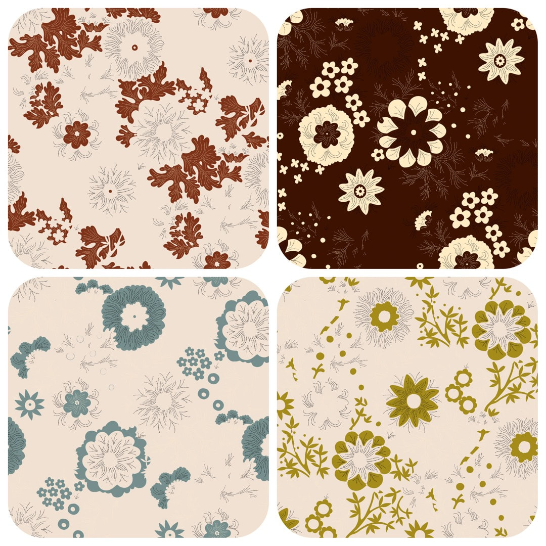 Having achieved this nice balance using colour-drop, I separated the design each colour onto its own Procreate layer. It was necessary to remove the outlines between the elements for use with clip-masks to avoid 'furring' of the lines, which would print with a fuzzy appearance; above shows how four of the five separations now look. 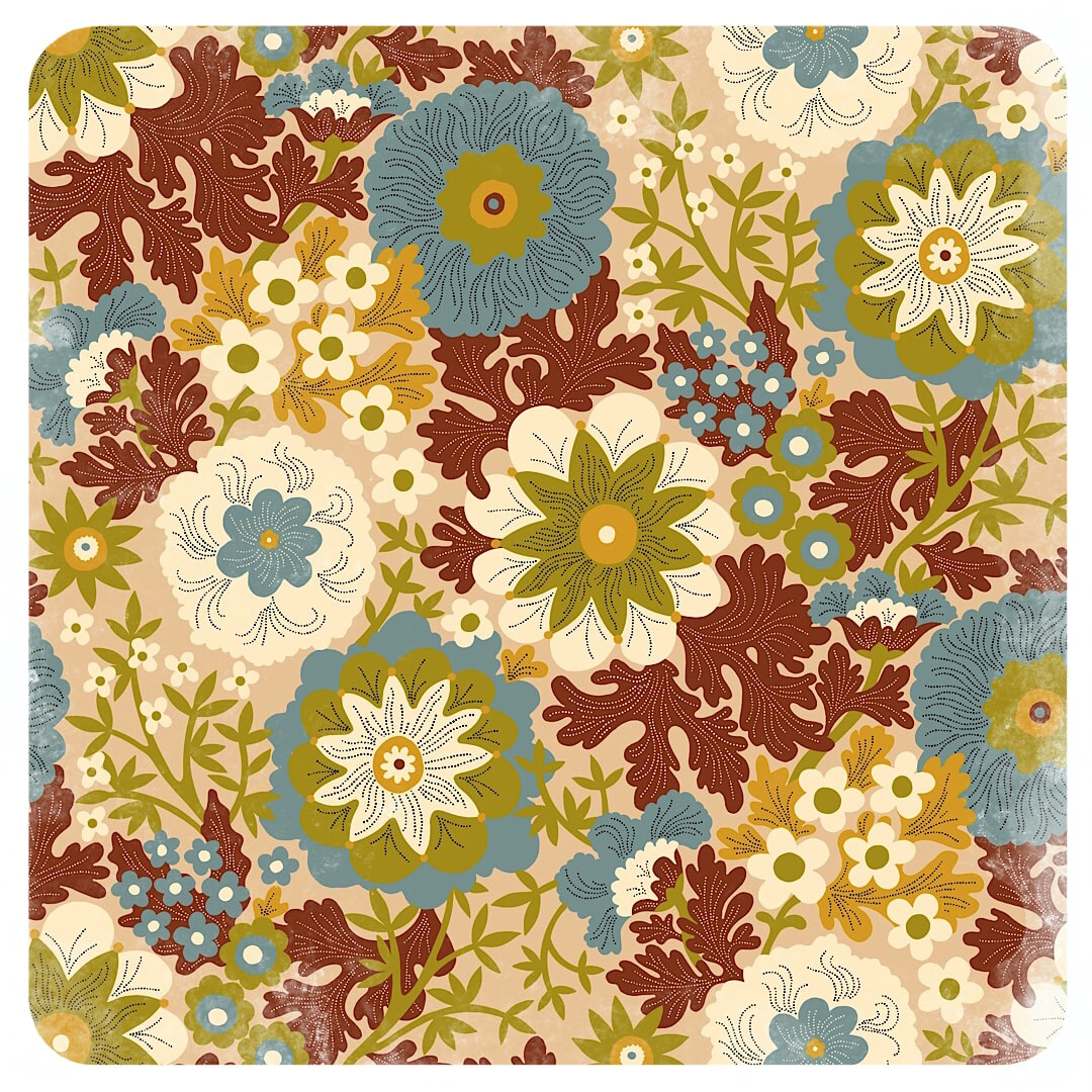 Here is the final result - a nice, fresh pattern. I like the cartoon effect of the outline version, but feel the pattern is now a lot more open with improved flow, and I look forward to playing with different colours and textures.
As a note, until now I have just kept textured finishes for interest in blog posts or Instagram. However, recently I have been working with fire-retardant and blackout fabrics which have a plain, bland surface, and noticed patterns with added texture do work well on these materials. So, moving forward: flat and clean versions for weaves and nap, and texture for smooth cloths and papers as well as blog posts - it's good to know! 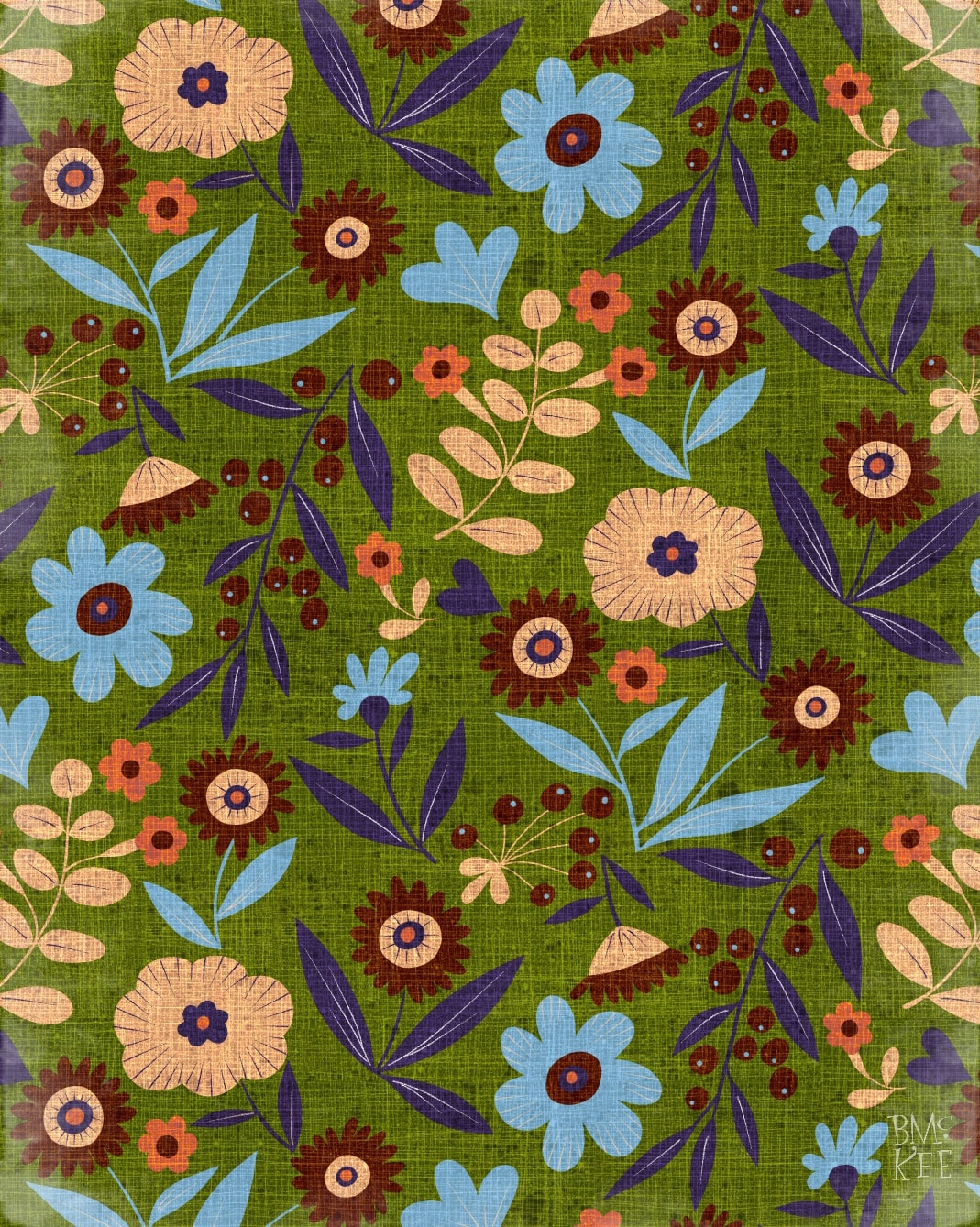 Following a recent jaunt into abstracts and geometric patterns, it's back to florals again with a rework of one I made in May 2021. It's one of my favourites, but I hadn't made it into a half-drop back then, just a block print, which I thought was a shame because it deserved a better flow; so while I was still on holiday I revived and refreshed the original. Now it is flowing and has bigger, brighter (and fewer) colours than before. I also revived a linen texture I made ages ago to provide texture just for blog and IG posts - it looks charming! Wouldn't it be great if it looked like that actually printed on a linen weave? 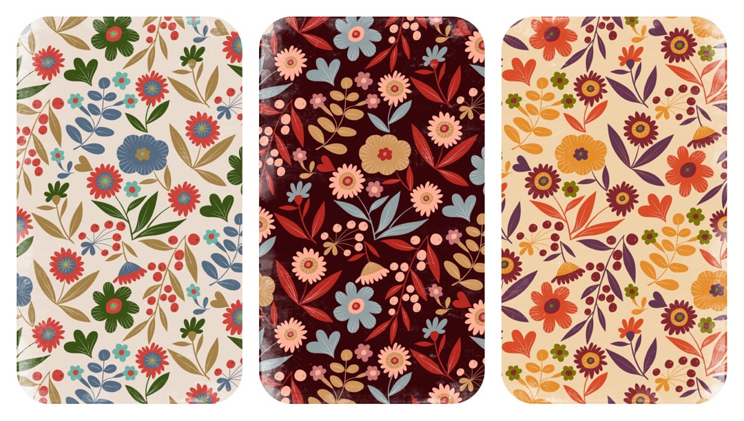 Here are a few more colour experiments. And, as often happens, while I was working on this one, some new developments came into my head which I will post here next week!  I haven't yet mentioned a revisit to the abstract shapes I started back in January to kickstart the new year after the Christmas holidays. I had developed ideas for patterns, which I never got around to putting into repeat, so this is what I was working on before I took my holiday from work. This one is my favourite, in 6 colours. I like to limit colour palettes from time to time, harking back to the old days of colour separations and single colour print runs. As a matter of fact, because my iPad technology is somewhat outmoded (it's nearly 10 years old), this is still the way I work, using the layers in Procreate 4.3.8 for colour separations.
Thanks for visiting, see you next week!  Because I don't have any automated tools to produce the geometry for a true ogee repeat, I had to devise all sorts of tricks to make templates and guides for these patterns. I managed to get the spacing perfectly even between the long ogees above by making a 'pixel counter': Procreate's crayon brush has a good texture, so a boldly-coloured block of that exposes the pixels clearly when zoomed up close. I moved the block around the initial pattern tile to measure the distance between components. I also made good use of Procreate's built in accurate click-to facility, and the canvas crop function. The image below shows the assisted quadrant rotational drawing function at work over a home-made guide which looks like a windmill. 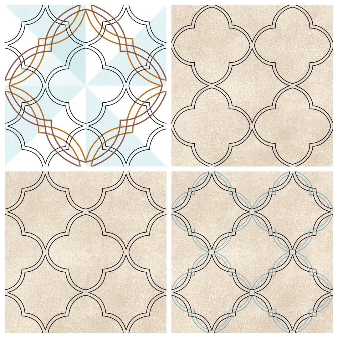 In addition, the ellipse tool is a bit too random to create perfect circles to use as guides for drawing S shapes, but I got around that by using the vignette frame tool in AfterLight on a plain square canvas. I did 'cut out' the circle very carefully so I could manipulate it, but just the plain flat image AfterLight provided is a good guide tool. Below is the result: an elegant, flowing line which creates a true ogee pattern, very pleasing to the eye. 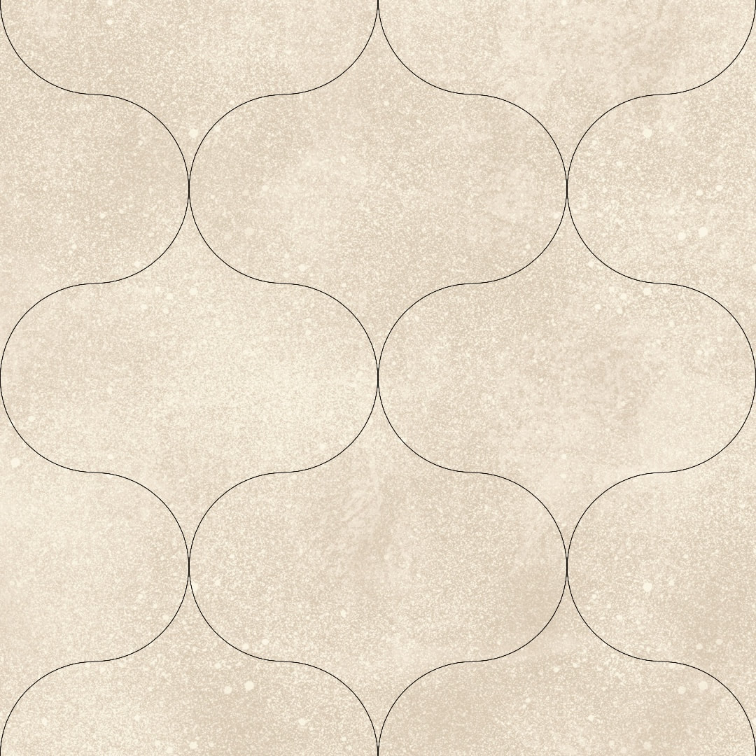 I actually love this kind of problem-solving and inventing new methods, all based on how these patterns would be made by hand using curved templates, compasses, rulers and tracing paper. I have shared more images of these 'tools' here on my Heather Eliza journal.
Thanks for visiting, see you next week! 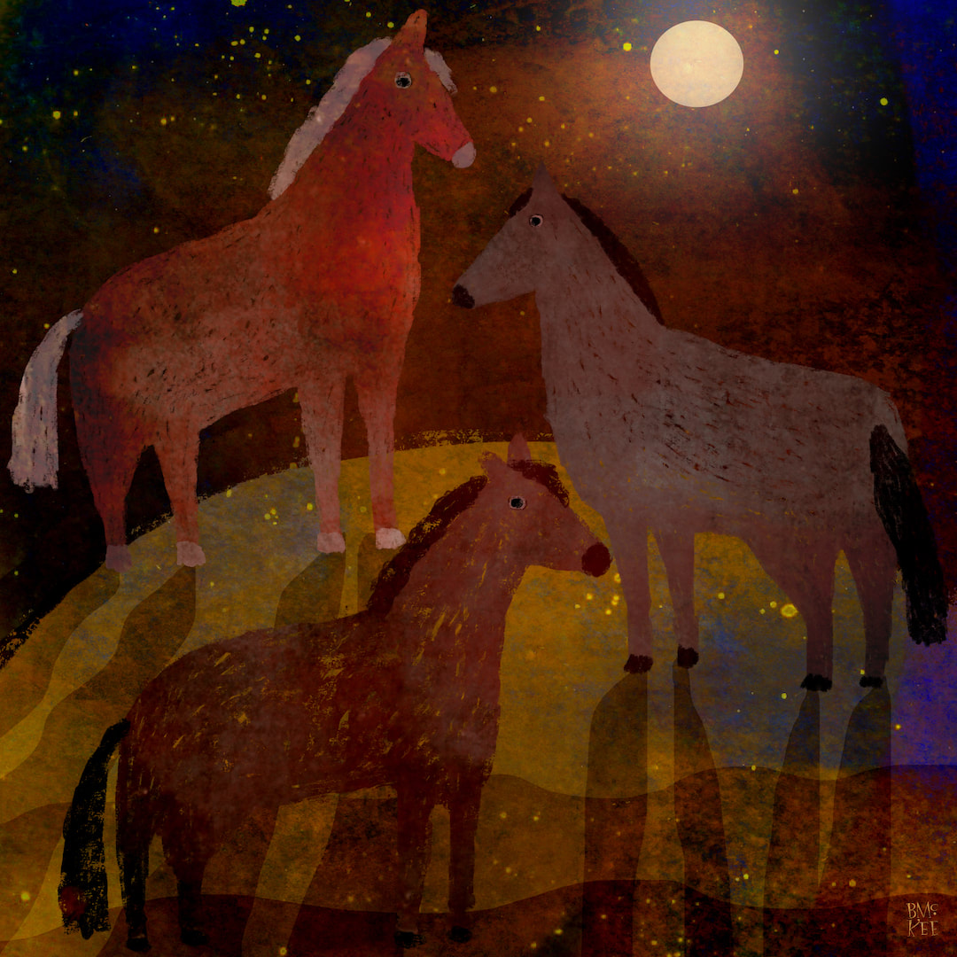 Well, this totally sorted out my problem with the ponies. I found the original texture I used in Yellow Bear and overlaid a clipping mask on the ponies drawings. It's interesting to see the clip mask applied to the first brush drawings of the ponies. I know it is very close-toned and painterly, but I'm much happier with this result.
Odd how things develop sometimes - it must be a mood thing. By the way, I'm reworking the leaping doggie/faun creature avatar I was using prior to the birdy one in temporary use at the moment - watch this space. Thanks for visiting, see you next week! 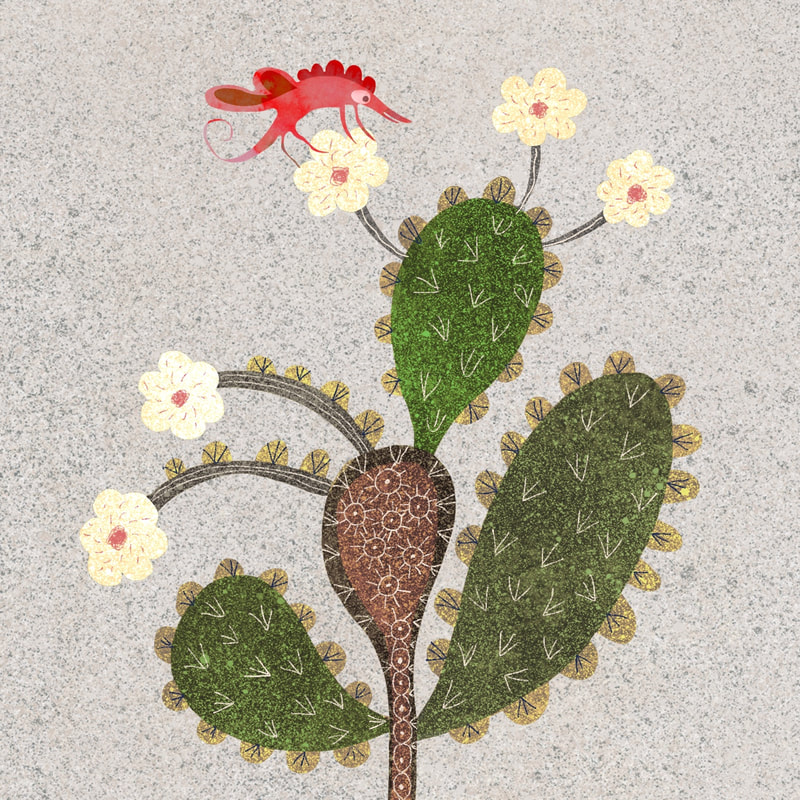 I had a refresh of colours, textures and subject matter this week. These flowering cactus collages (made inProcreate) had been hanging around in my workspace for a while but something wasn't gelling; however, a new approach to completely brought them to life. I wasted an awful lot of time trying unsuccessfully to get them to work (I liked the shapes and idea) until this refurbishment in new speckled textures and drawing captured exactly the right mood. 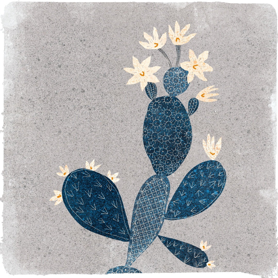 When I'm not designing patterns, I don't have to worry about making everything as clear as a cartoon. Close tones and subtlety are open to me, and these two cactus pieces were my favourites of the week's work. I particularly like the Japanese woodcut look of the blue one here - it's cool, flat and graphic yet soft, with its little pattern details derived from the spikes of a cactus. 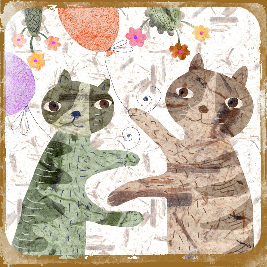 These charming partying cats were created especially for Caturday on the May bank holiday weekend!
Thanks for visiting, see you soon! 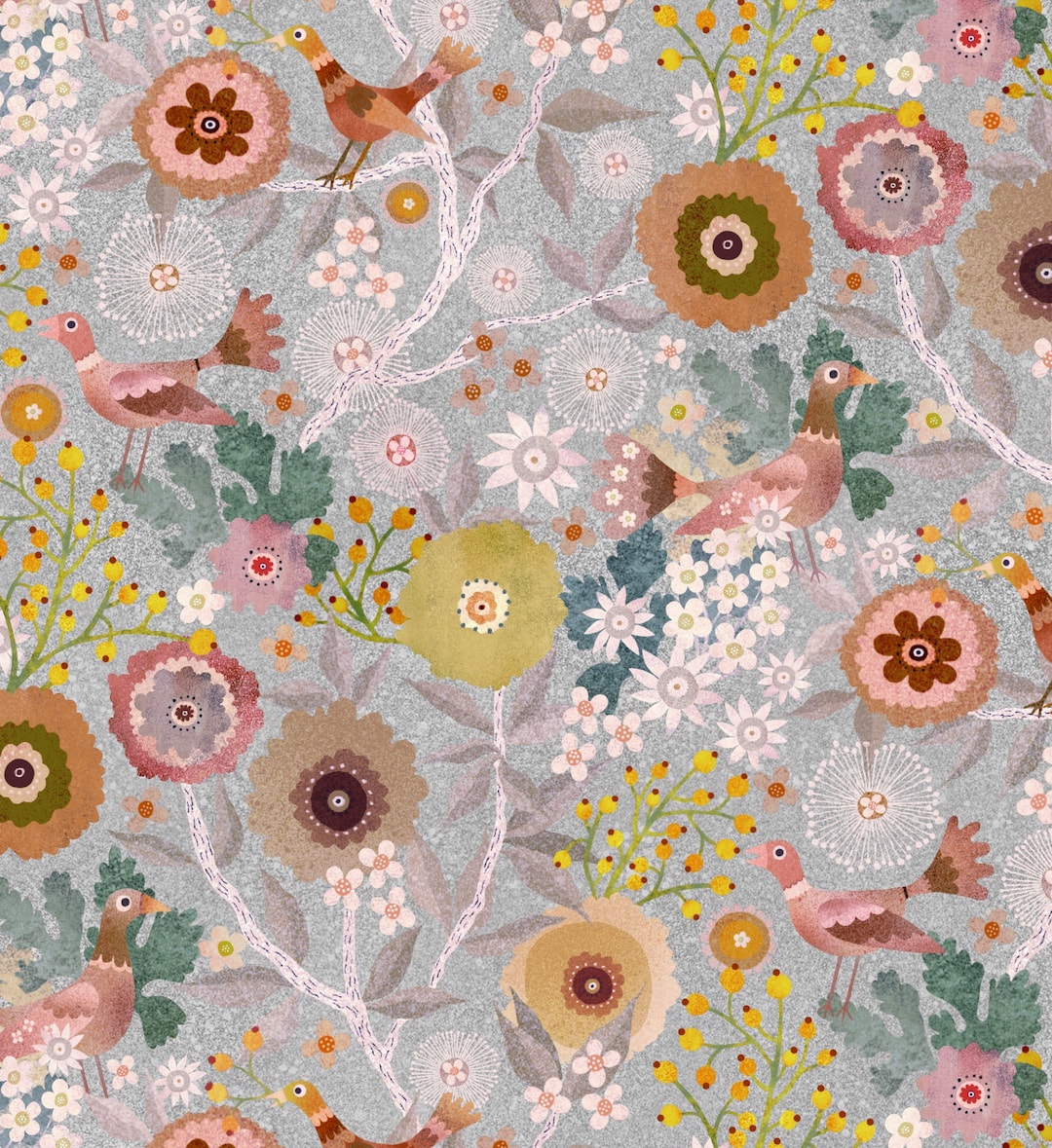 Last week's success reworking Yay Flowers! from 2020 inspired me to rework the Birds and Berries garden pattern I also made last year, but never used. I gave it a quick try on Redbubble at the time, but had concerns about it so I never launched it. Back then I was working by bouncing designs back and forth between iPad and Photoshop and it raised a few issues, such a line of just one pixel going missing etc - a minuscule difference, but enough to fault a good pattern, and although I tested the repeat thoroughly and it seemed fine in the end, I just didn't trust it. I lost Photoshop when my very, very old MacBook finally died, but already had Procreate on iPad and was using that more and more. I won't subscribe to Adobe any more (don't approve, and can't afford it anyway) so nowadays no more Photoshop and I am working exclusively on my iPad Air. No, I don't have the wondrous Procreate 5 because it's only available for iPad Pro (which I also can't afford) but over the last few months I have worked out an idiosyncratic but completely practical way of making good patterns 'by hand', which I really enjoy; I can work in comfort at massively enlarged pixel scale for total accuracy. It's a kind of hybrid of the physical paper method and modern (well, sort of in my case) technology, and it certainly satisfies my inner jigsaw puzzler! So, this week I had the confidence to get out my favourite pattern and rework it. I could only get it to work last year in merged form, solid state with background, so colour variations didn't really work. I rebuilt the pattern tile from scratch with elements I had filed away, and hey presto - colour separations! I love this silvery version (above), the original colourway is shown below. And yes, the pattern is going back onto my Redbubble store to play in all its colourways. 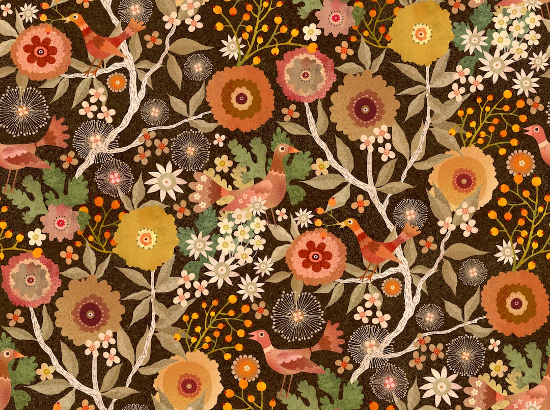 Thanks for visiting, see you next week!
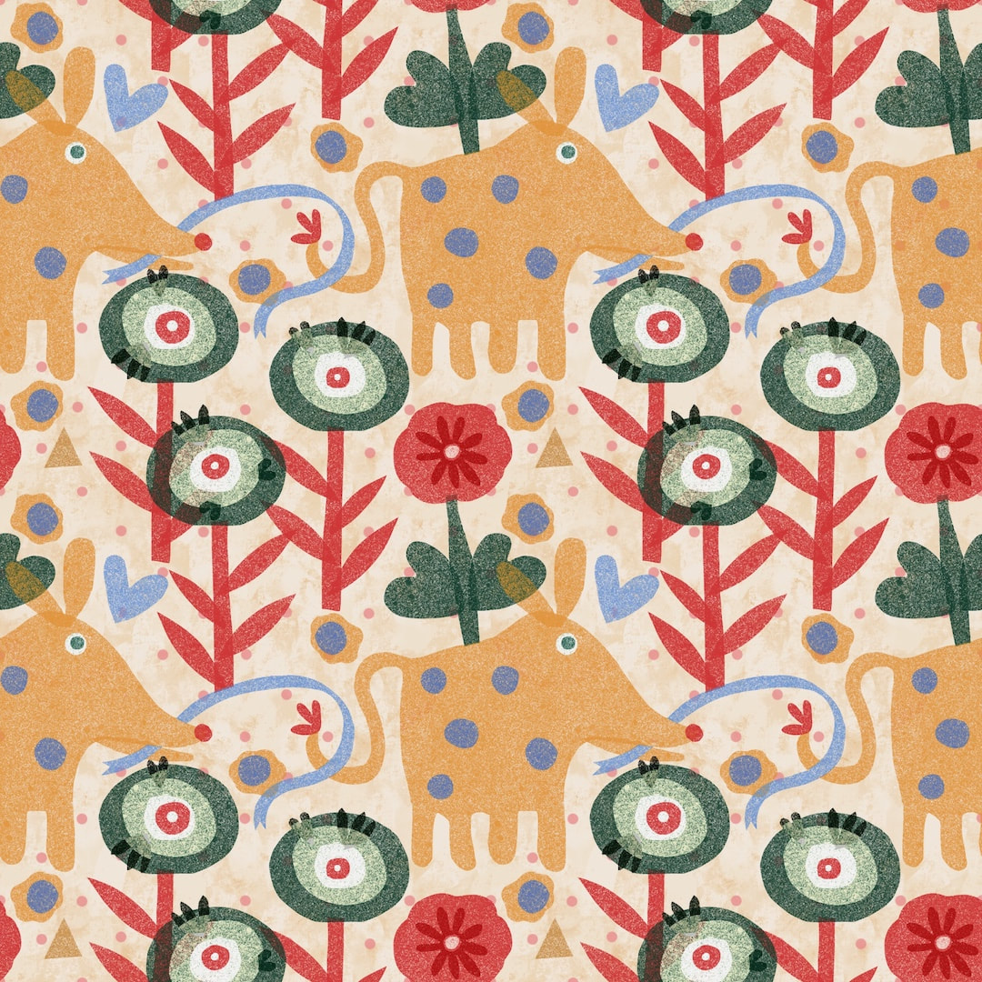 I challenged myself to make a pattern in 15 minutes just to see if I could do it! Still on the 'riso' texture I created, I quickly drew these little creatures and some plants. I got them into a simple block, or grid, repeat, and it worked! 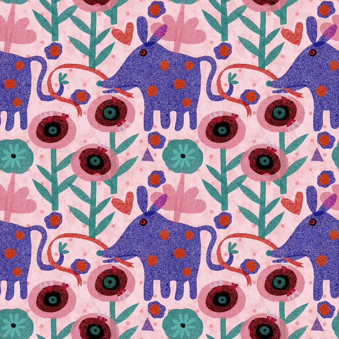 I experimented with different colours, not very sophisticated because in the time frame I didn't make colour separations on layers. The painter in me really loves the nuances of texture and colour, but I know they will not reproduce well when printed on cotton or other textiles. It's a cute design, though. I thought of them as being kind of elephant creatures, but was reliably informed when I posted them on Instagram that they are possums! A Google search revealed that they do, indeed, resemble possums although they could do with loner toes. 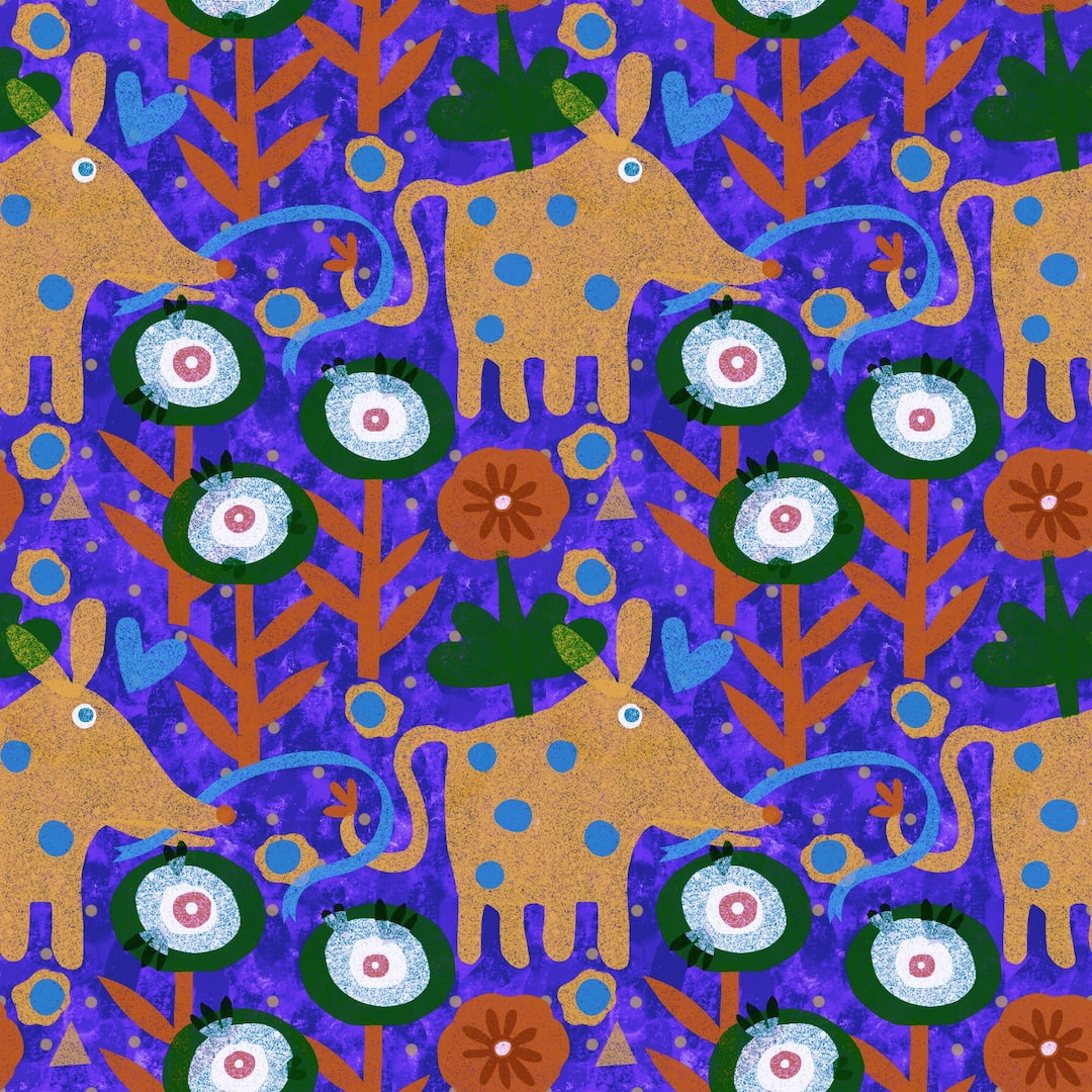 Lovely strong shmoosie blues here, but because of the transparency and texture of my 'riso' attempt the possums look a bit dirty and tonally it's all a bit wrong.
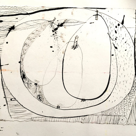
Thanks for reading. see you next time! 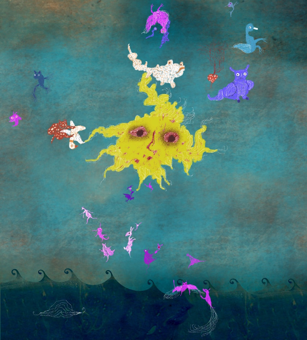 At last, I am starting to edge my way back into work. It looks as though our Perthshire house sale is on again. At the weekend we had a great visit from friends we haven’t seen since before lockdown. The household suddenly settled into a more regular regime, and all of a sudden I found myself with some time to work in the afternoon yesterday and today. Sometimes it’s hard to drop back into the swing of work. Re-opening projects which have been lying for 5 or 6 weeks can be daunting - what was the train of thought? How did I do that? - it can be overwhelming. So, I always find the antidote in a good dose of pareidolia to loosen up! The other day it rained hard overnight, but in the morning the sun was up and so hot I knew it would be drying the pavements in the park leaving picturesque watermarks. On our daily walk with the dog I took snaps with my phone which are proving to be a mine of inspiration ... 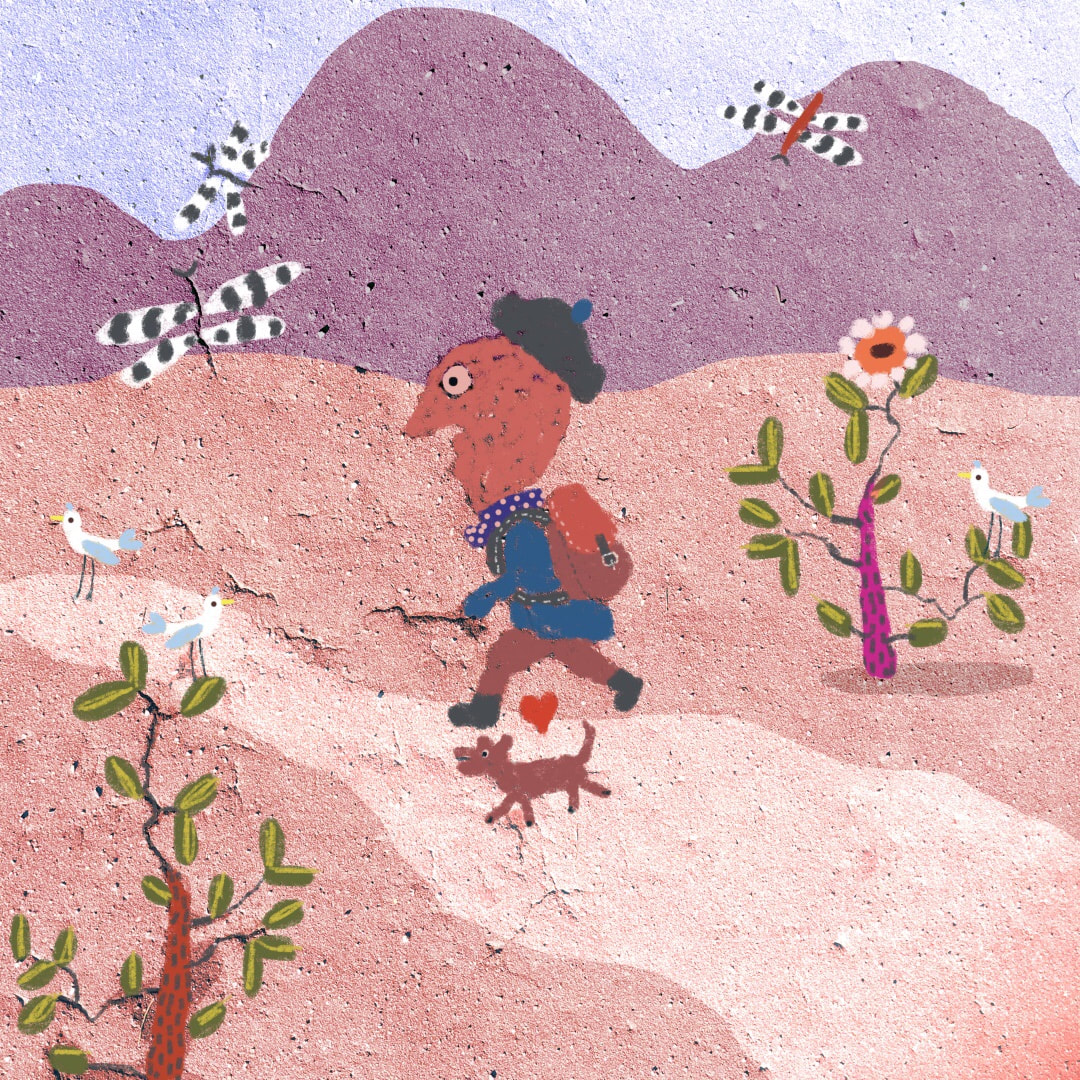 ... Here we have, top: weird sun-god creating constellations from the sea, and above, a hiker. Below are the original snaps I took in the park.  I nearly forgot to mention, I got a new stylus this week: I bought an Adonit Dash3. I use an old iPad (2014, 2ndGen) as well as a Samsung Galaxy mini phone, and an iPhone. This stylus works brilliantly on all. Previously I had two Heiyo styli; the first one was about 18 months old when the on/off switch cover fell off, following the plug charger cap which fell off almost immediately after purchase. I replaced the stylus with a new one, and that suddenly stopped working after just two months; I literally put it down to go to fetch a cup of tea and when I came back it had just stopped working. Nothing had changed on iPad. I switched back to the old one, which for all its faults worked fine for a couple of months until it, too, suddenly stopped working in mid-project. Tech support was infuriating so after some research I got the Adonit Dash3 and it is excellent! Smooth, instantly works etc etc. Nice nib for drawing and writing. Should have done that when the first Heiyo failed. Note and NB!!: it doesn't work on iPadPro.
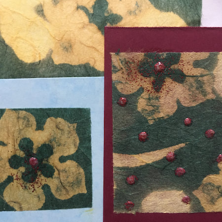
Thanks for visiting, see you next week!  At last, Christmas card-making underway! I'm running a bit behind time this year and cutting it fine for International post, but catching up. I should really begin collecting ideas and materials in September to begin the process of Christmas card-making in October, because November and early December get busy with Heather Eliza work for winter exhibitions; I just didn't get around to Christmas things before Hallowe'en, after which time runs away. Complicated by a head-cold virus which wiped my brain's creative files, I had a couple of false starts, but luckily one feverish night I remembered a carved Indian box I have been itching to make prints from for ages. It bears a central motif which could be interpreted as the Christmas star, so in no time I was back to my excited self, up and running with the printing ink and roller and delighted with the results of a day's work.  A shmoosh of glitter later, plus mounting on excellent cream card blanks (purchased from Anita's on Amazon), and ... this year's cards are a Thing!
Thanks for visiting, see you next week! 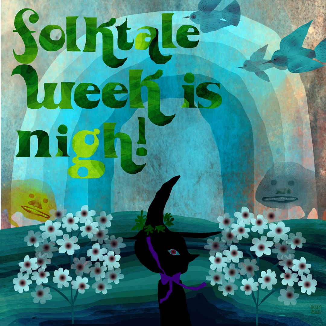 A poster I made last year in the run-up to Folktale Week
I didn’t manage to get any new illustration work done this week, my focus being on making more confused flags for Artobotic vending machines, especially the Brexit Art machine. Because it is time sensitive with only 11 days left to go (apparently Britain will still leave the EU on the 31st of this month), I had to set the 100 days of cats project temporarily aside in order to prioritise Brexit themed art. When I get back to it, I will be incorporating 100 days of cats with Folktale Week, telling my stories for the prompts with cats! Folktale Week starts two weeks tomorrow, so I thought it would be interesting to look back on what I was doing this time last year. I want to make another “Folktale Week is Nigh” poster next week, so I pulled last year’s from my archives. It reminds me that a year ago I was working exclusively in Procreate on iPad because our house move was in full swing, and my new work space wasn’t yet functional. I could work anywhere at any time on iPad, even when travelling or in the dark. I enjoy mixing things up, who doesn’t love the play and experiment of collage? The main difference between now and then is that since March I have been drawing and painting by hand again. When I was working on patterns in the spring, I found Procreate to be great for cleaning up and ‘cutting out’ hand made elements. It feels natural to use a stylus for drawing around edges with the eraser tool, freeing hand painted images from their paper background to set them into transparent layers. Last week I combined hand painted cats and trees with scanned collage elements and digitally created images. I made the alphabet I use for text in Procreate, too, basing it on Goudy Old Style (my favourite font when I worked as a graphic designer). It’s such a glorious mixup, exciting and playful with endless possibilities - I predict I’ll be making more illustration work with these techniques in future! Thanks for visiting, see you next week! P.S: Confused Flags development can be seen in The Weekly at my HEW website 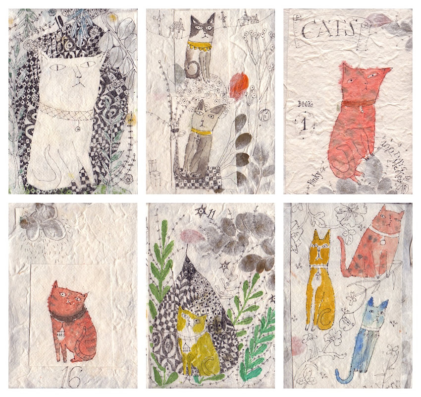 A selection of 6 cats, in no particular order, from my 100 days project which is going well. I will complete the first booklet’s posts on Instagram next week - I can’t believe how quickly the time has gone! I am getting so much joy and inspiration from it, it is amazing how doing 100 of something benefits work all round, and I am only a fifth through. I hope it continues as creatively. The patterned mosaics and mats I have been drawing with the cats became a source of great interest to me. After a drive through the old fishing villages along the Fife coast one day, I began drawing them combined with buildings inspired by East Neuk architecture on a large sheet of paper. 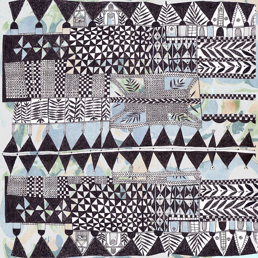 Experiments with scanning and placing elements from the drawing together proved so exciting I am now giving my online shop a complete overhaul full of new ideas. There isn’t much to see yet, but I will post a link when there is enough to toot my horn about!
Thanks for visiting, see you next week! 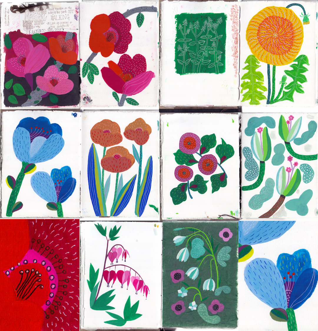 It’s a Wednesday mid-weekly today, because I got out of the studio over the Easter weekend. Friday, Saturday, Sunday and Monday presented the most beautiful, hot sunny weather. I caught up with laundry and gardening in the mornings, but I also set myself an art challenge for the afternoons to work in a completely different way from usual: I was not to make my habitual line drawings coloured in with watercolour, but instead to paint with gouache directly onto paper.
 I had a brainstorming session this week. What I do when I brainstorm is to work very fast, allowing myself 4-10 minutes per drawing, and do as many as I can until my brain runs dry. I don’t worry about good drawing, expertise, or mistakes. In fact, the time limit prevents overthinking, so mistakes are good; I believe problem-solving is one of the key processes which help an artist to find their own voice, and working fast forces you to think on your feet and get resourceful in a way only you know.
Once I have finished the drawing session I take the more interesting ones into photoshop - not necessarily the best, but often the craziest which appeal to me - and I treat them in the same way as I would treat a considered project. It is amazing what reveals and connections occur. The collage above is a mix of revisiting works I have made as early as 15 years old, bonkers stuff that came out of photoshop, one which is rough as anything but I worked on some more (the yellow cat), more bonkers photoshop, prints I made 10 years ago (bottom left) which have good pattern-making potential to take forward, and lastly the line drawing in sepia and brown, where this week’s happy process led me today. I recommend this exercise to anyone who suffers from creative block. I only get creative block in times of great sadness or similar emotional times, but I do get incredibly frustrated with myself. I have too many ideas and try and go deep into them all. This is a great way to separate the wheat from the chaff, to get back to your core, to see what is time-wasting and get back into your quiet self. I always feel cleansed, relaxed and stimulated after one of these sessions, ready to take on new work. Thanks for visiting, see you next week!  A week of intensive pattern making again! I studied how William Morris made his pattern repeats and used one of his methods to create the floral pattern above in two colourways. Then I moved on to learning how best to draw in Procreate (I usually employ a cut and collage technique, but I get tired of the hours of cleaning up wobbly edges, the downside of using that technique digitally). Suddenly, and I really can’t remember how it came about, this mosaic or cloisonné effect drawing began to happen and I loved it. I even made a cat from it for hashtag caturday on Instagram! I will continue working on developing this idea this week, as well as adding to my Redbubble shop.
I am making the patterns really nice and big, so they fit just about all the products on Redbubble. My shop is growing, but there still isn’t enough to make the grand announcement yet. I reckon the second week of March will see it ready to ‘open’. I will, of course, be posting a link around then, so watch this space! It’s very exciting and I am enjoying the process enormously. Thanks for visiting, see you next week! 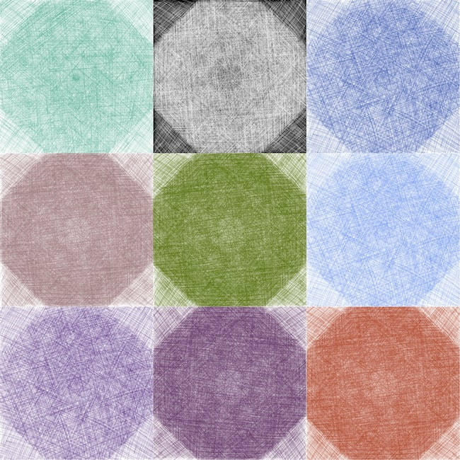 This week has been all about crosshatching and colours. There were many other experiments, but I just love the way these look together as a group. Subtle repetitions and changes are evident within the forms which themselves are simple. That's a thing that interests me. Thanks for visiting, see you next week! |

~~~~~~~~~~~~~~~~~~~~~~
Welcome to my illustration and patterns blog.
I illustrate under the pen-name of Binky McKee, McKee being my mother's maiden name. Binky was the name of every single cat my great-grandmother kept - allegedly about 40 of them during her 94 years of life. I changed the website address a few months ago, so some older links on previous posts are broken. If you click one of those and it takes you to a strange page, simply replace the .co.uk after the binkymckee. with weebly.com and it will work again. I hope you enjoy your visit! ~~~~~~~~~~~~~~~~~~~~~~
~~~~~~~~~~~~~~~~~~~~~~
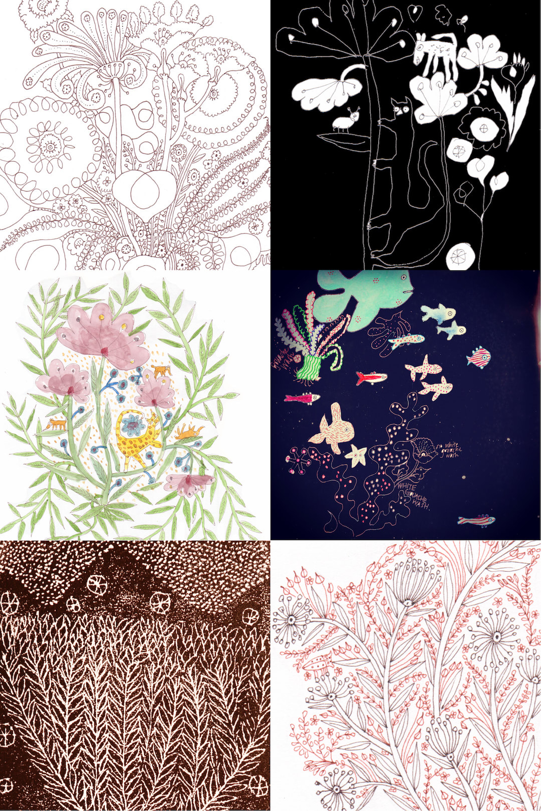
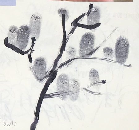
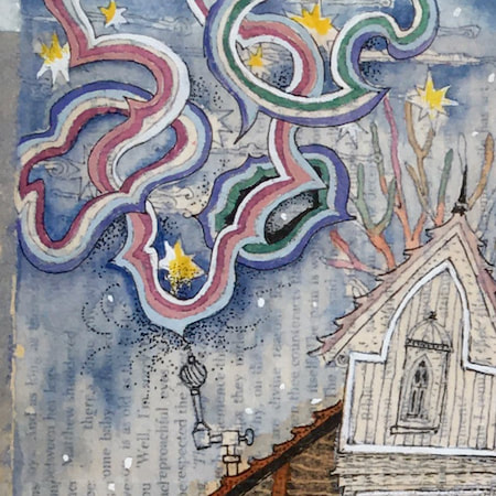
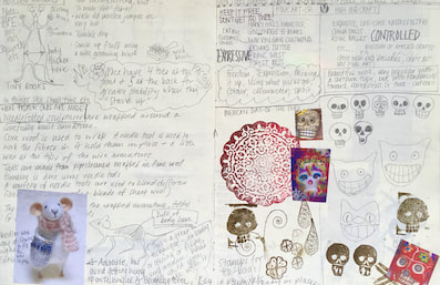
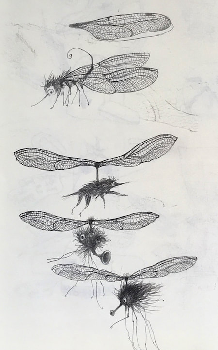
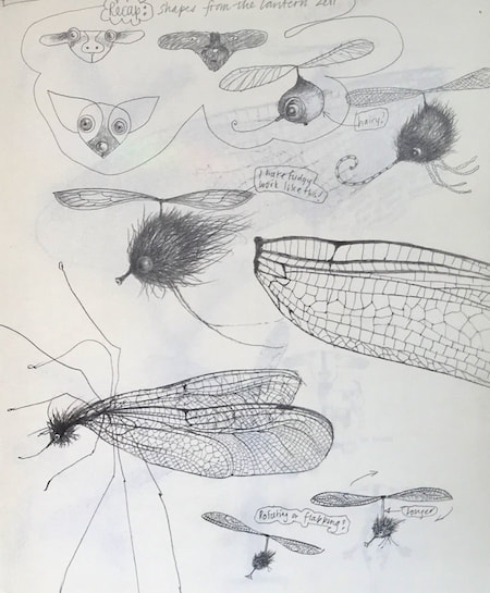
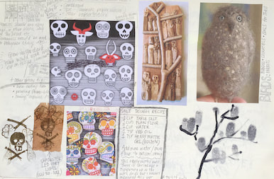
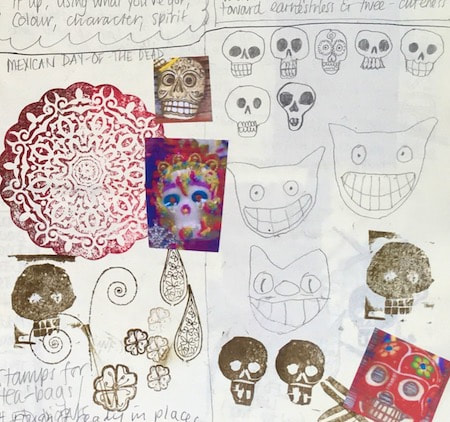
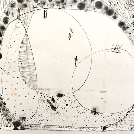
I keep lots of scrapbooks and sketchbooks where I develop ideas and design little creatures. Here's a peek inside one ...
~~~~~~~~~~~~~~~~~~~~~~
~~~~~~~~~~~~~~~~~~~~~~
As you may know, I am also known as Heather Eliza Walker.
Click the image if you would like to find out more and visit my other website. ~~~~~~~~~~~~~~~~~~~~~~ ~~~~~~~~~~~~~~~~~~~~~
~~~~~~~~~~~~~~~~~~~~
April 2024
~~~~~~~~~~~~~~~~~~~~~~
~~~~~~~~~~~~~~~~~~
All
~~~~~~~~~~~~~~~~~~~~~~
~~~~~~~~~~~~~~~~~~~~~~
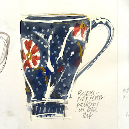
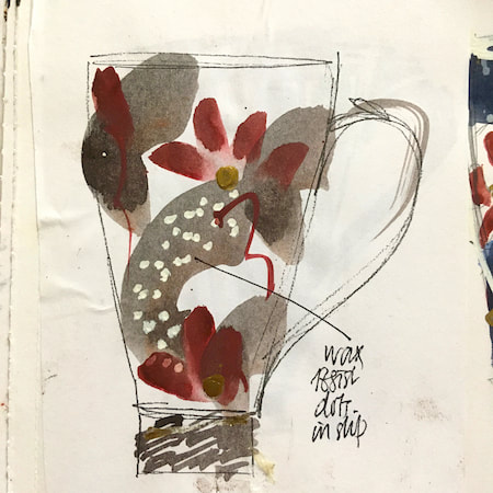
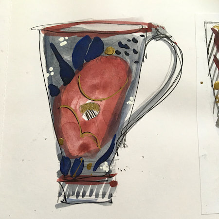
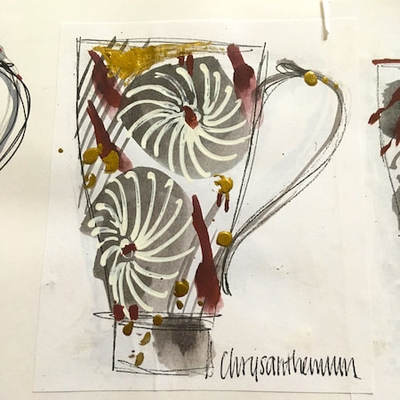
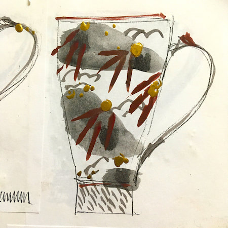
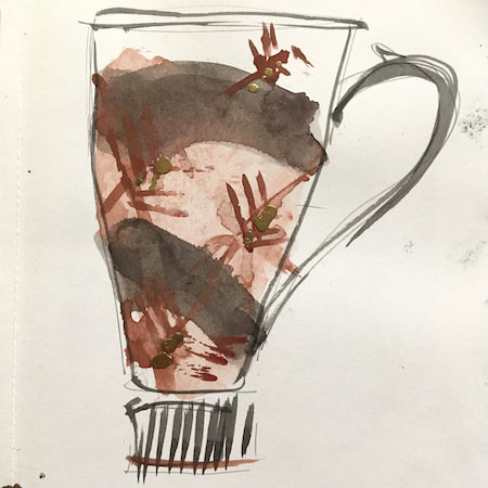
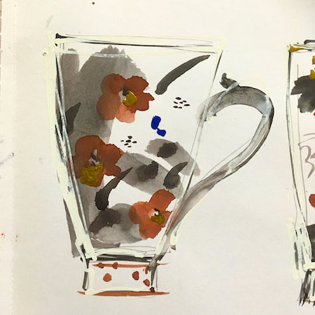
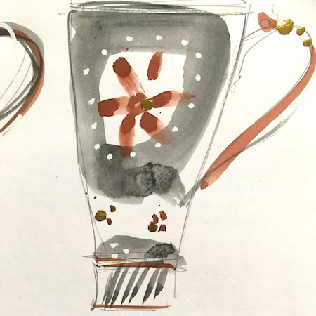
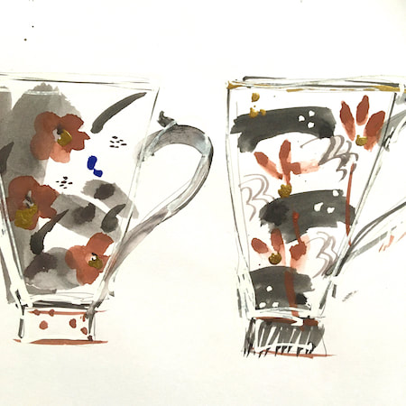
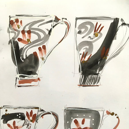
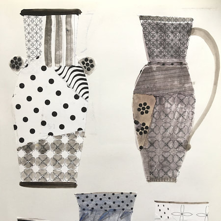
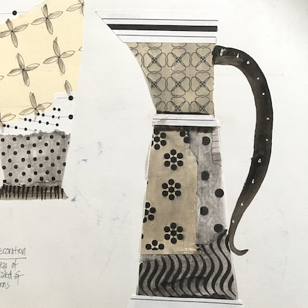
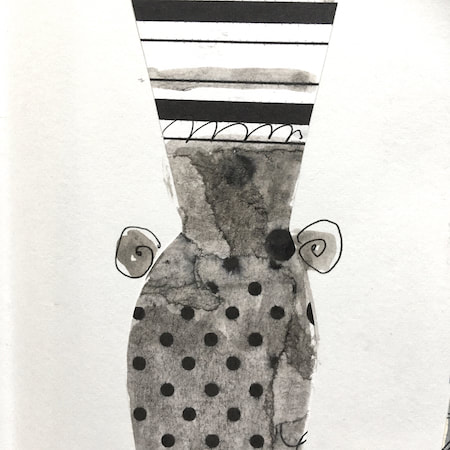
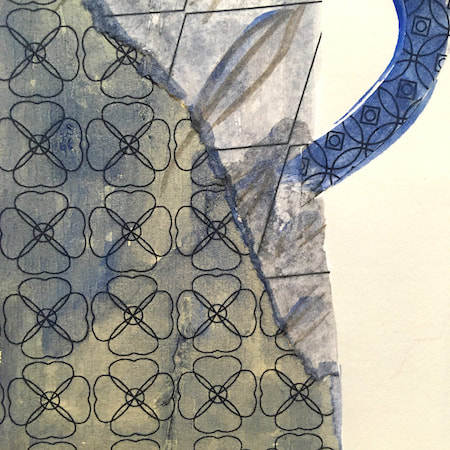
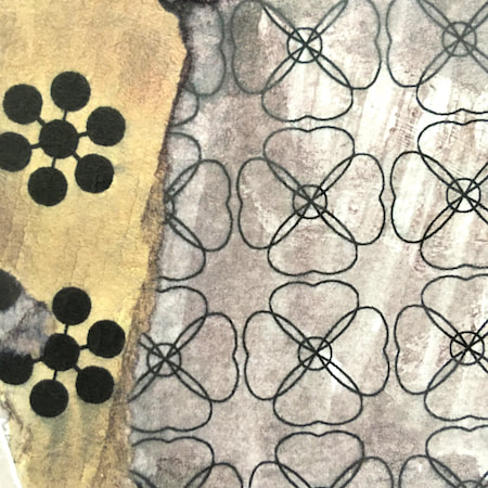
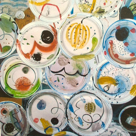
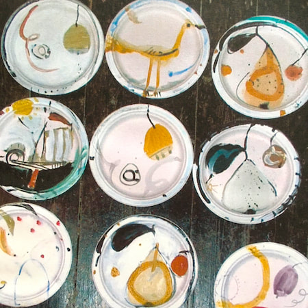
This time, take a peek into my ceramic design sketchbook. I actually made some of the mugs, but I kind of prefer the drawings! The plate designs are painted on paper plates, a most liberating process.
~~~~~~~~~~~~~~~~~~~~~~
~~~~~~~~~~~~~~~~~~~~~~
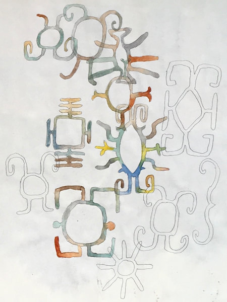
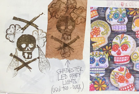
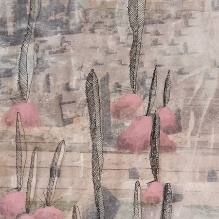
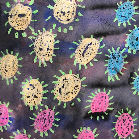
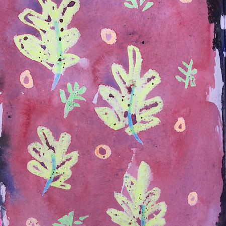
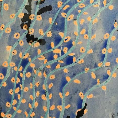
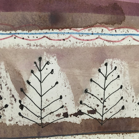
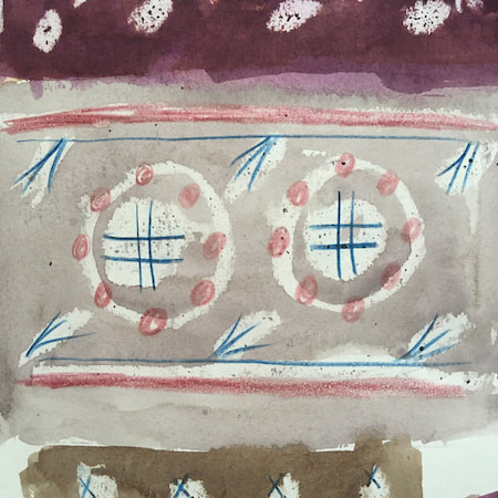
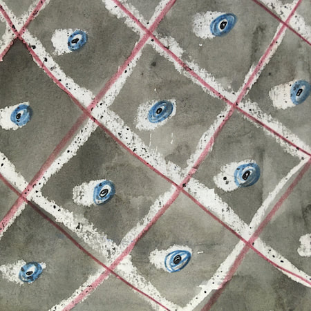
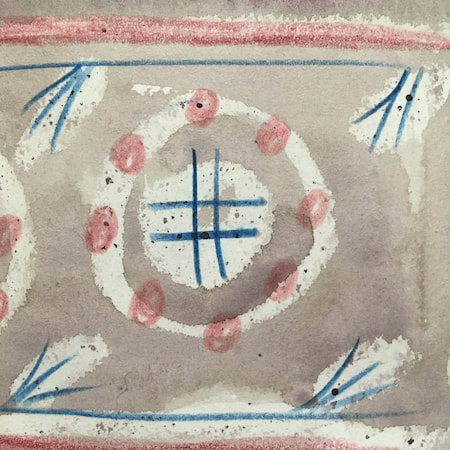
These watercolours are from my pattern sketchbook. I used coloured wax crayons to resist the washes of watercolour, also home-made rubber stamps dipped in bleach then printed on crêpe paper - the bleach takes out the paper dyes.
~~~~~~~~~~~~~~~~~~~~~~
~~~~~~~~~~~~~~~~~~~~~~
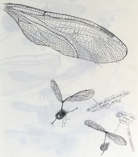
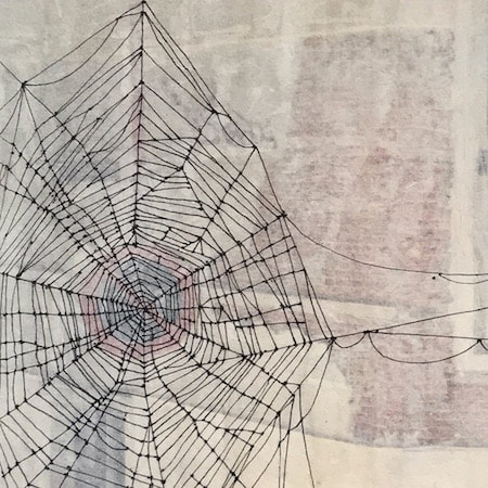
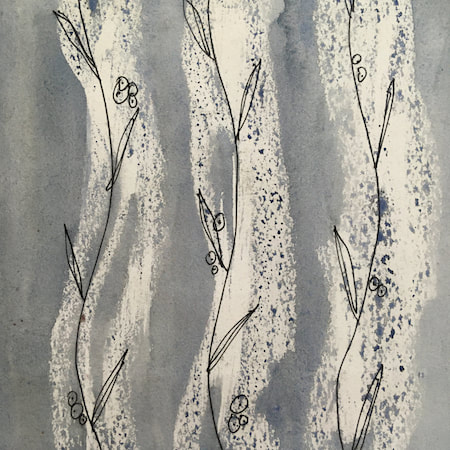
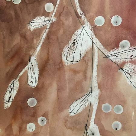
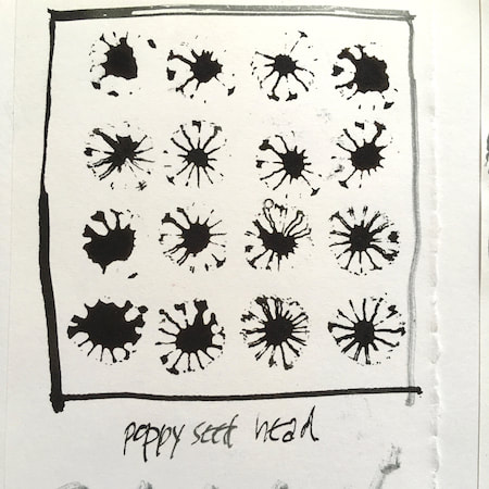
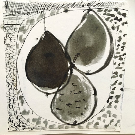
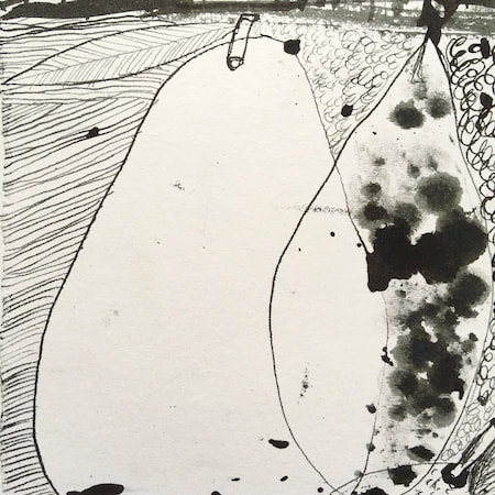
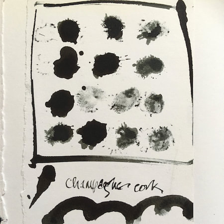
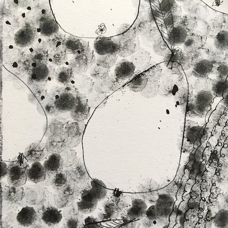
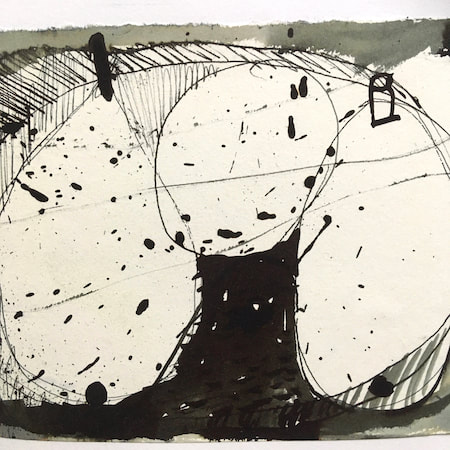
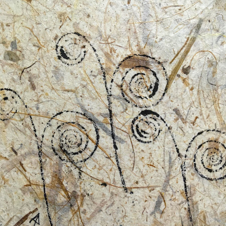
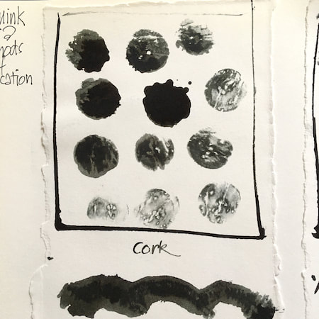
A sketchbook I used for mark-making with unusual objects - corks, seed-heads, feathers, home-made rubber stamps, my fingers and lots of flicky things ...
|
 RSS Feed
