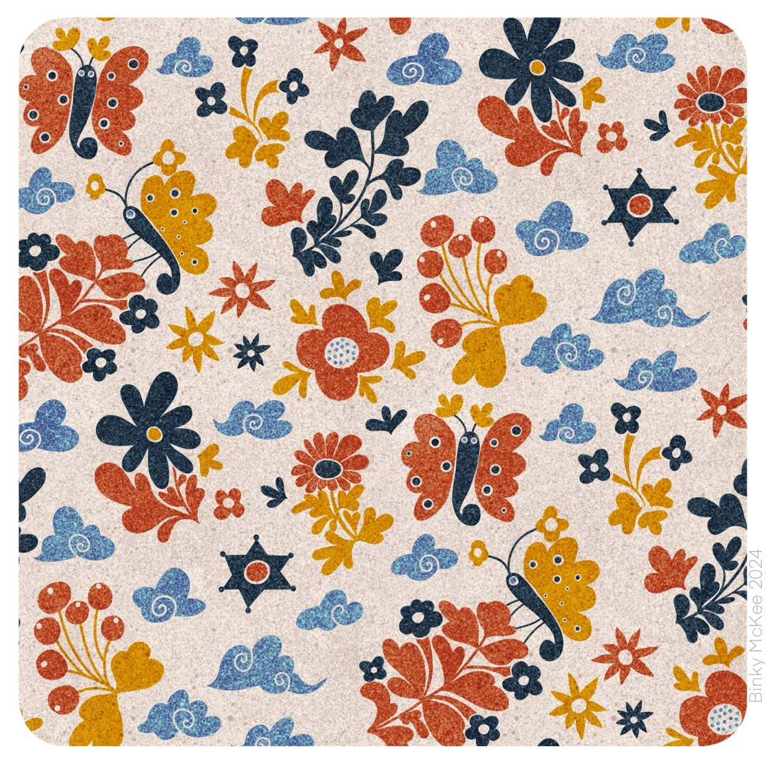
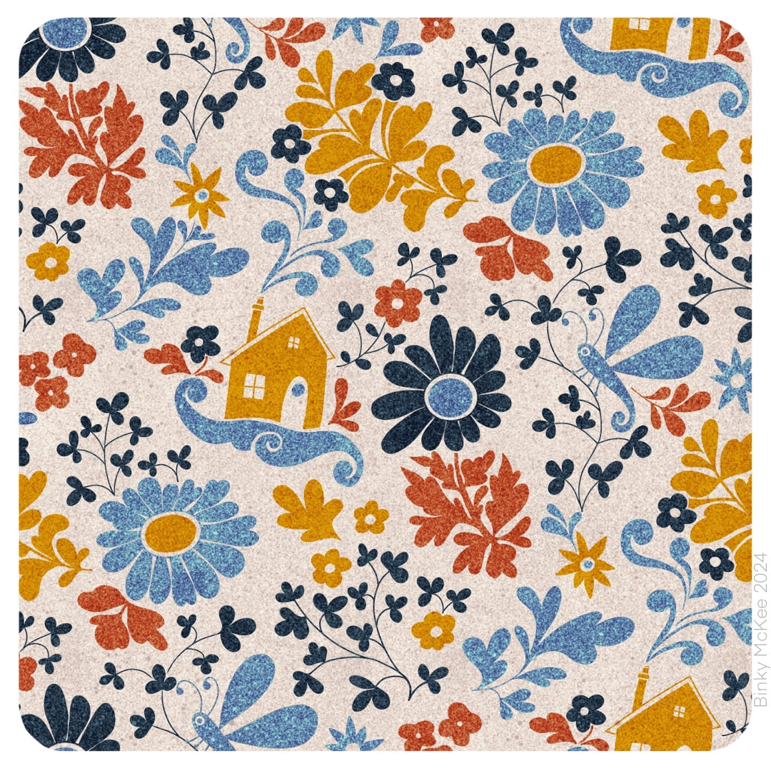
  I made monochrome versions of these designs last December as a quick aside, but only just got around to working on colour separations last month (and no, I still haven't found a better title than the mondegreen "Rivermoth Tonight"). Here they are now in beautiful speckly ink colours. Of course, I wanted to see how they would look applied to products. 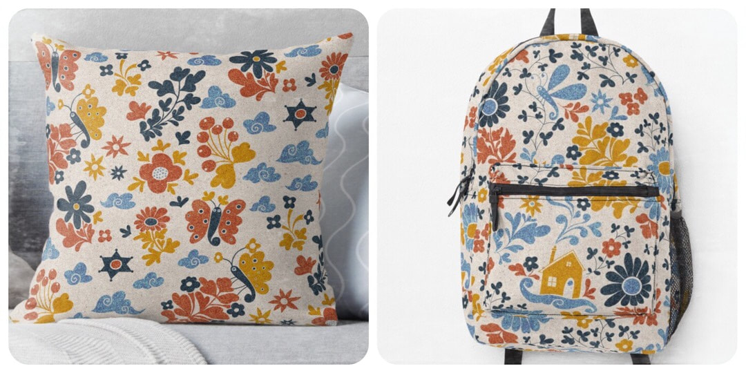 It has been an absolute age since I had a go on Redbubble and it was very nearly another age until I got logged in, thanks to forgetting my password and user name, and then had the wrong password written down for the email address to receive account recovery directions. But I sorted it out in the end, so I could try these two out on a couple of my favourites. It's marvellous really how the tech works to let you see how a pattern sits on an object, such a fun thing - and who knows, I may even buy something one day. For the time being I have my designs set to private until I decide what I want to share there, as I have a sneaking suspicion that ideas get pinched left right and centre from the platform.
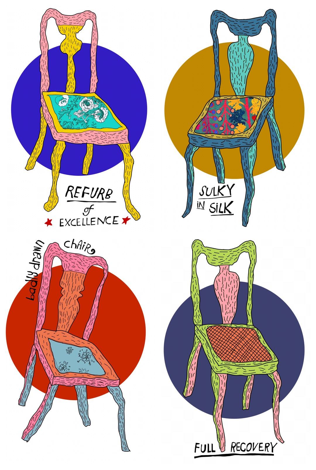 Today is a double post with my Heather Eliza journal, not something I do very often. However, these chairs started 10 years ago (almost to the day) as drawings in a Heather Eliza sketchbook which I traced this week and featured in my Heather Eliza journal, where I have written a little about how they were originally made. During the week I suddenly had the idea to get a T-shirt made for work with upholstery in-jokes on badly drawn chairs (because I am an upholsterer and seamstress by day) - I thought the lads at work might find it amusing. I remembered the old wonky chair sketches which I thought would be great for the job, and got them out to give them the Binky treatment. Here is a quick attempt at a T-shirt design. I'm a big fan of raglan sleeve baseball T's, so this style is what I would get for myself if I did decide to get one. Here is a suitably upholstery-type cheeky-looking young man modelling my design on my Redbubble: 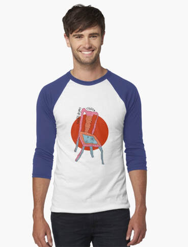 Below is a continuation of the crows pattern I have been revamping, beginning to add colour. It's actually quite slow work, a lot of touching-in has to happen as I go along, but that is over-ruled by the freedom I now have with this pattern to create different colourways.  Thanks for visiting, see you next week!
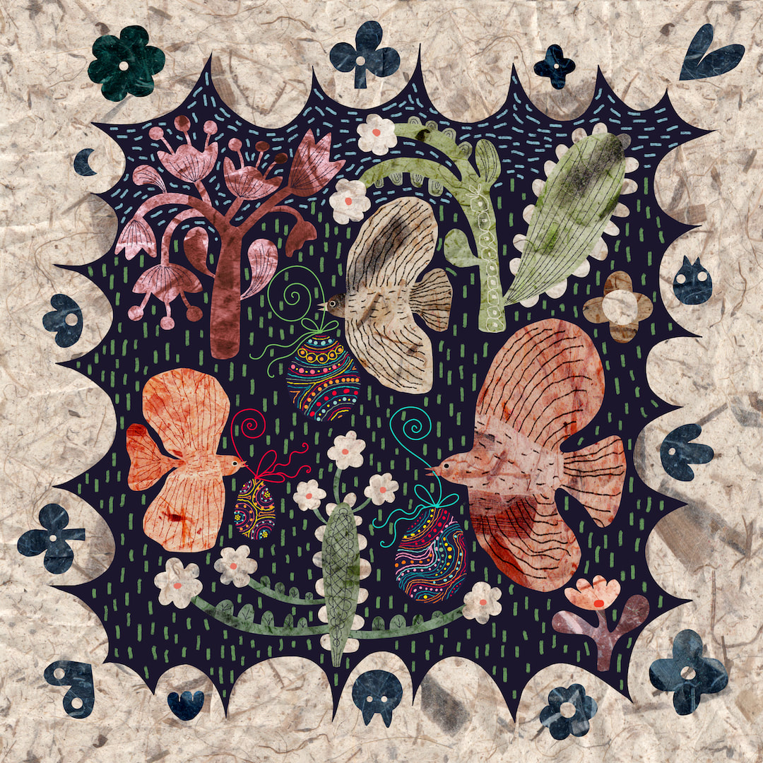 I liked the folksy Caturday collage so much I rejigged it, together with the Easter egg birds collage, into a square with a folksy border. 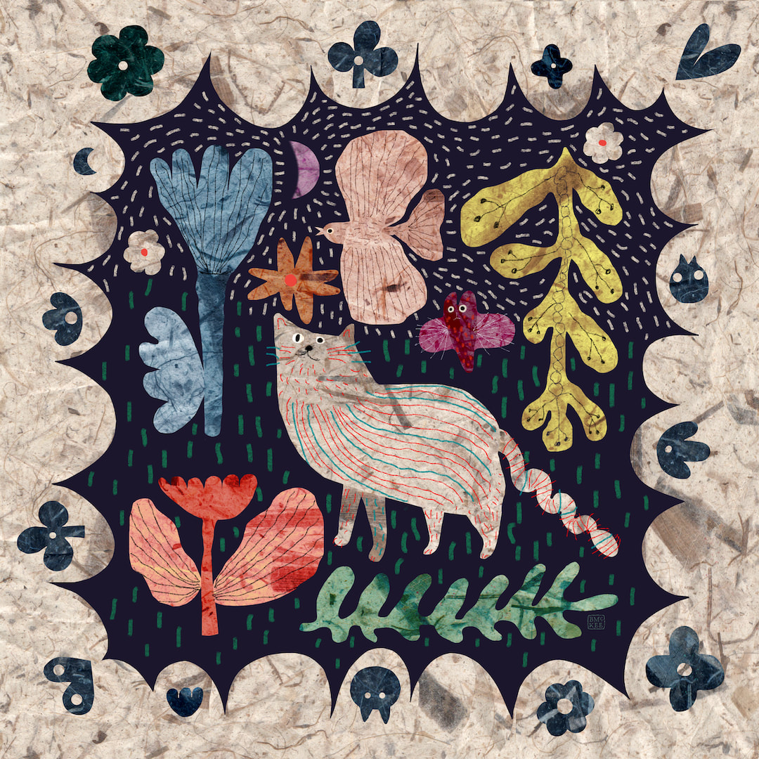 I especially had throw pillows in mind, but both designs look super on the products I selected! I still get a big thrill from seeing my work on Redbubble's products. 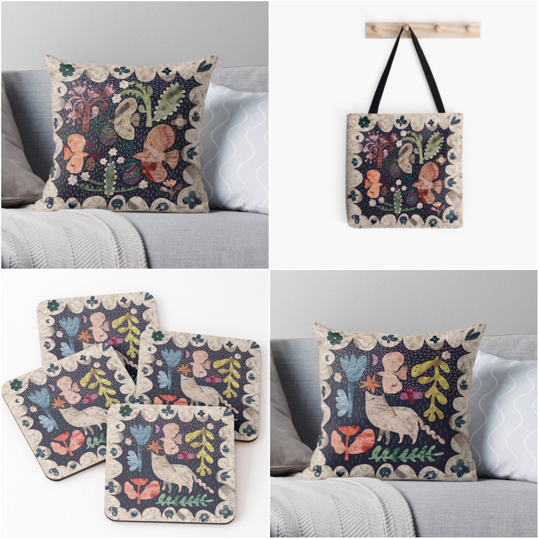 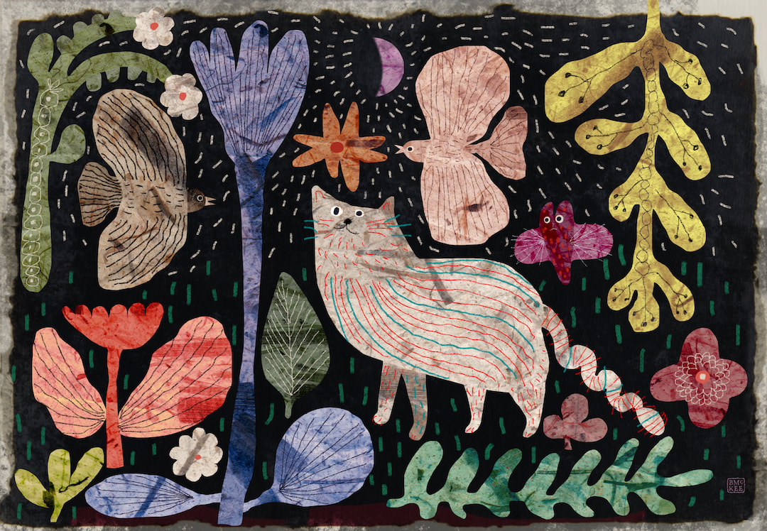 I called this "A twist in the tail" (sorry!) - it is another Instagram post for Caturday which began as a square format but I reckoned it would make lovely art prints and cards, so here is a landscape version and how it looks as a framed print. I was so pleased with this I went on to redesign the Easter eggs birds in a similar fashion to make a matching pair. This is currently work in progress in my spare time as I push on with the children's book, which is going extremely well and I am sure it will not be long until I can begin sharing some of the work. 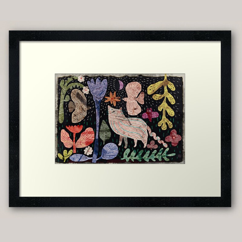  An exciting start to the week when my first ever sampler from Spoonflower arrived on Monday morning for proofing. I worked in the print industry for a number of years, so I am no stranger to proofing, or finding unexpected results and learning from them.
I ordered proofs for a variety of different patterns to see what works and what doesn't. The printing itself is very good and close to the original, but I could see that I need to buck up my design ideas! The one that worked best of all was the 'vintage tie' design. Patterns which look the strongest on screen printed the least successfully; Yay! Flowers for example, because the close tones and colour harmonies don't show up so well. After close critical scrutiny I made a check-list for designs for Spoonflower ... 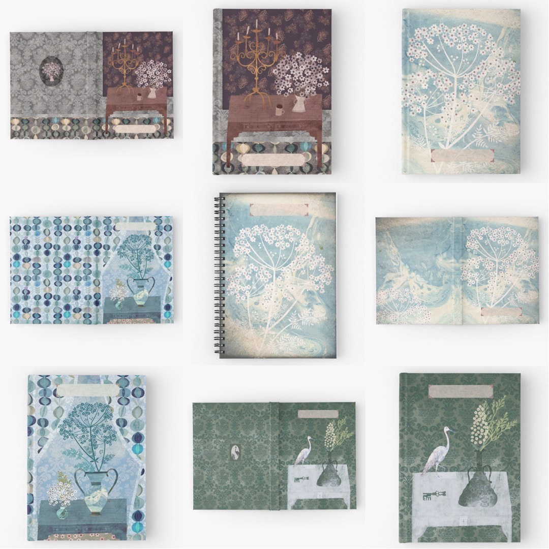 I spent the last few days redesigning my notebooks which feature artworks (rather than repeat patterns) on Redbubble. I wasn't very happy with the hardcover journals in particular, I wasted so much time uploading and tweaking the old designs over and over each time with no success, I decided a radical rethink was required for them which would also work for future designs from the off when uploaded. I also wanted the back covers to be more intrinsic to the design, so I made the decision to free the artworks from the frames I had created previously which were an absolute nightmare to line up on the products on Redbubble, and which I found a bit uptight anyway. Luckily I keep all my psd files, so it was possible to simply remake the artwork to spread across the spine and flow. I am now very happy with the hardcover journals - they are a lot of fun made this way! I haven't yet changed the spiral notebooks in all cases, but I'll get there in time; it's the kind of work I really have to be in the mood to do. 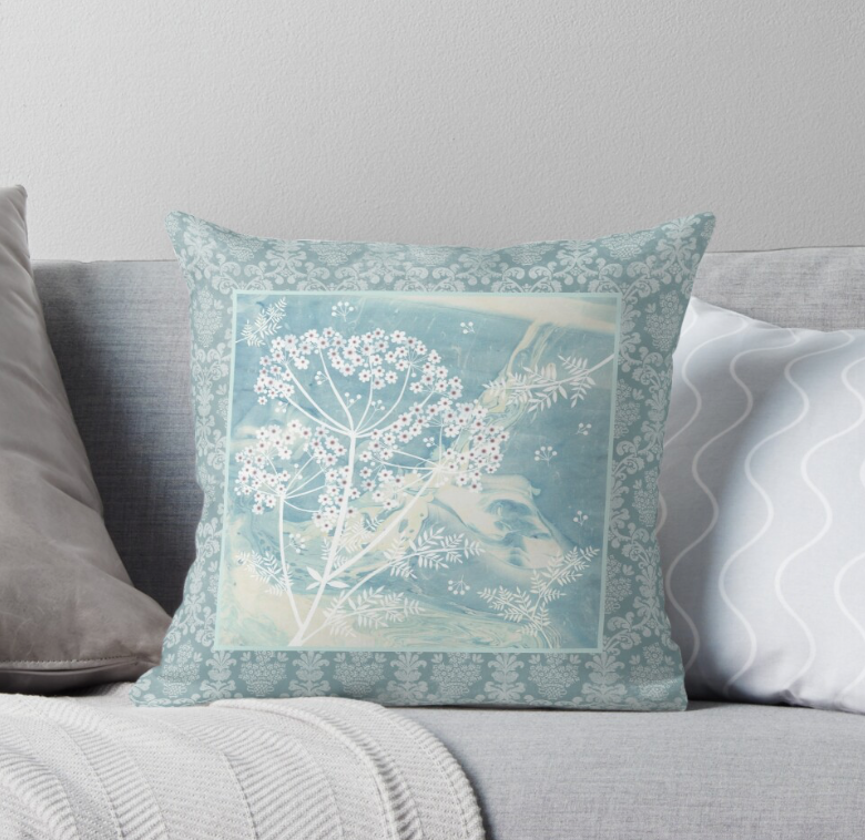 It occurred to me during the notebooks process that I was able to get artworks onto throw pillows, so I worked a few of those with complementary cushions designed with the brocade border. I visualised a sofa with a coordinated mixture of both.
However, the larger sized documents required for the products began to prove a bit heavy going on my now ageing iPad Air. Procreate constantly crashed, in spite of offloading all other works to storage files got wearisome, so I have only made about three of these artworks available on cushions so far. I do think they look pretty, though, so it is something I will continue during odd moments. I just feel it's time to move onto something else now before I go crazy! Thanks for visiting, see you next time ... 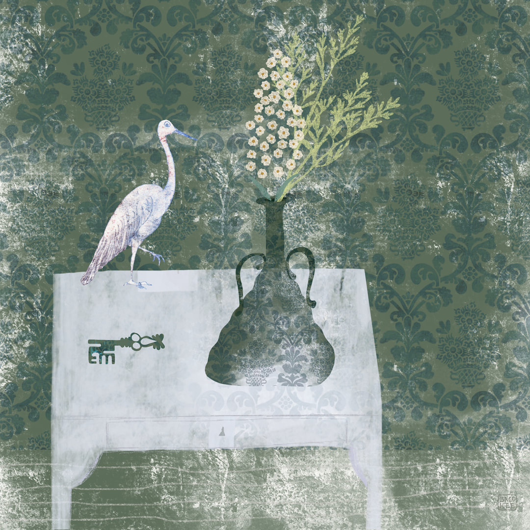 I was quite thrilled with the glassy nature of a new texture I had created almost by accident, and made another wall art piece with it and a stork and a key. No, I don't know what it means, but it has a nice tranquil feel. I mostly designed them as framed artworks, but they work well on a few other homeware products such as coasters and acrylic blocks, so I made separate templates for spiral notebooks and hard cover journals, complete with parchment textured labels to write the journal title, your name, etc for Redbubble. I can't resist stationery goods. 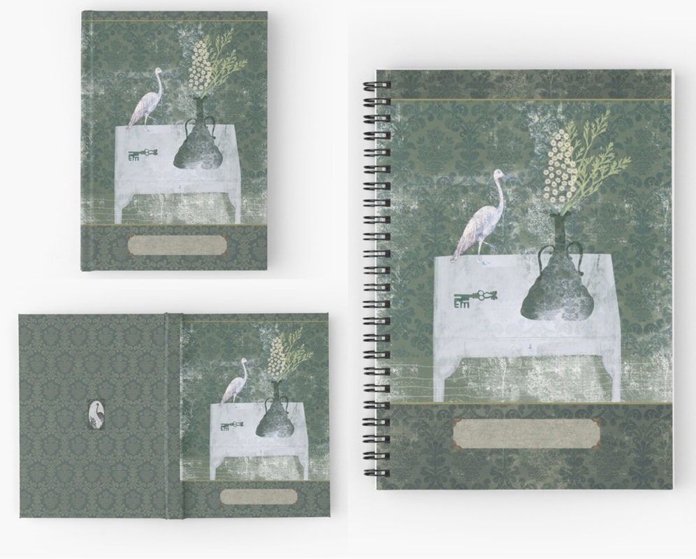 Thanks for visiting, see you next week!
 I discovered my brother's collection of vintage ties in a plastic bag in the loft of our old family home a little while ago, and one tie really caught my attention. I reckon it's '60s or '70s, just my thing, so I began a drawing in Procreate based on what I could put together from the sliver of fabric which makes up the tie. I drew sections of what I could see and put them together in the image above, with some filler shapes which I tried to keep in harmony with the original. 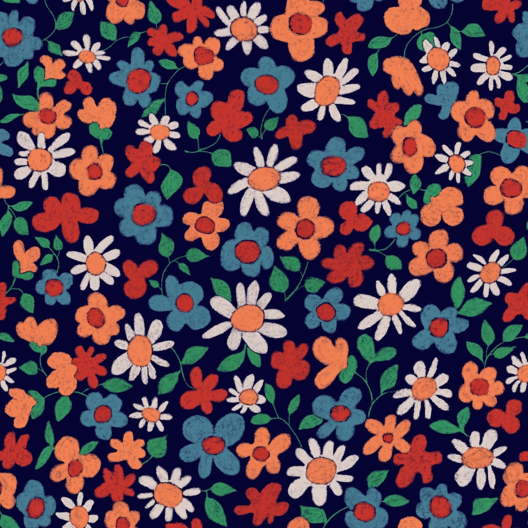 The next step was to create a repeat pattern, here's the tile. 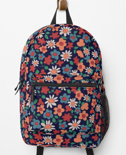 Then of course there was a lot of fun adding it to my Redbubble account.
I was very happy with the results, it looks properly dandy and cheerful on the backpack (for some reason I am particularly fascinated with those, and the duffle bags, not to mention the socks!) I took great pains with the pattern tile, creating it in separate layers so I could change the colour for each, rather than just adjusting the colours of the whole tile. It's quite a long process because I do it the 'old fashioned' way in my now quite antiquated version of Procreate. I don't subscribe to Adobe anything any more, which means I don't have Photoshop now, so nothing is automated and the process is just like the hand-made method of cutting the original into four quarters and 'turning inside-out' (that's how I think of it). I repeat the process for each colour separation and it really provides wonderful clear results for every colourway. Perhaps I'm a bit of a dinosaur, but I prefer this way of working 'by hand', I feel more in touch with the design. I have made six colourways from the original. The advantage of doing it this way is that each colourway emphasises different aspects of the drawing with the use of tone as well as colour, which can't be done working with just a single layer tile. They can look like a completely different design as a result. I'll post some of them here soon! Thanks for visiting, see you next time! 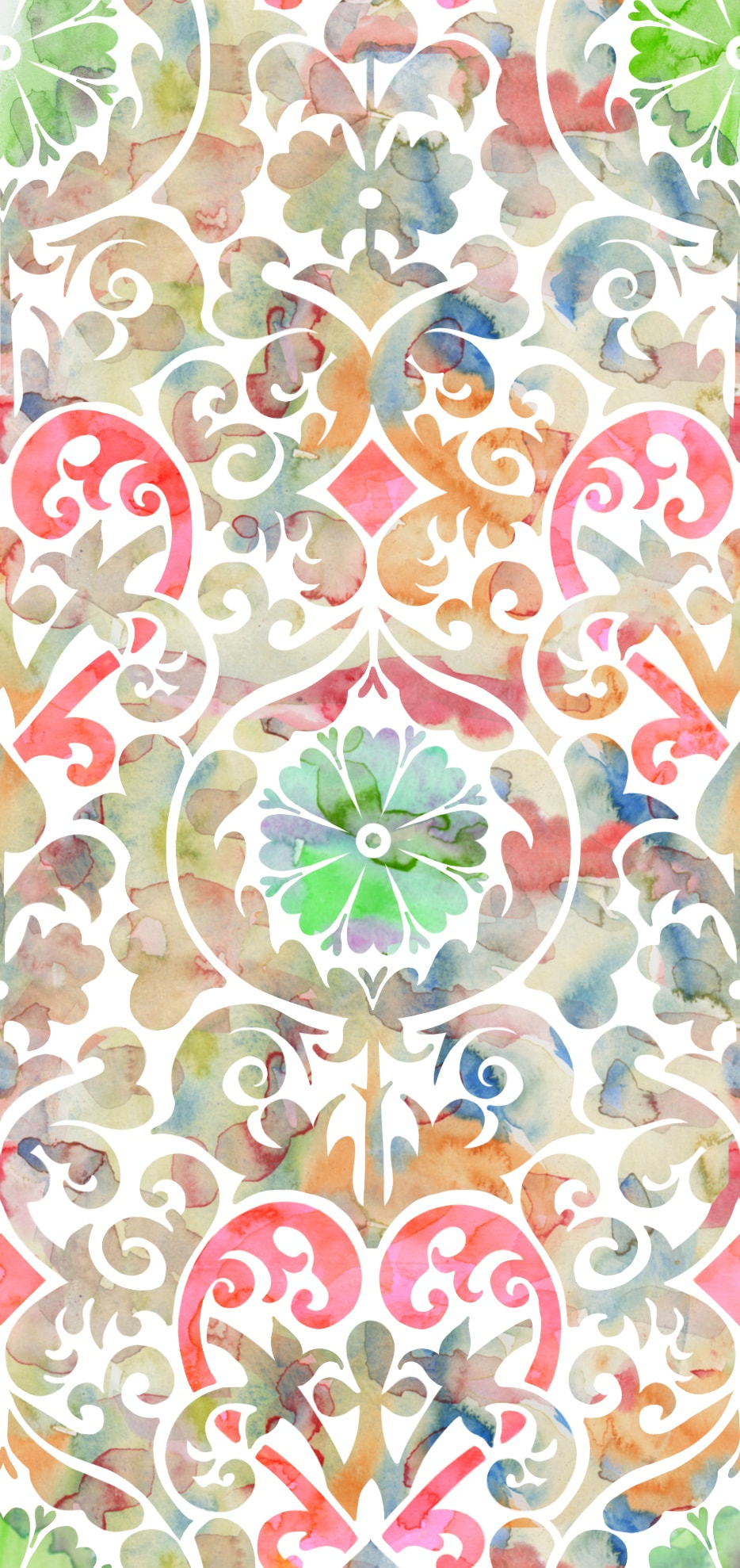 It was an exciting week, being B's birthday, and my first ever order from my own shop arrived. I can't describe the buzz when I spotted my own design through the packaging. I designed a graphic tee and matching mask as part of his birthday present, and I was actually delighted with the quality of both. I have seen one of my masks in real life before and couldn't believe the detail in the printing, and it is true that you do really have to see what you are producing for yourself - I got full of new ideas and set to work experimenting with a new brocade design I have been working, using painterly watercolours in jewel colours for summer. I made B's tee in masculine greys and as always was fascinated at the appearance of the printing tile when it is 'turned inside out', it always amazes me that the two are exactly the same design. B loved his gift, that was the main thing, and the mask had its first outing on Thursday when the fishmonger's van came around bearing delicious seafoods for the celebratory dinner. 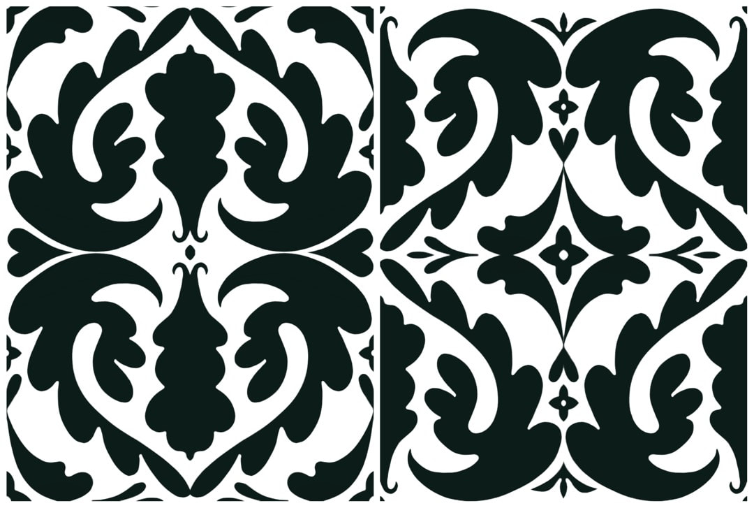 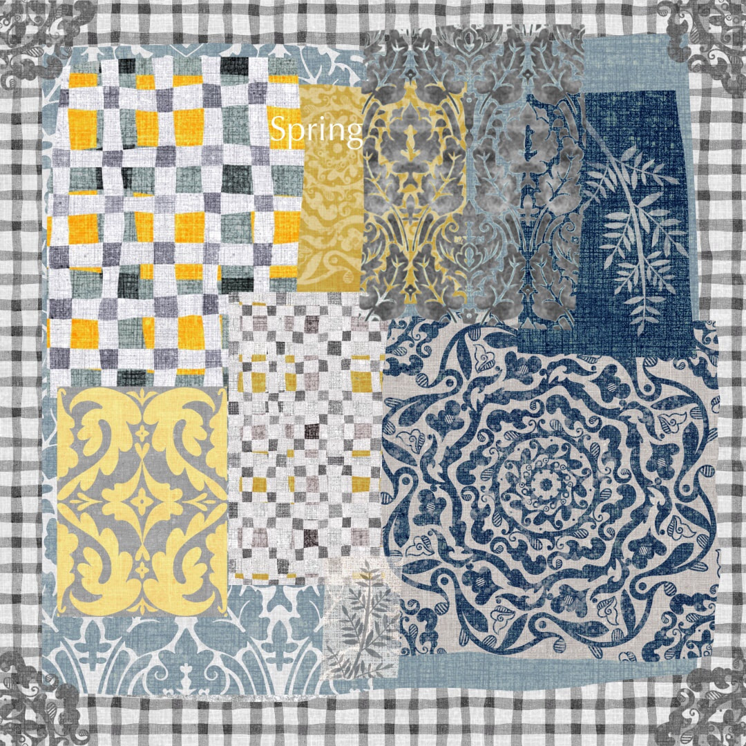 Total snow-melt and a bit o' sunshine is a heady mix! I went mad with spring themes this week, using lots of daffodil yellows and fresh winter rose white with light stony greys. Delighted I made a brocade drawing from last year into a proper pattern, too, and put it to good use, I'm going to have to buy my own leggings now. And a mask and backback. Yup, I'm my own best customer.
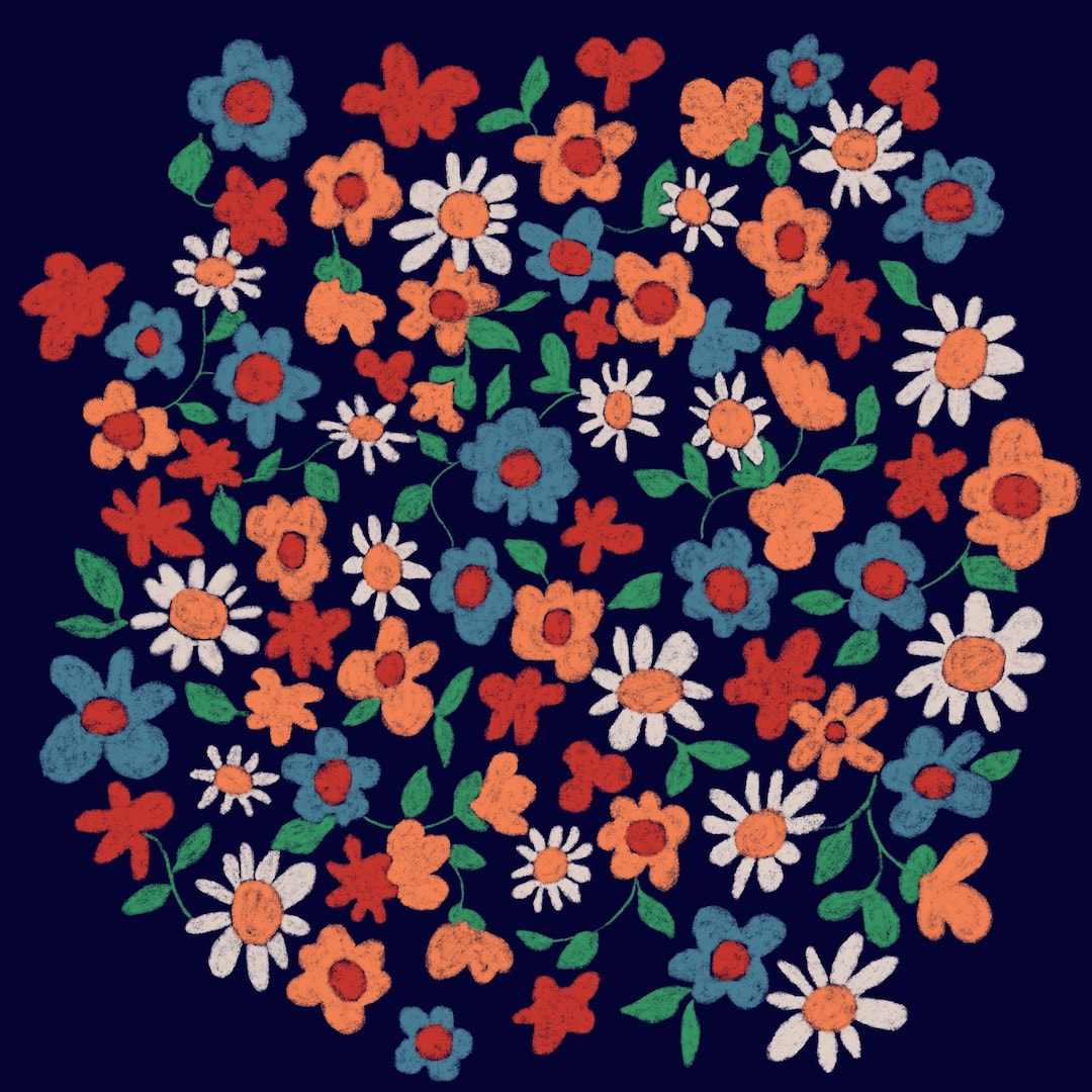
 Another pattern this week for my Redbubble Store - birds and potted plants gardening, inspired by the fact that I have been doing a lot of gardening recently. I was delighted to launch this one on the full range of 'kids' clothing' as well as home décor, adult apparel, accessories - and of course, socks! I do love the socks.
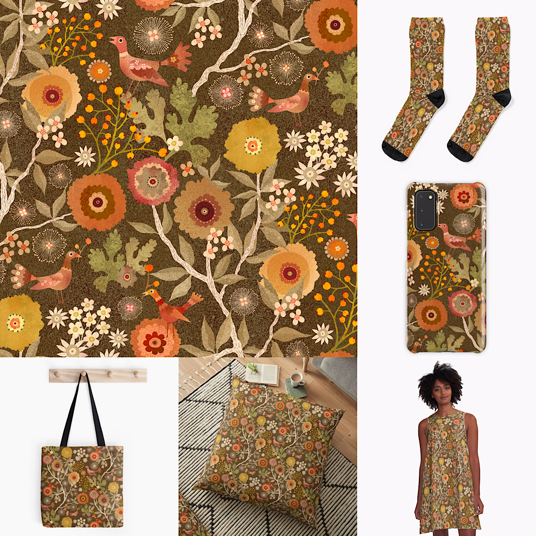 Warm, sunshine-filled days must have gone to my head last week because I totally forgot to post this! I back-dated it while I was posting next week's, if that makes sense (beginning to feel a bit Time Lord) Anyway, I took a bit of time out to tidy up my Redbubble Store and design a new pattern - birds and berries, all ready for Autumn. I am loving the way the pattern works on the products and I have discovered I definitely have a thing about socks. Here is last week's pattern on some products, too. 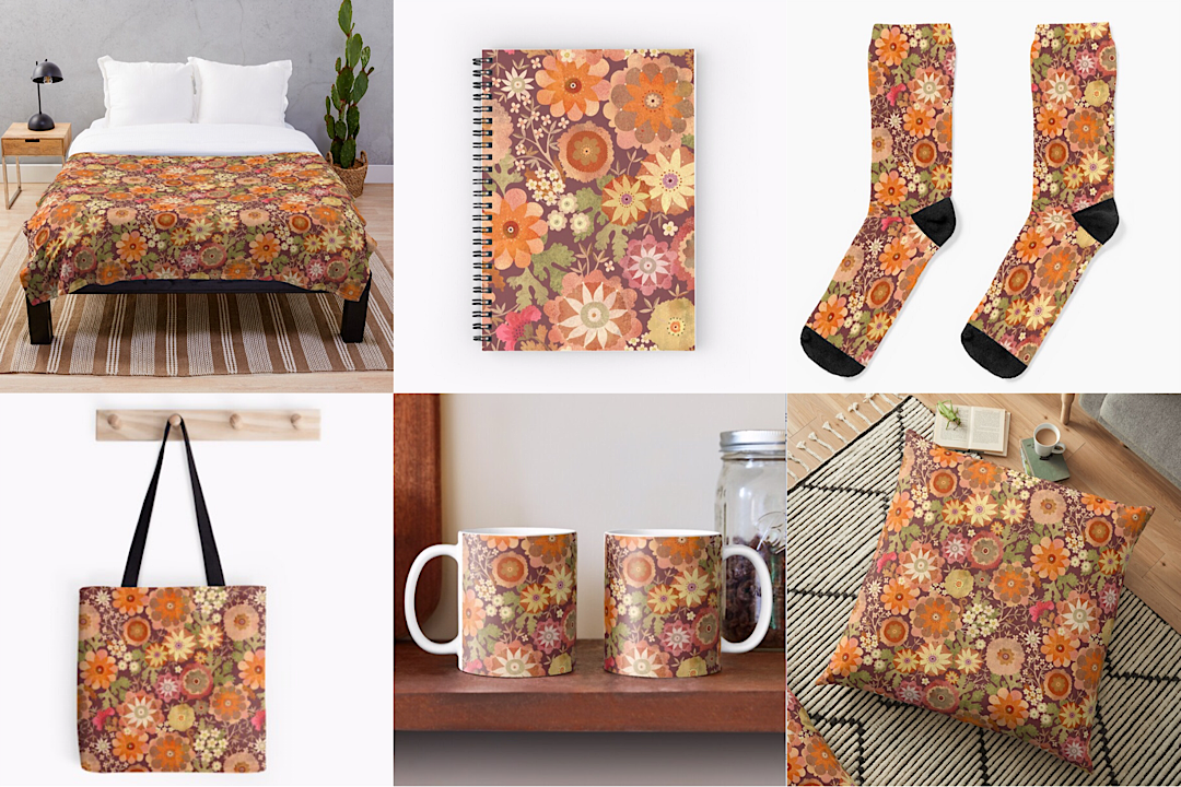 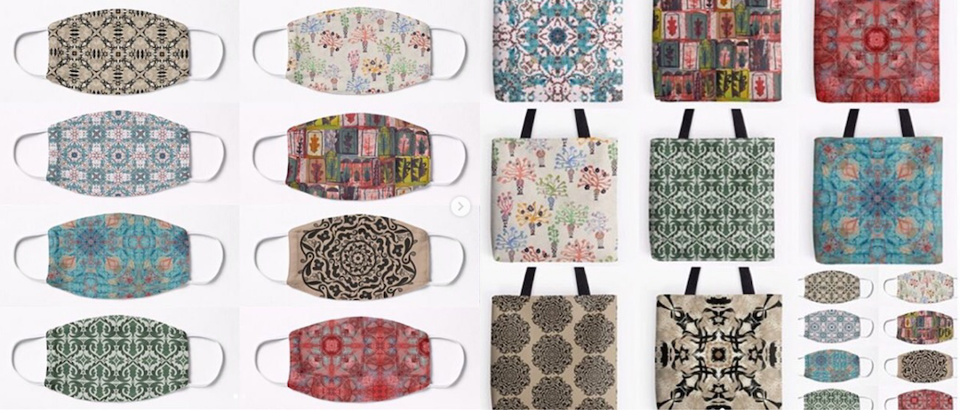 I was so excited when Redbubble launched their face masks I couldn't wait to get my patterns on them! I loved the way they looked, and it occurred to me that stylish shoppers could sport some phenomenal accessorising (phrase courtesy of my friend Tish) with matching face masks and shopping bags! - or socks, or scarves ... etc!
Thanks for visiting, see you next week! 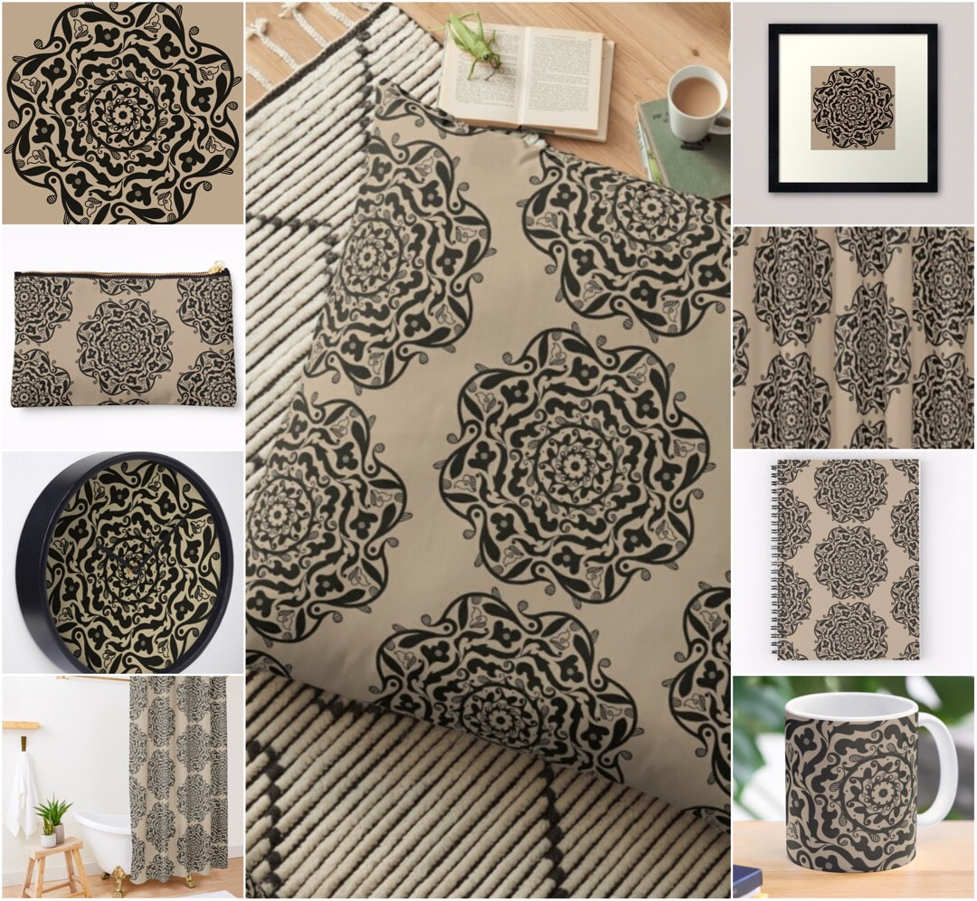 The children's book illustrations are going well, I'm getting very excited for the time I can finally share them. I also try to add something new to my Redbubble store every day, even if it's just a post card; this week I made this mandala tattoo design and love how it looks on the products.
Thanks for visiting, stay safe, and see you next week 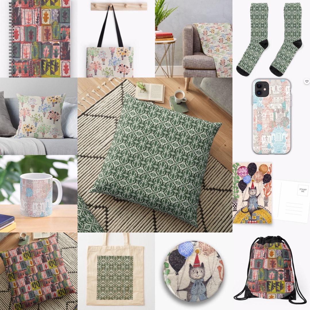 I had imagined I would have lots of time on my hands and get lots of work done in these extraordinary times of lockdown against the spread of coronavirus. It is true that reduced traffic outside brings peace and tranquility, but ironically I have never been more social. People having unexpected time on their hands means much more Face Time calls and get togethers on Zoom, as we bring one another cheer and chat to those who are in isolation. B and I have been more regular than ever dog walking as our 'one-a-day outdoors exercise' walk. Shopping takes so much longer because of social distancing measures in the shops, followed by cleaning down all the purchases when they come into the house. I have actually been forced out to the shops more often than usual; normally we would get two home deliveries a week, but now so many people are working from home that high demand on delivery slots makes it difficult to get one.
I did, however, spend a few days this week on my Redbubble store, continuing to make greetings cards, post cards and pin buttons from my 100 cats project, plus refreshing old patterns and adding a couple of new ones to decorate the products. Thanks for visiting, keep well, and see you next week! |

~~~~~~~~~~~~~~~~~~~~~~
Welcome to my illustration and patterns blog.
I illustrate under the pen-name of Binky McKee, McKee being my mother's maiden name. Binky was the name of every single cat my great-grandmother kept - allegedly about 40 of them during her 94 years of life. I changed the website address a few months ago, so some older links on previous posts are broken. If you click one of those and it takes you to a strange page, simply replace the .co.uk after the binkymckee. with weebly.com and it will work again. I hope you enjoy your visit! ~~~~~~~~~~~~~~~~~~~~~~
~~~~~~~~~~~~~~~~~~~~~~
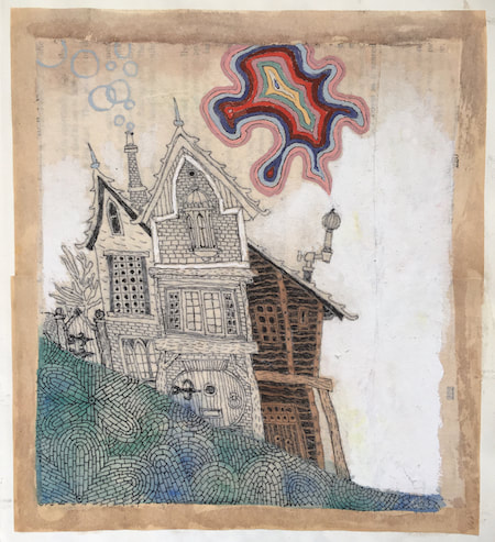
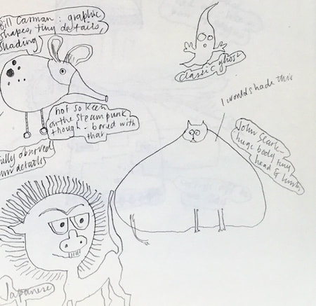
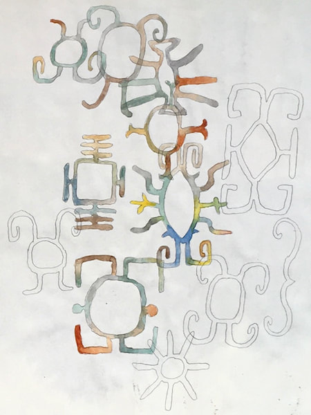
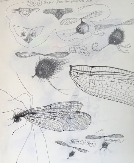
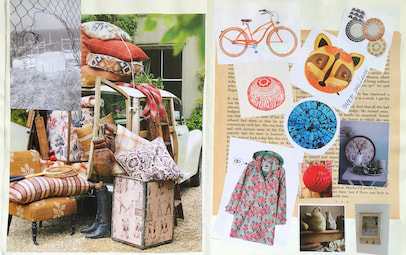
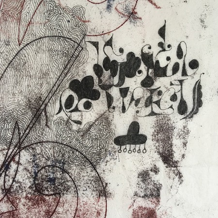
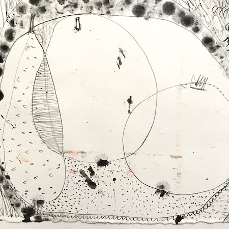
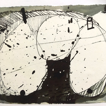
I keep lots of scrapbooks and sketchbooks where I develop ideas and design little creatures. Here's a peek inside one ...
~~~~~~~~~~~~~~~~~~~~~~
~~~~~~~~~~~~~~~~~~~~~~
As you may know, I am also known as Heather Eliza Walker.
Click the image if you would like to find out more and visit my other website. ~~~~~~~~~~~~~~~~~~~~~~ ~~~~~~~~~~~~~~~~~~~~~
~~~~~~~~~~~~~~~~~~~~
April 2024
~~~~~~~~~~~~~~~~~~~~~~
~~~~~~~~~~~~~~~~~~
All
~~~~~~~~~~~~~~~~~~~~~~
~~~~~~~~~~~~~~~~~~~~~~
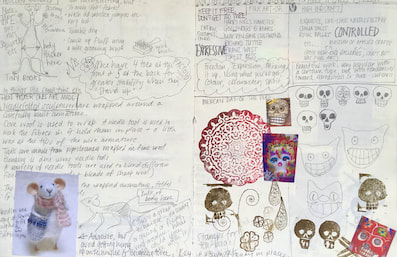
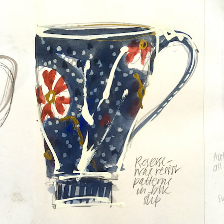
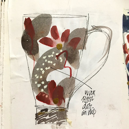
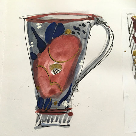
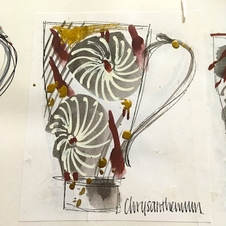
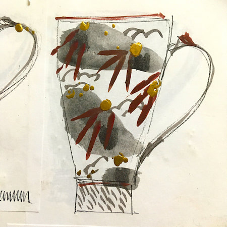
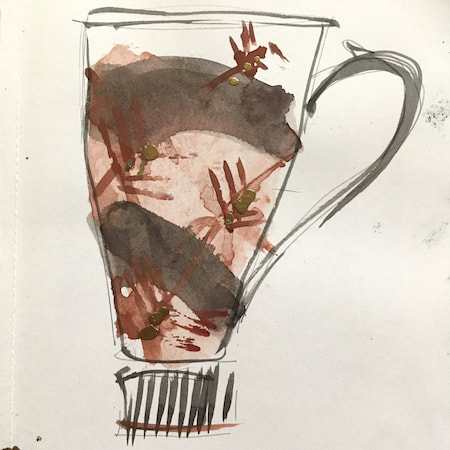
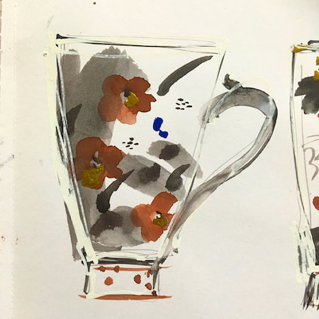
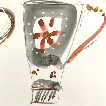
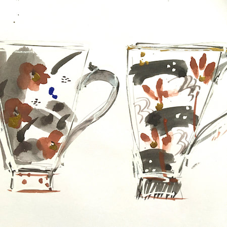
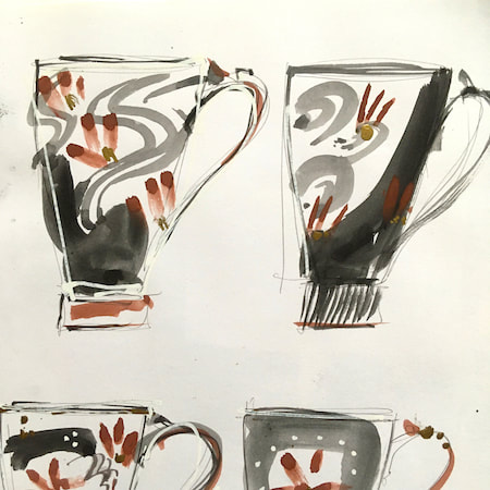
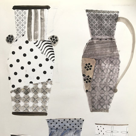
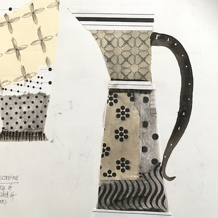
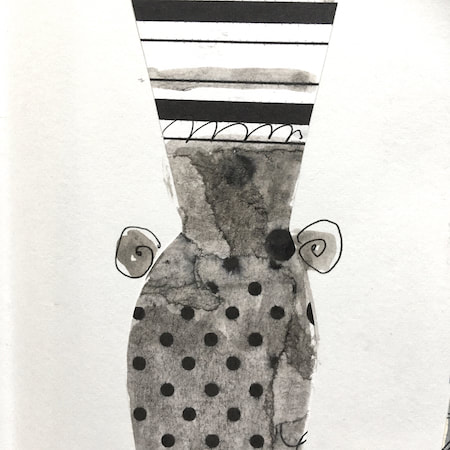
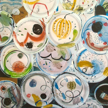
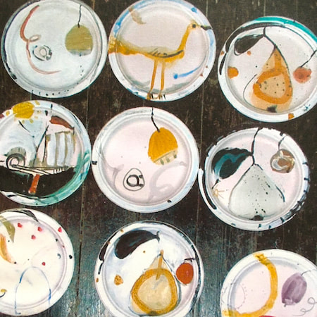
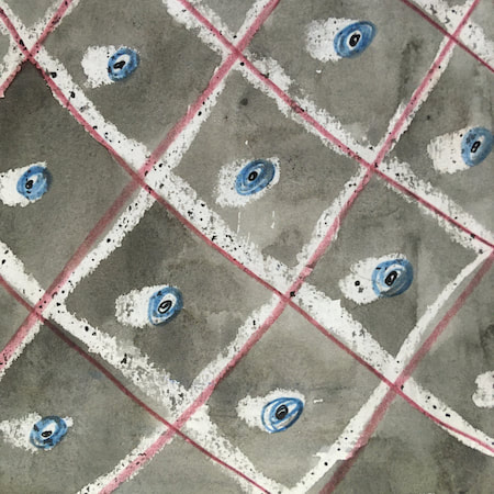
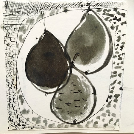
This time, take a peek into my ceramic design sketchbook. I actually made some of the mugs, but I kind of prefer the drawings! The plate designs are painted on paper plates, a most liberating process.
~~~~~~~~~~~~~~~~~~~~~~
~~~~~~~~~~~~~~~~~~~~~~
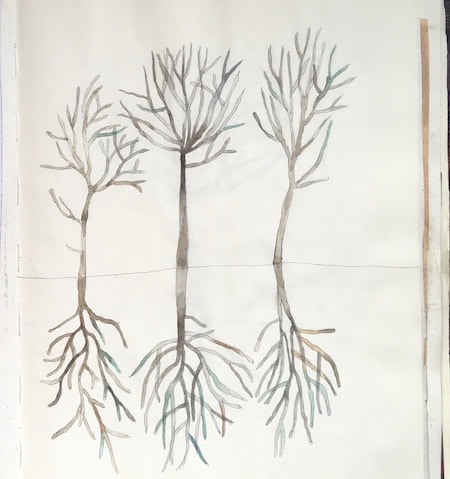
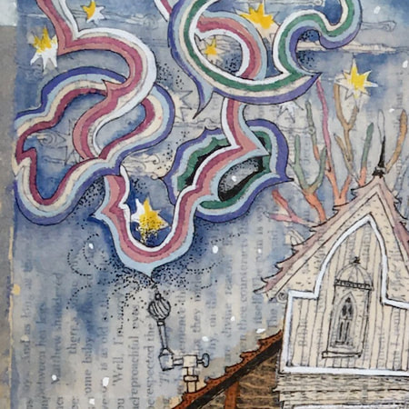
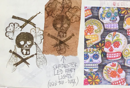
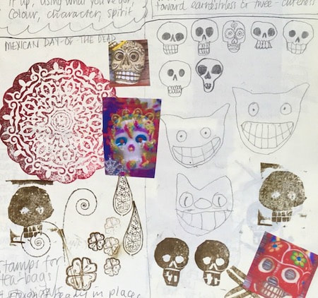
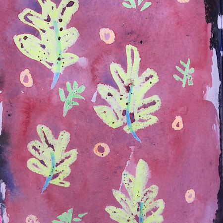
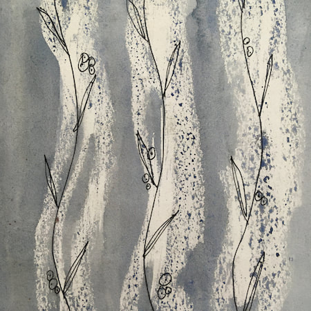
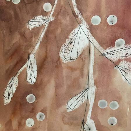
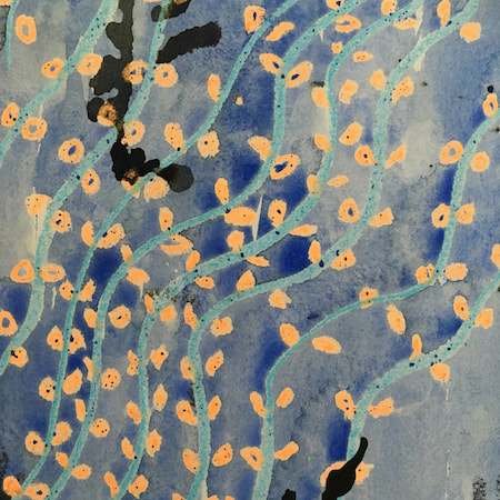
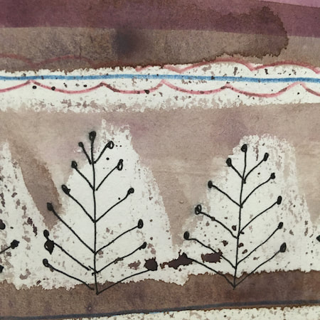
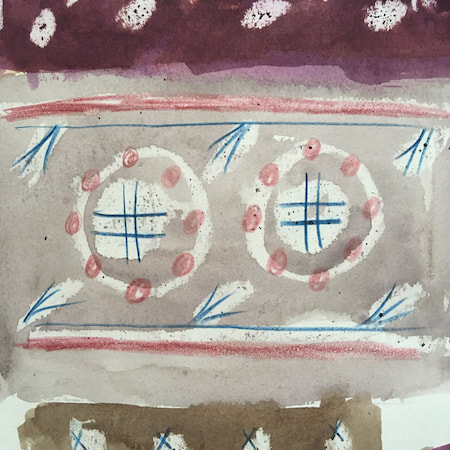
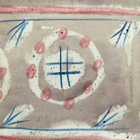
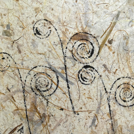
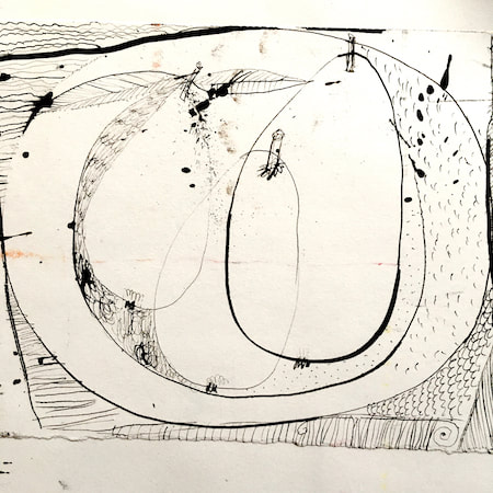
These watercolours are from my pattern sketchbook. I used coloured wax crayons to resist the washes of watercolour, also home-made rubber stamps dipped in bleach then printed on crêpe paper - the bleach takes out the paper dyes.
~~~~~~~~~~~~~~~~~~~~~~
~~~~~~~~~~~~~~~~~~~~~~
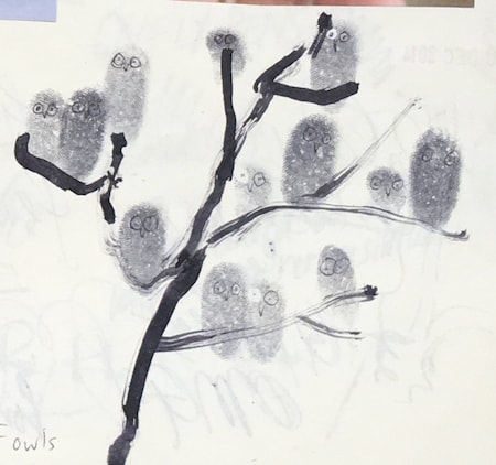
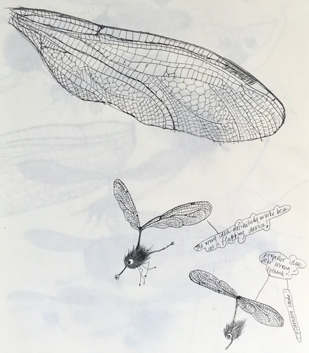
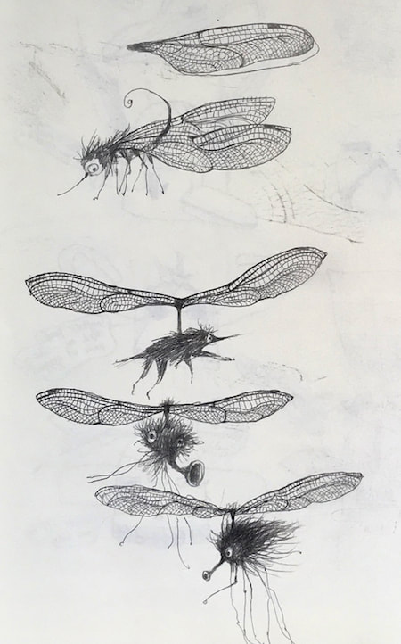
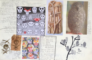
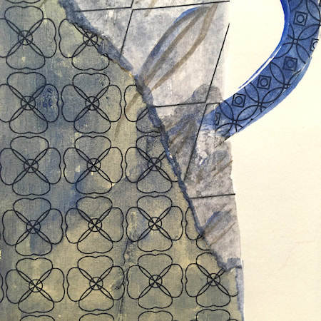
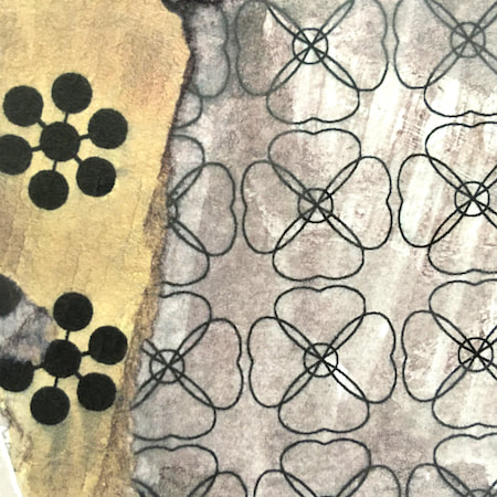
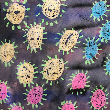
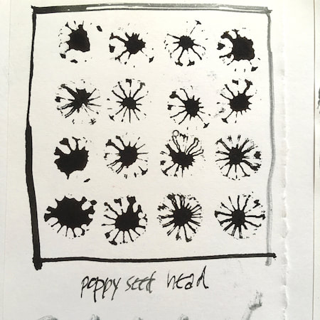
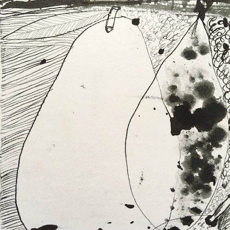
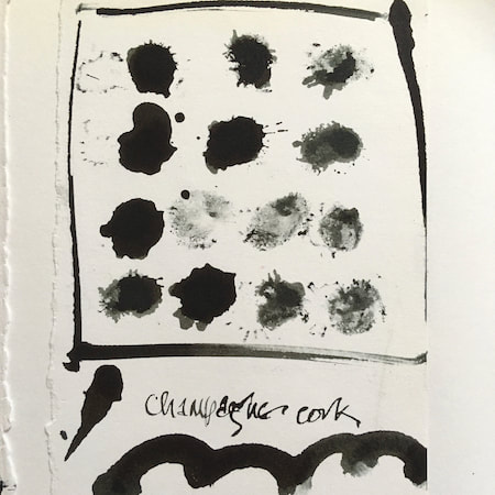
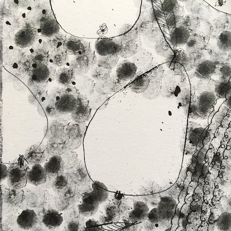
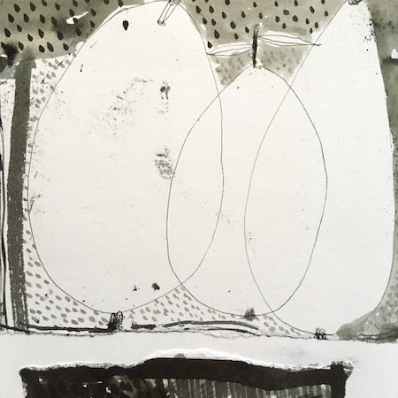
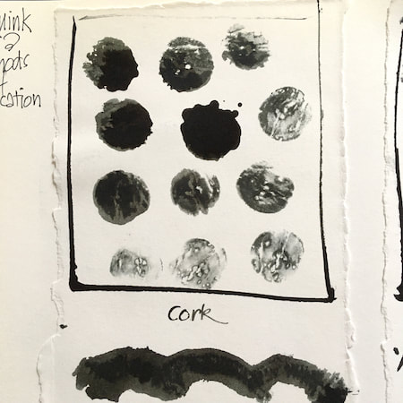
A sketchbook I used for mark-making with unusual objects - corks, seed-heads, feathers, home-made rubber stamps, my fingers and lots of flicky things ...
|
 RSS Feed
