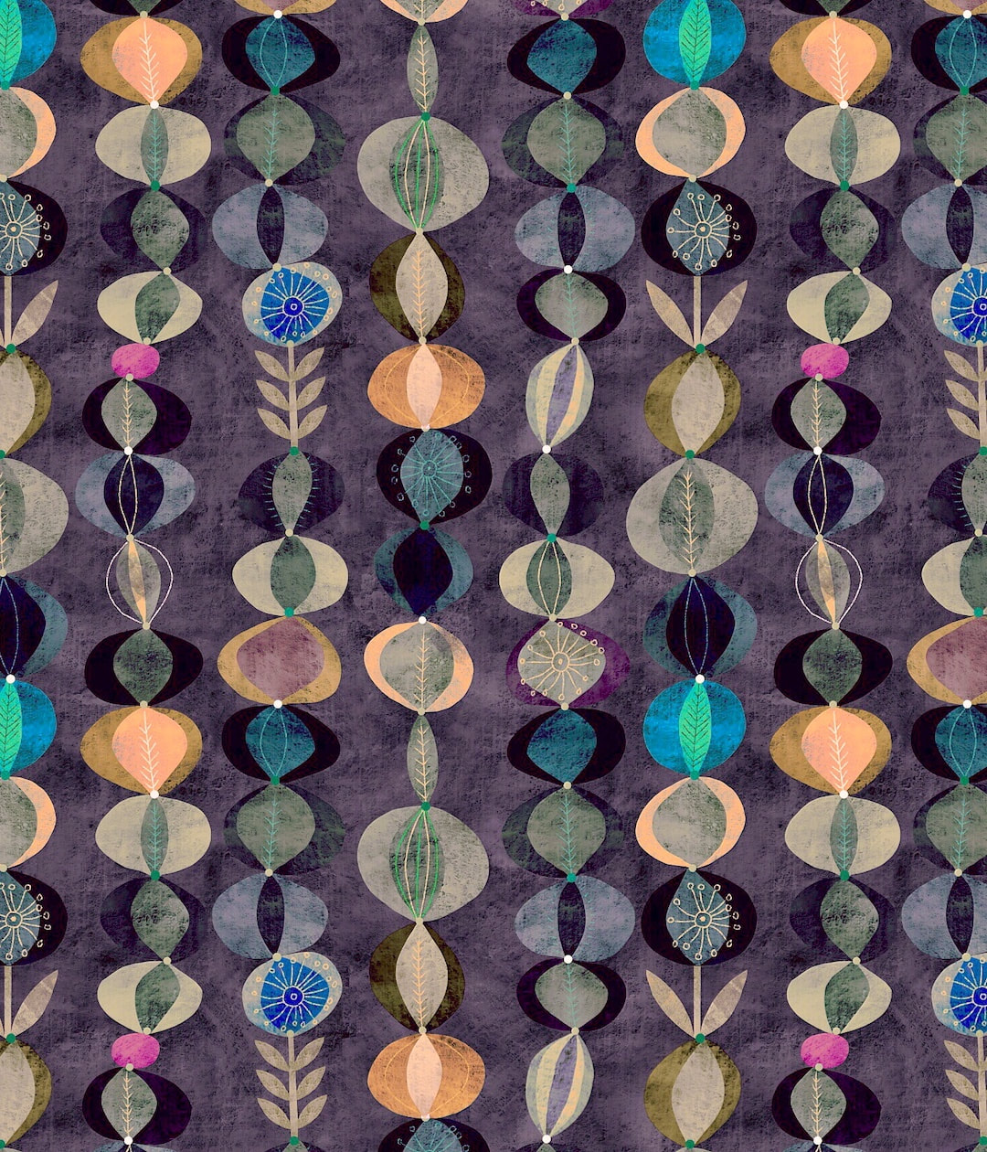
 During the week I was filing, backing up and sorting my iCloud files and I found a forgotten but favourite design I made in March 2020 buried in the archives waiting to be put into repeat. I got onto it in spare moments, not only getting it into repeat but tweaking a few finishing touches. It was a lovely task and my favourite version of it is pictured above. Unfortunately, this version was an accident - I hit something by mistake in the editing suite while I was cropping it for Instagram, thought "oooh!", saved a jpeg, and now unfortunately I can't work out what I did. I thought it was something to do with the enhance wand but I can't get it to work again on any of the colourways, so, hmmm, some extra detective work required. A few of the colourways I tried out below: 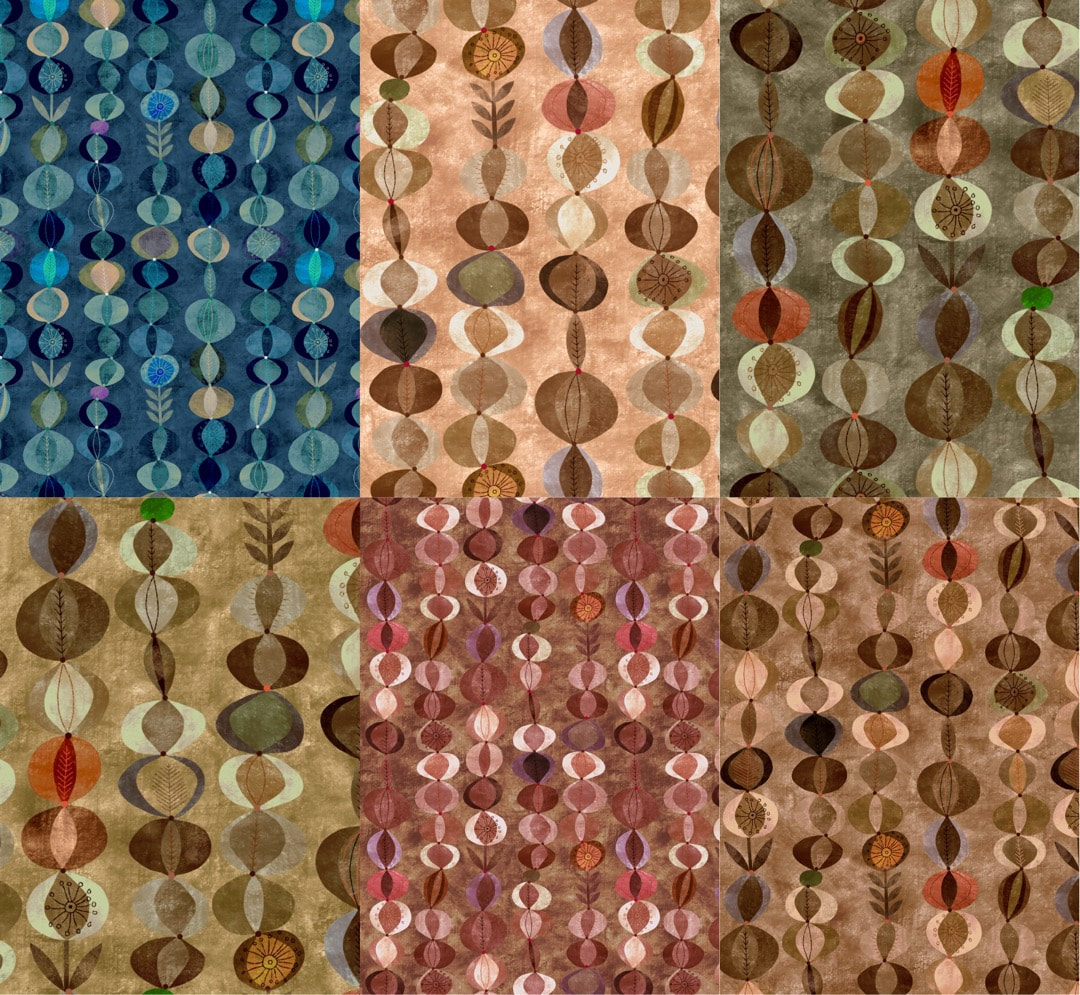 At the beginning of the week I made a textured background for the latest pattern which really activated all the colourways (image below), so simple but effective. I also began work on a page for all my patterns on Redbubble, I will keep adding to that until they are all there. All rainy-day jobs, I even put away the Christmas trees and hoovered, bringing the house out of lockdown mode ahead of a long-awaited family visit. That was hard work, I can tell you. Then the sun came out with such brilliance at the end of the week all my focus was transferred to outdoors (see my HEW blog if you're interested). 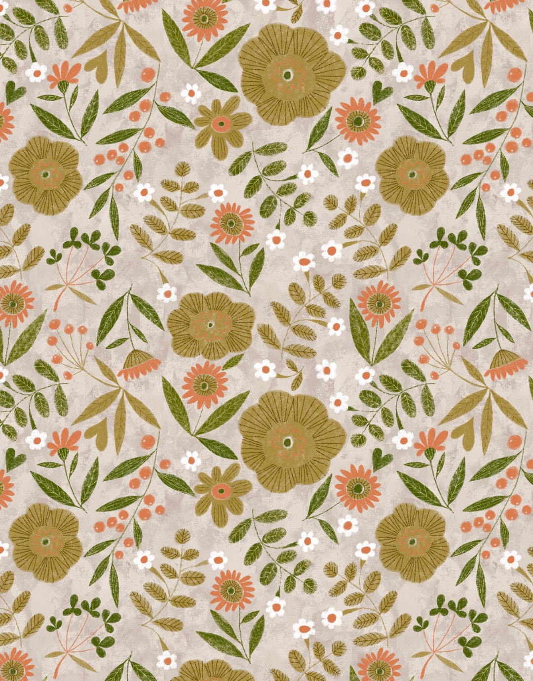 Thanks for visiting, see you next week!
 I worked two more colourways of my latest pattern during the week. I like to limit the number of colours for such patterns to no more than five, plus a background colour. It partly comes from my training as a graphic artists in the print industry in the early-mid '90s, working with colour separations to produce one printing plate for each colour for the offset litho process. I enjoyed seeing how an image was composed by unravelling the colours. 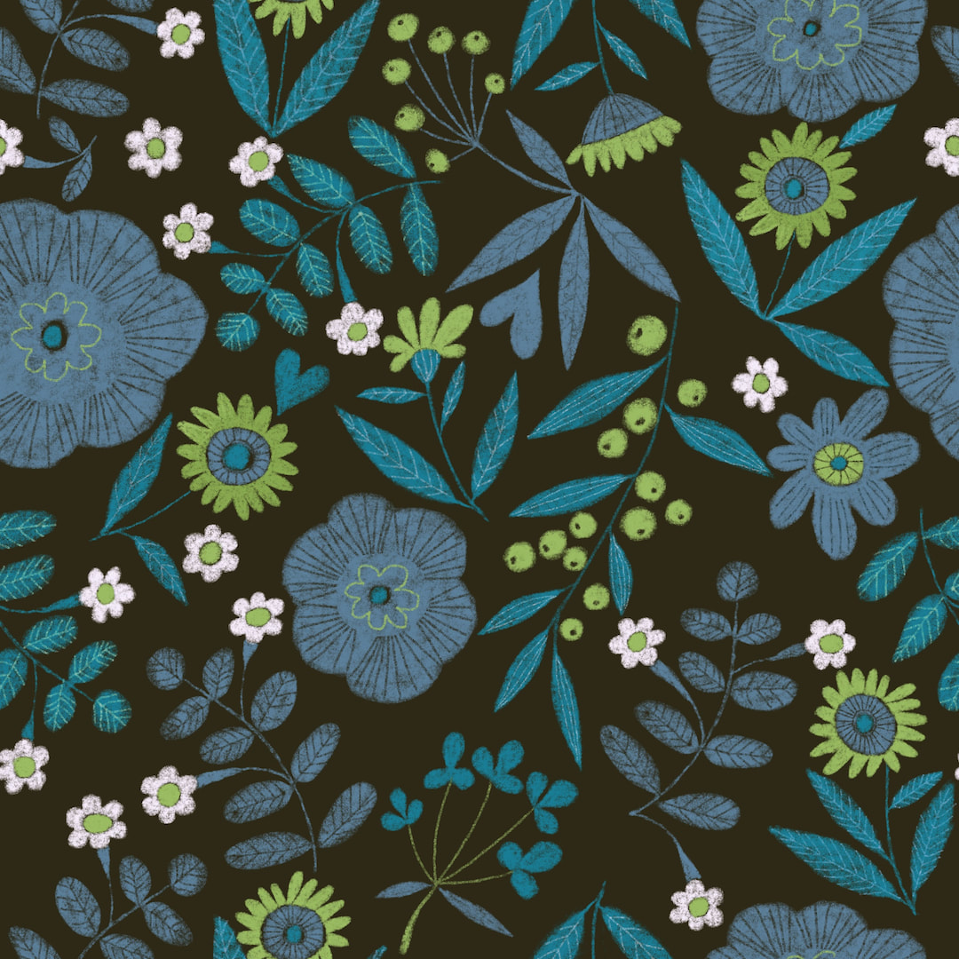 Below is a photo of a little Christmas card I had made at the printers back then, the colour separations can be seen clearly because something I loved to do was emphasise the hand-made quality by making the separations miss here and there. The negative spaces are activated and appear white because of the surrounding colours, although it is printed on a buff coloured laid paper. Interestingly, I bought a new duvet cover from George at Asda recently where the designer had done exactly the same thing in making the separations 'miss', which adds a considerable amount of charm to the pattern. 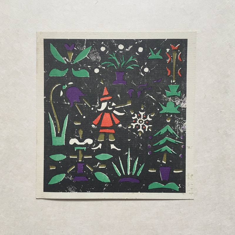 More recently, when I was working on the daisy pattern based on a 1970s neck-tie, I was surprised to find only five separations plus the background, in spite of looking like a riot of colour. Naturally, working in Procreate or any application which uses layers, I keep one layer per colour and limiting the colours means putting a design into repeat is very much faster; if I can stick to four like this new pattern it makes life a lot easier. I find fewer colours make a more cohesive pattern and I enjoy the challenge of working within limitations, which is just as well with my comparatively archaic methods. My Redbubble shop has become a wonderful playground where I can see my patterns on a variety of products - I randomly present a framed art print and a pair of socks today! 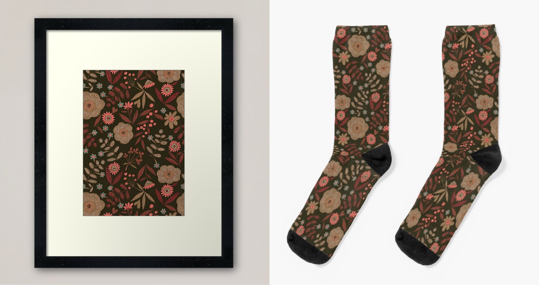 Thanks for visiting, see you next week!
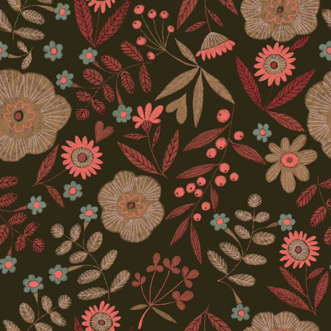
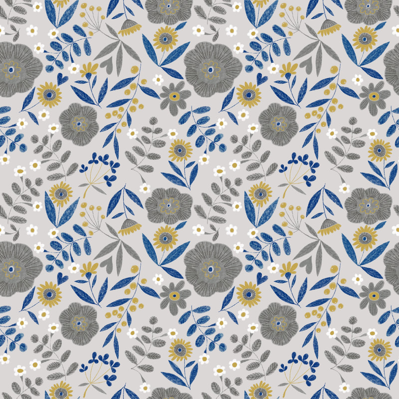 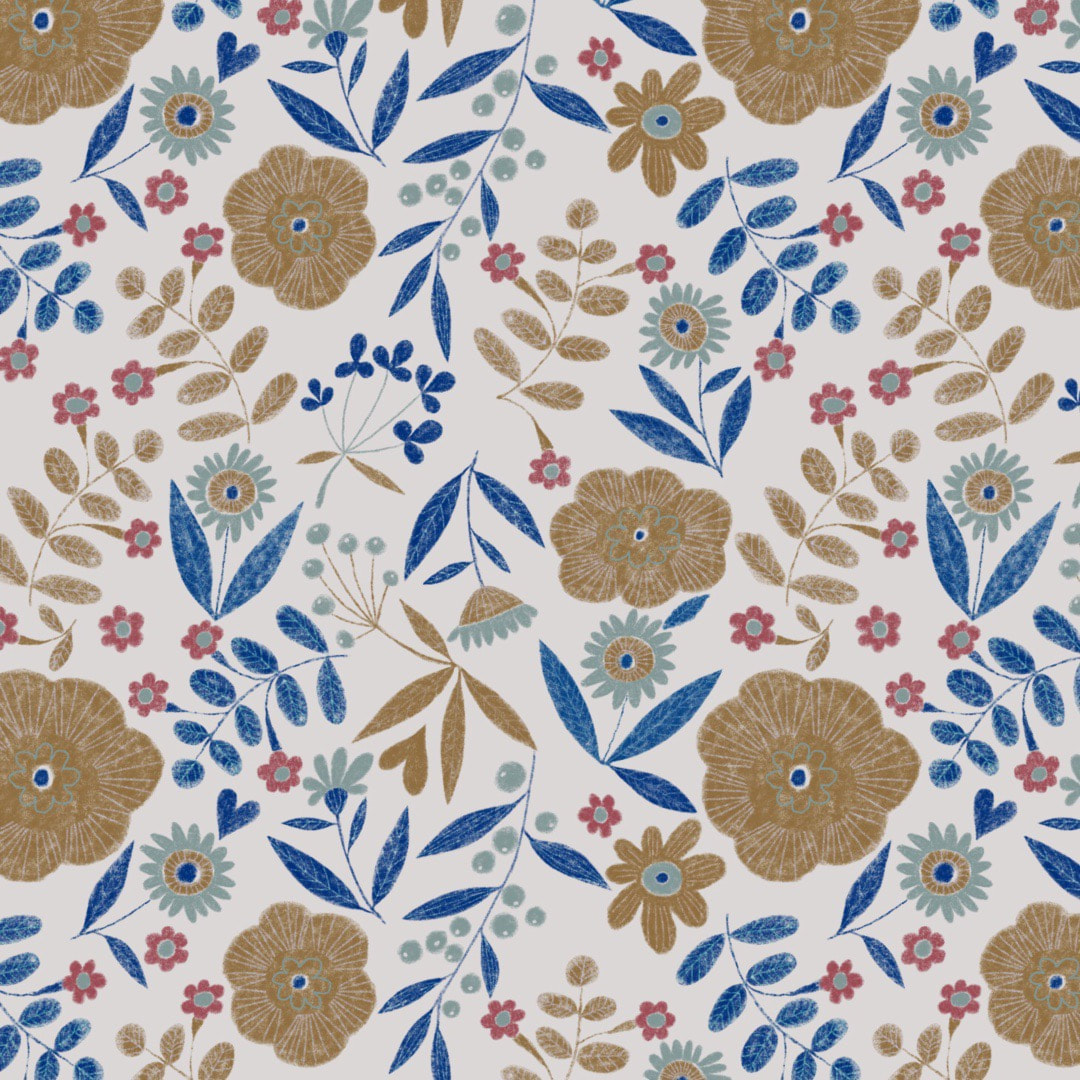 Above, a new pattern in its first two colourways, and below, different colourways of last week's pattern inspired by a vintage tie. I have been thinking about why I love pattern-making so much, my interest is increasing rapidly with time. I don't really know, to be honest; I think it may relate to solving jigsaw puzzles, or crosswords, but it's worth noting the process: while the purpose and end results are quite different, the mental process is almost the same as in my drawings. In fact, pattern-making feeds into and assists the drawings. When you design patterns it is necessary to think about the motifs and the surrounding space - it's the only way I can express it, but you quickly learn how to avoid the irritating forms, line-ups or gaps which when put into repeat disrupt a pattern, so the up and down and left and right become vital to a successful composition. I can spot a no-no from a mile off these days! I suppose the devil is in the detail. I'm using this knowledge gained from applied art in my drawings and it makes me glad that I diverted into the two disciplines. 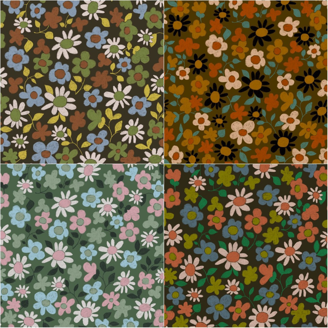 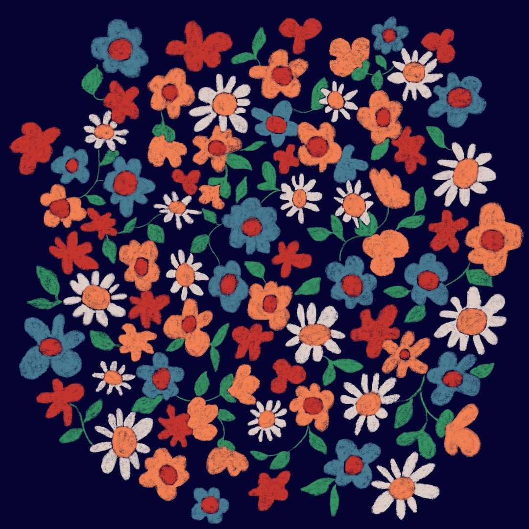 I discovered my brother's collection of vintage ties in a plastic bag in the loft of our old family home a little while ago, and one tie really caught my attention. I reckon it's '60s or '70s, just my thing, so I began a drawing in Procreate based on what I could put together from the sliver of fabric which makes up the tie. I drew sections of what I could see and put them together in the image above, with some filler shapes which I tried to keep in harmony with the original. 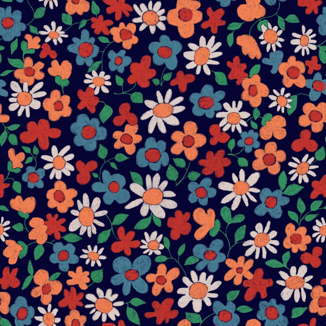 The next step was to create a repeat pattern, here's the tile. 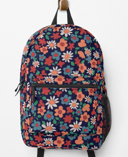 Then of course there was a lot of fun adding it to my Redbubble account.
I was very happy with the results, it looks properly dandy and cheerful on the backpack (for some reason I am particularly fascinated with those, and the duffle bags, not to mention the socks!) I took great pains with the pattern tile, creating it in separate layers so I could change the colour for each, rather than just adjusting the colours of the whole tile. It's quite a long process because I do it the 'old fashioned' way in my now quite antiquated version of Procreate. I don't subscribe to Adobe anything any more, which means I don't have Photoshop now, so nothing is automated and the process is just like the hand-made method of cutting the original into four quarters and 'turning inside-out' (that's how I think of it). I repeat the process for each colour separation and it really provides wonderful clear results for every colourway. Perhaps I'm a bit of a dinosaur, but I prefer this way of working 'by hand', I feel more in touch with the design. I have made six colourways from the original. The advantage of doing it this way is that each colourway emphasises different aspects of the drawing with the use of tone as well as colour, which can't be done working with just a single layer tile. They can look like a completely different design as a result. I'll post some of them here soon! Thanks for visiting, see you next time! 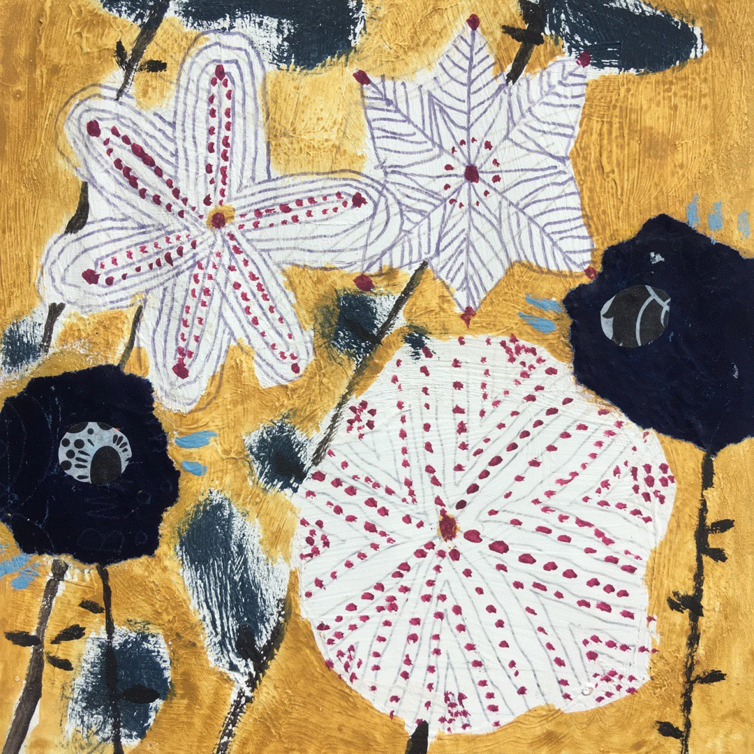 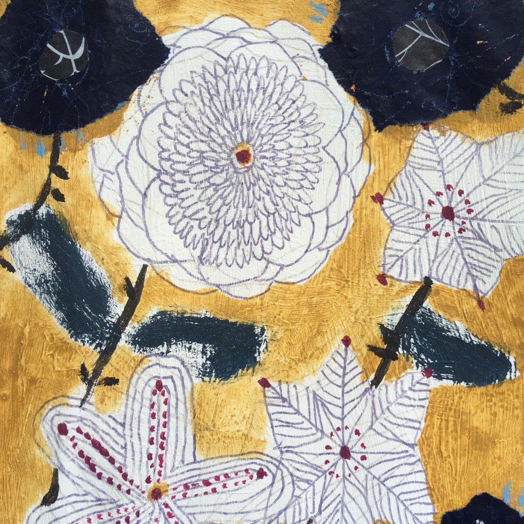 Some sunshine yellow to welcome in the merry month of May! I do wish we could have a bit more actual sunshine, it has been bitterly cold here in Fife this week, with very cold nights and some frost in the early morning. Flowers, very sensibly, are refusing to bloom in the real world but are still going strong in my work. 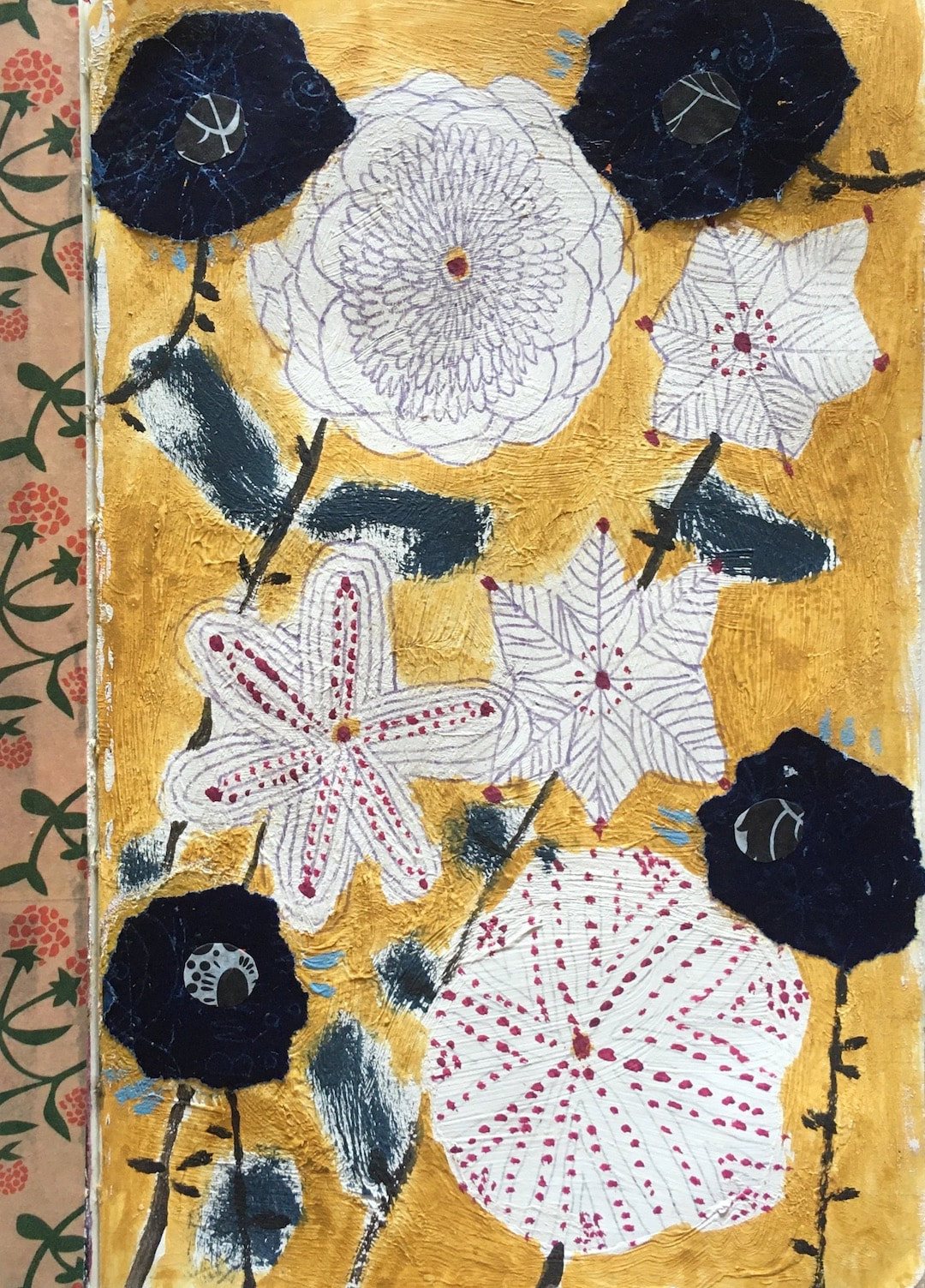 |

~~~~~~~~~~~~~~~~~~~~~~
Welcome to my illustration and patterns blog.
I illustrate under the pen-name of Binky McKee, McKee being my mother's maiden name. Binky was the name of every single cat my great-grandmother kept - allegedly about 40 of them during her 94 years of life. I changed the website address a few months ago, so some older links on previous posts are broken. If you click one of those and it takes you to a strange page, simply replace the .co.uk after the binkymckee. with weebly.com and it will work again. I hope you enjoy your visit! ~~~~~~~~~~~~~~~~~~~~~~
~~~~~~~~~~~~~~~~~~~~~~
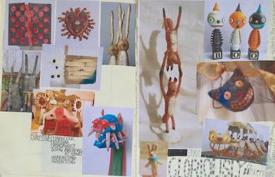
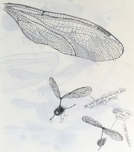
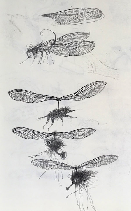
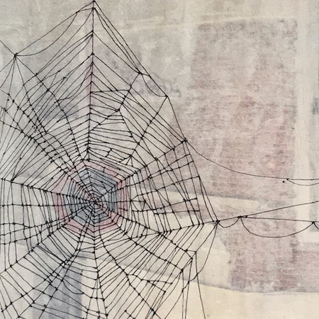
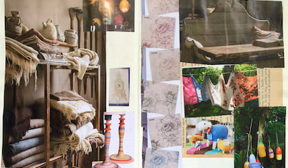
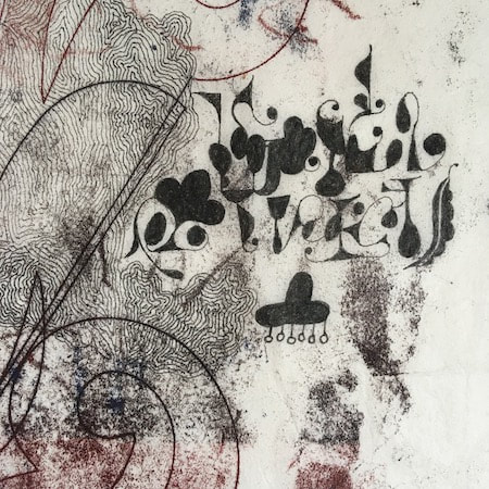
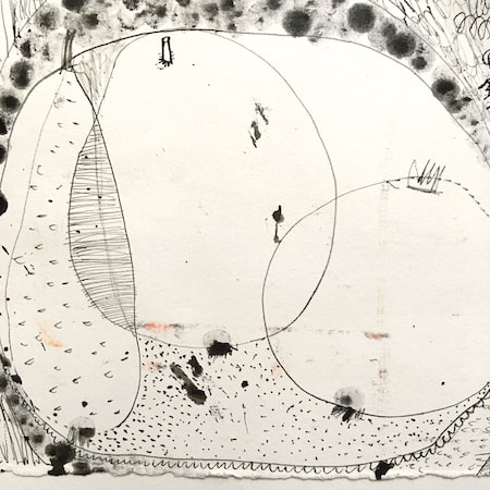
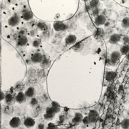
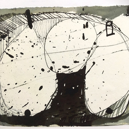
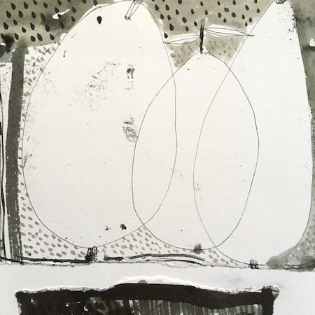
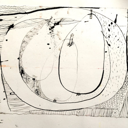
I keep lots of scrapbooks and sketchbooks where I develop ideas and design little creatures. Here's a peek inside one ...
~~~~~~~~~~~~~~~~~~~~~~
~~~~~~~~~~~~~~~~~~~~~~
As you may know, I am also known as Heather Eliza Walker.
Click the image if you would like to find out more and visit my other website. ~~~~~~~~~~~~~~~~~~~~~~ ~~~~~~~~~~~~~~~~~~~~~
~~~~~~~~~~~~~~~~~~~~
April 2024
~~~~~~~~~~~~~~~~~~~~~~
~~~~~~~~~~~~~~~~~~
All
~~~~~~~~~~~~~~~~~~~~~~
~~~~~~~~~~~~~~~~~~~~~~
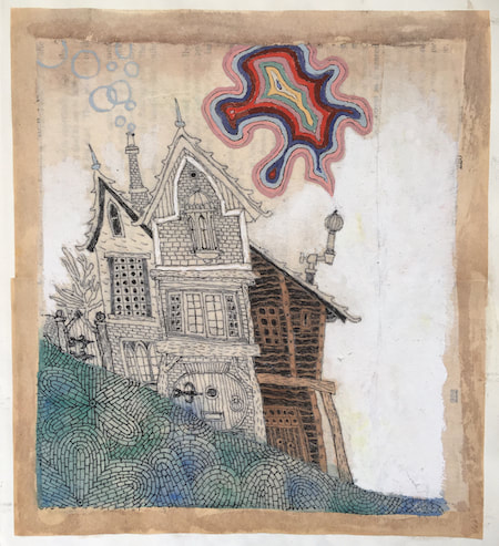
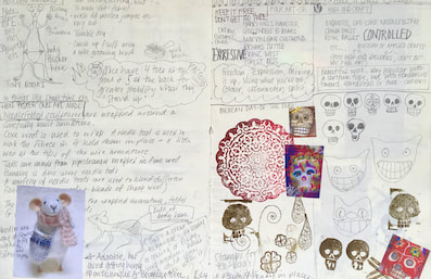
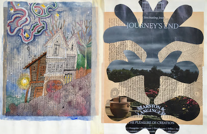
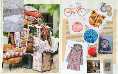
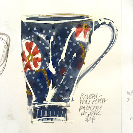
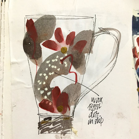
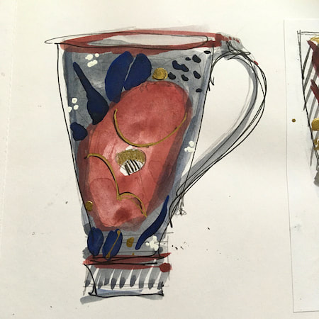
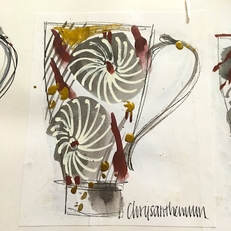
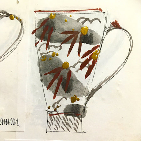
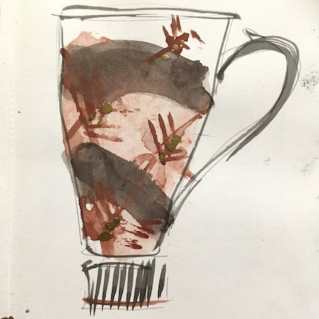
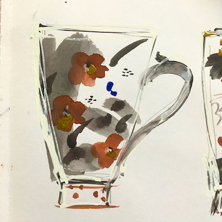
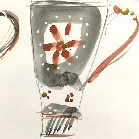
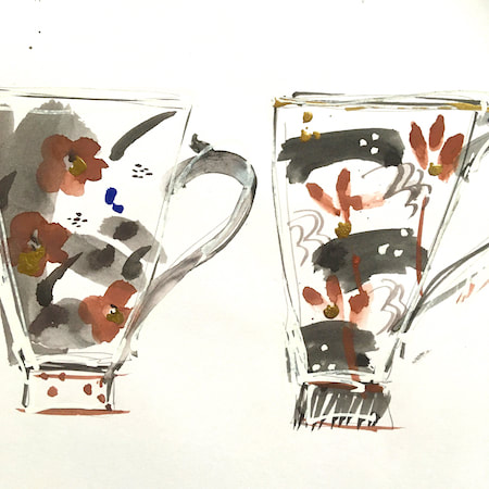
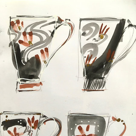
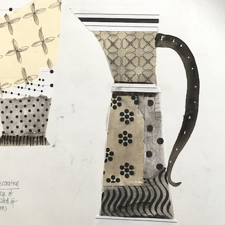
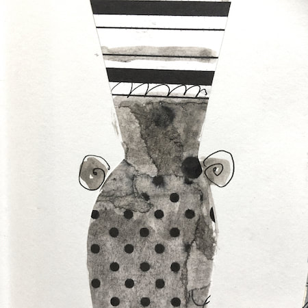
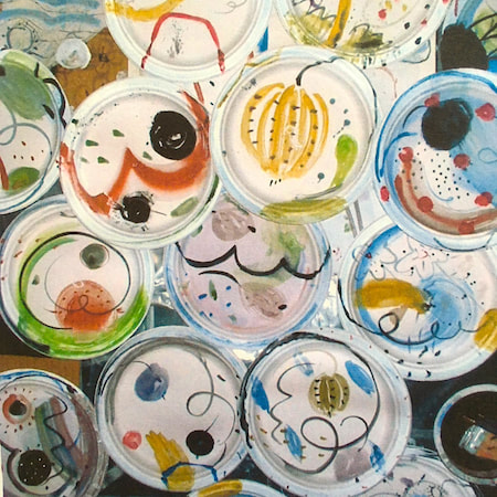
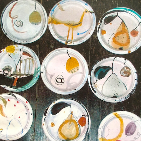
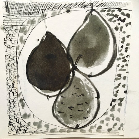
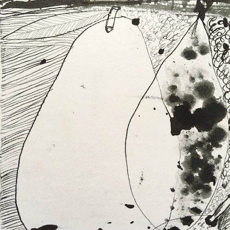
This time, take a peek into my ceramic design sketchbook. I actually made some of the mugs, but I kind of prefer the drawings! The plate designs are painted on paper plates, a most liberating process.
~~~~~~~~~~~~~~~~~~~~~~
~~~~~~~~~~~~~~~~~~~~~~
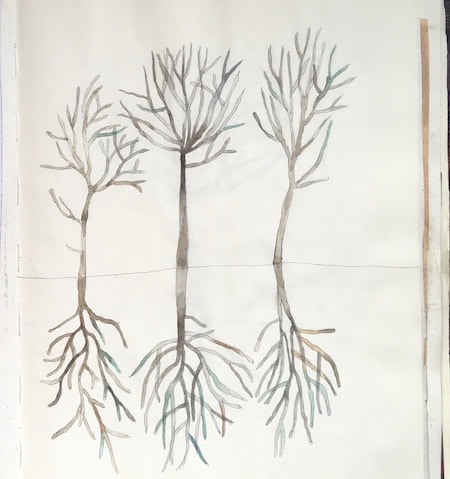
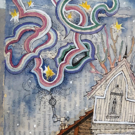
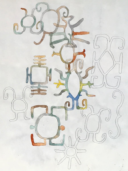
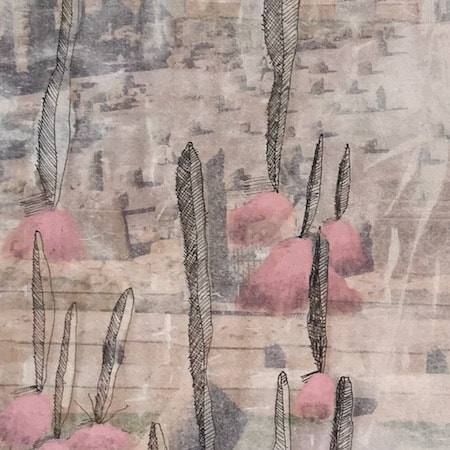
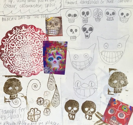
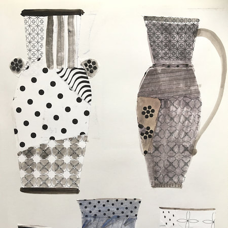
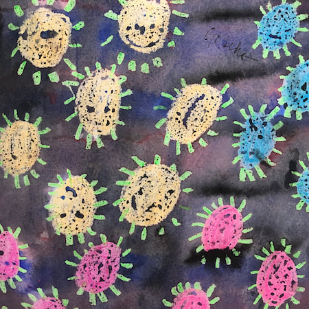
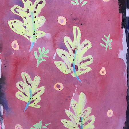
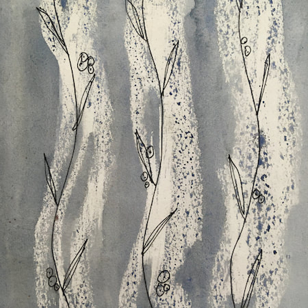
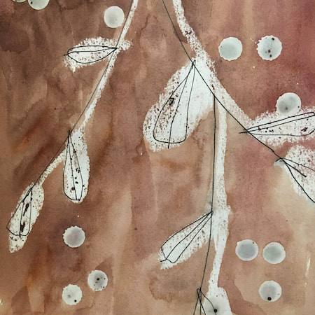
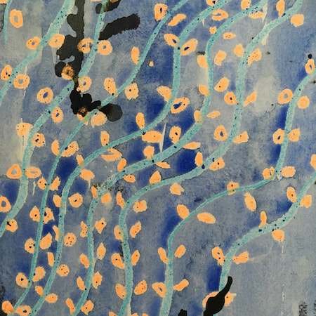
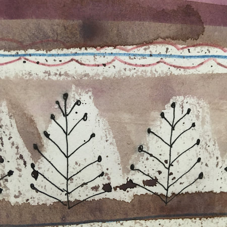
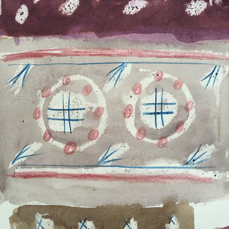
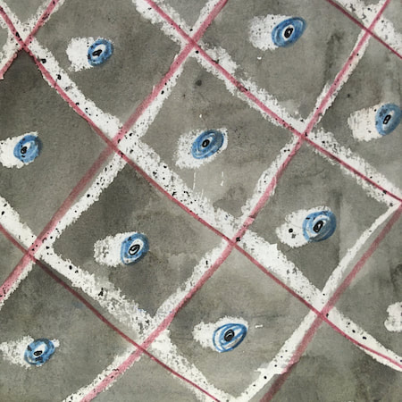
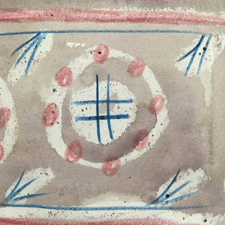
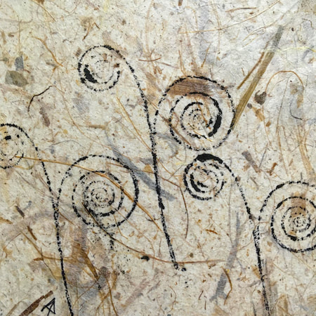
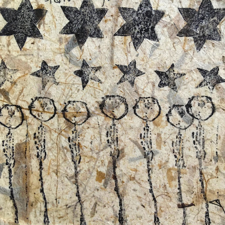
These watercolours are from my pattern sketchbook. I used coloured wax crayons to resist the washes of watercolour, also home-made rubber stamps dipped in bleach then printed on crêpe paper - the bleach takes out the paper dyes.
~~~~~~~~~~~~~~~~~~~~~~
~~~~~~~~~~~~~~~~~~~~~~
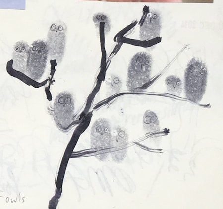
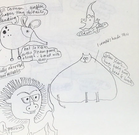
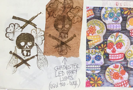
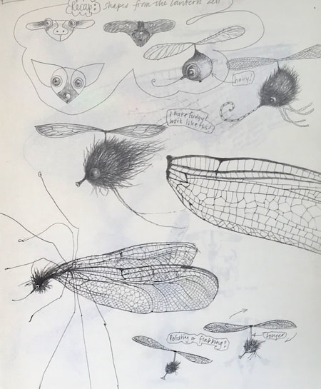
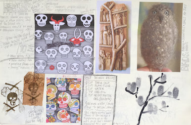
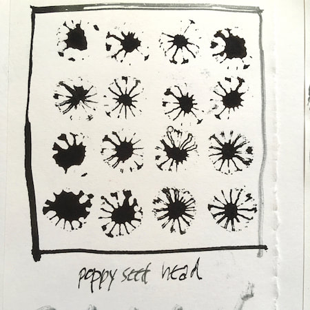
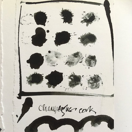
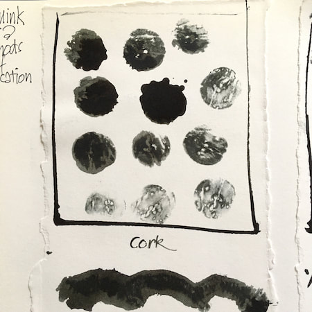
A sketchbook I used for mark-making with unusual objects - corks, seed-heads, feathers, home-made rubber stamps, my fingers and lots of flicky things ...
|
 RSS Feed
