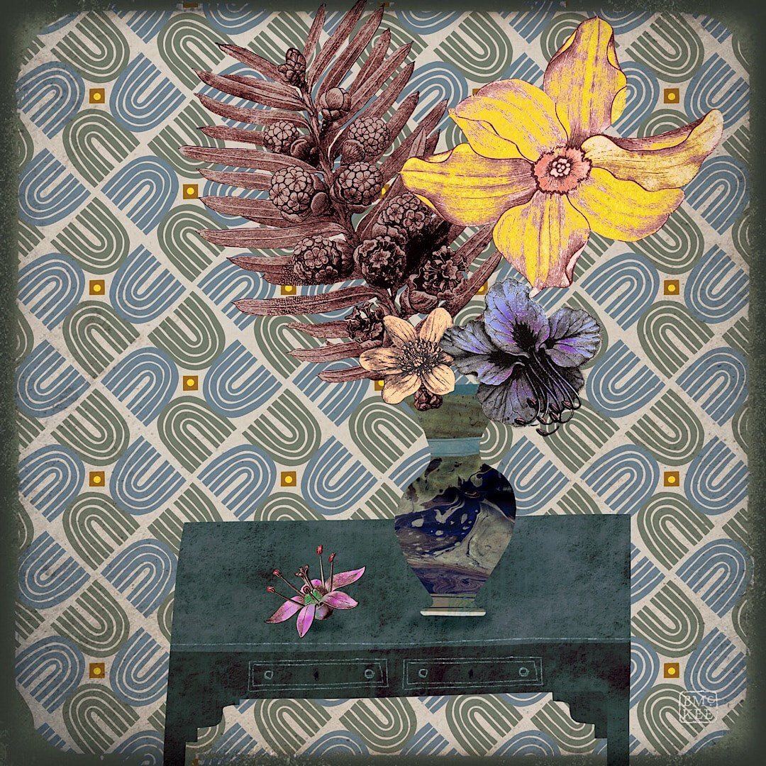
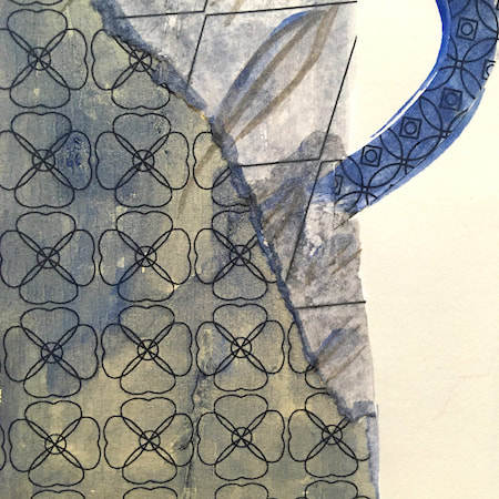
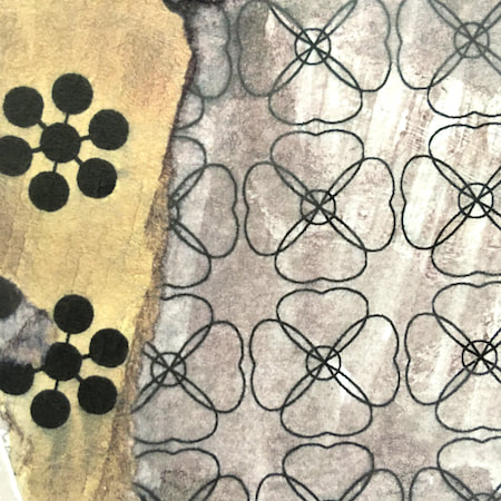
 Geometric pattern in blue and olive I lost my stylus for this entire week. It meant I couldn't work properly on my iPad without it, so little in the way of new work this week, but luckily I had these two collages I made last week to post here today. Until I lost the stylus I had not realised my level of attachment to it; we have been through so much artwork, so much discovery, and so much delight together. It had become a natural extension of my hand and therefore to my brain, and that hand felt quite bereaved without it. From the title of this post you can probably guess what happened, but if you would like to hear the whole story, read on ... 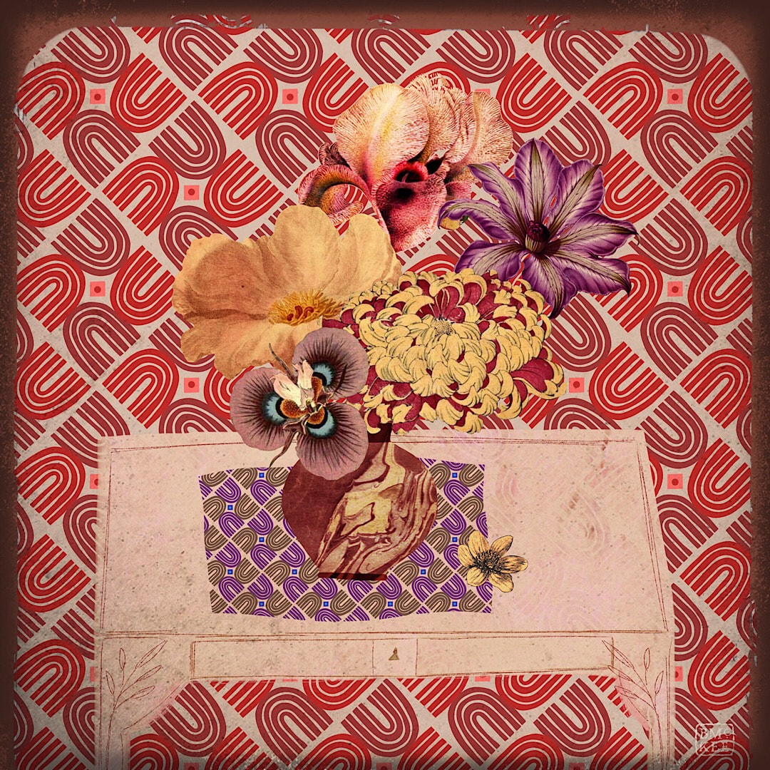 Geometric pattern in raspberry and plum 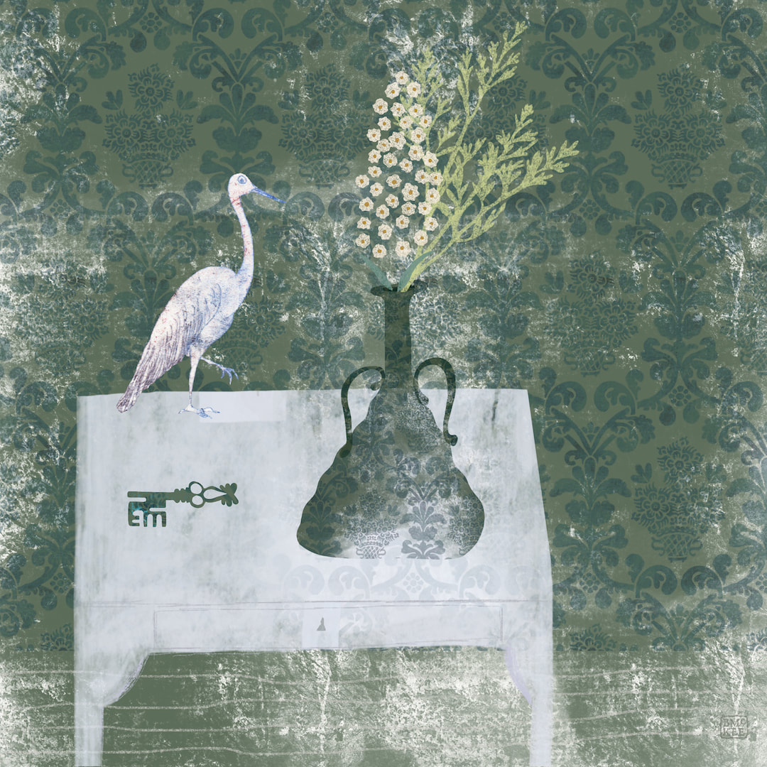 I was quite thrilled with the glassy nature of a new texture I had created almost by accident, and made another wall art piece with it and a stork and a key. No, I don't know what it means, but it has a nice tranquil feel. I mostly designed them as framed artworks, but they work well on a few other homeware products such as coasters and acrylic blocks, so I made separate templates for spiral notebooks and hard cover journals, complete with parchment textured labels to write the journal title, your name, etc for Redbubble. I can't resist stationery goods. 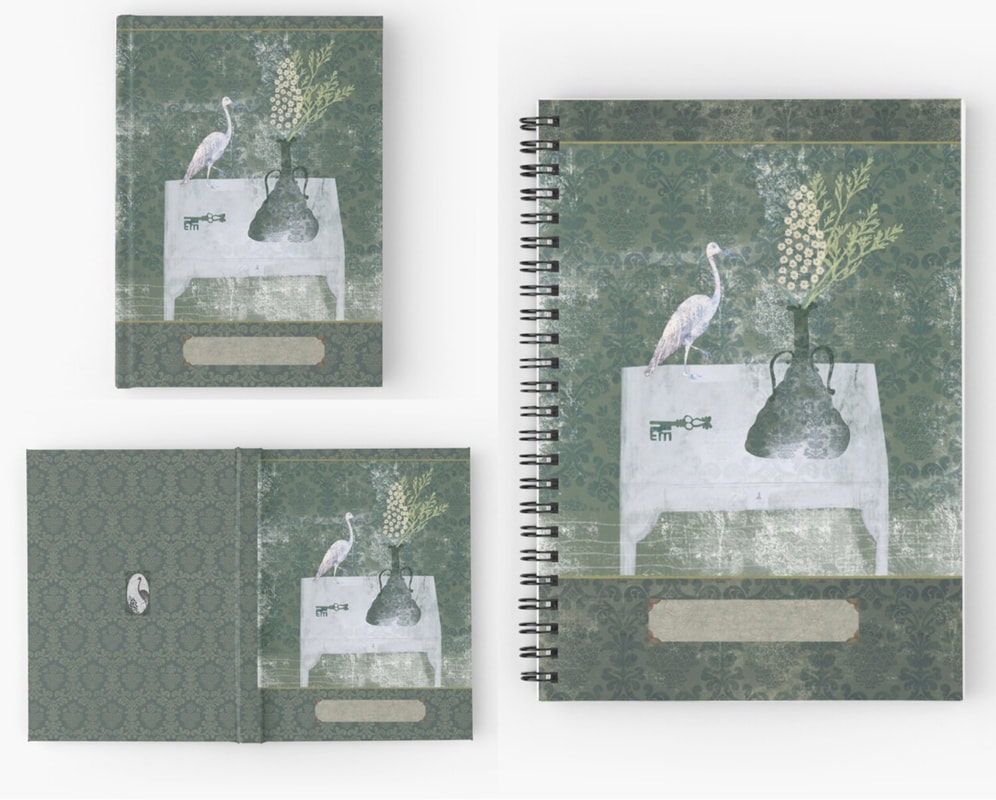 Thanks for visiting, see you next week!
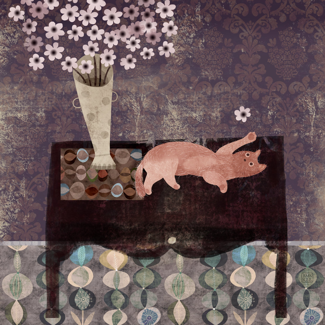 Still on the wall art theme, I made this composition of a naughty moggy on a table for the caturday hashtag on Instagram. I haven't posted a caturday for ages, it's so much fun!
 Instead of just uploading patterns to my Redbubble store, I have been turning my attention to wall art. Below is a rework of one of last year's pieces, and I was so encouraged by how charming it looks framed in my shop I went on to make the new composition above. 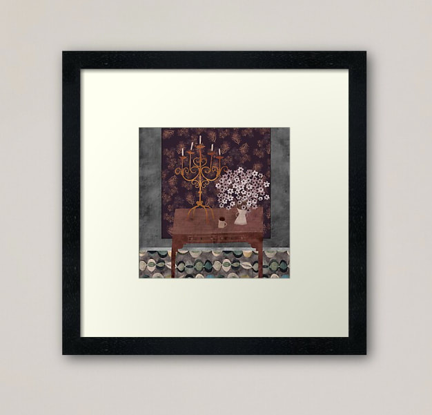 The variety of work and different dimensions certainly makes my Explore Designs page more exciting, taking it away from the strict grid into a naturally staggered flow which is easier on the eye. I have also begun to mix up the designs; I had been uploading patterns in different colourways one after the other so they were grouped together, but I think that looks a bit boring so now I am alternating patterns to work the colours. I discovered that's actually a fresher and enjoyable way to work anyway. 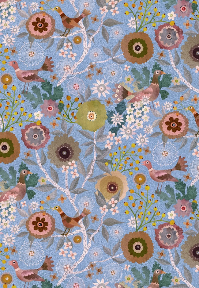 Here's a version from this week, a blue colourway of the birds and berries pattern I have been working on lately, but I also got out the vintage tie daisies pattern plus a few others to put into new colourways. Mixing it all up seems to be really improving the look of my page.
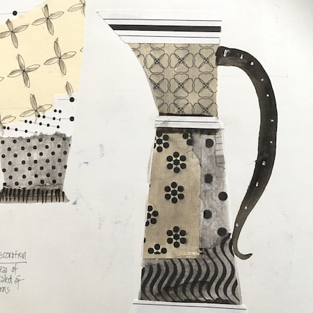
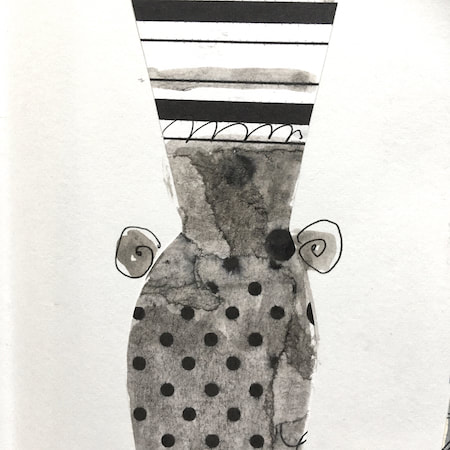
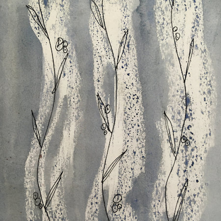
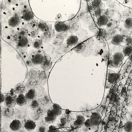
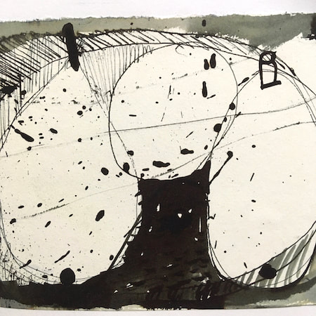
Thanks for visiting, see you next week! 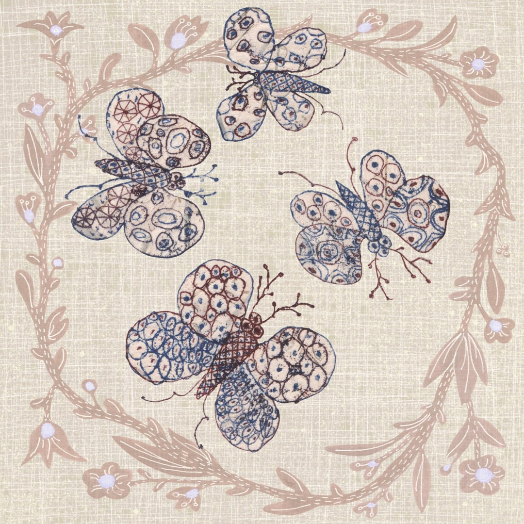 It hasn’t been the easiest week. Indecision and insecurity about my work took hold when work with the monotype vases I was cutting out last week didn’t go quite as planned, and I panicked when my Instagram went quiet. I worried in case I was taking a wrong turn and getting distracted by the monotype process. I worried that the new work just wasn’t interesting enough. I worried I was being inconsistent. 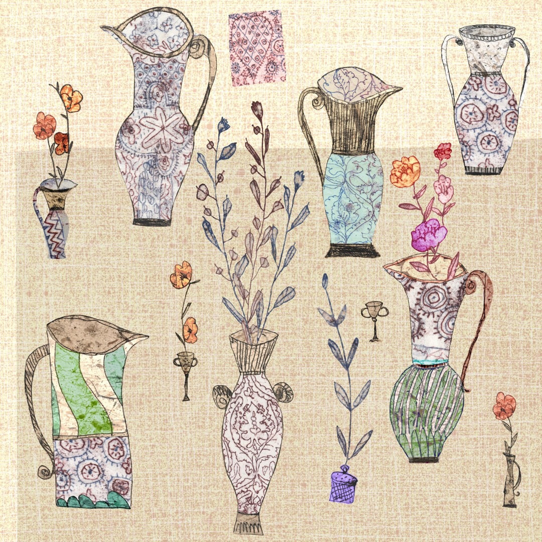 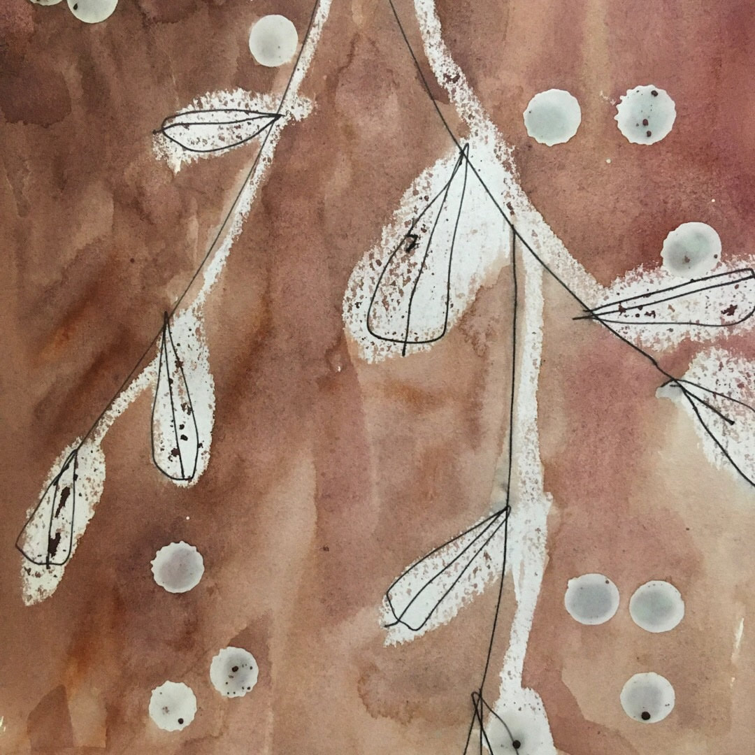 I have been working purely digitally for a while, which I love - but I always end up with a hankering for the human presence of the hand, and the alchemy of materials. Above is a watercolour from one of my sketchbooks, with wax resist and simple, free pen lines, which I made a while ago. I am very interested in designing patterns which could contain this freedom, I haven't figured it out yet, but it's something which has been going on in the background of my mind for over a year. Also, I haven't a clue which pen I used to worked on wax! It has bonded perfectly with the resist - experiments required (and possibly a lot of spoilt pens). 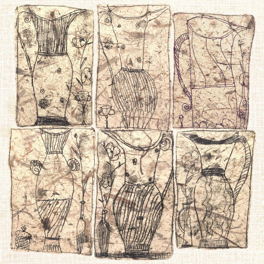 Above is a set of six little monotypes from the same sketchbook. I have always loved making monotype drawings. Using a glass plate rolled with printing ink or oil paint, paper is placed over the plate and I draw on the paper. It means when the paper is peeled away from the plate it reveals a mirror image of the drawing plus accidental smudges and textures. These surprises are exciting, and I use the technique both for illustration and in my Heather Eliza drawings. This week I began to isolate sketches from my book (I did write about getting my jugs out and working with them, but NO, that's SO wrong!! Raised a few laughs on Instagram, though) . Here is a rudimentary something I put together as an experiment. The original monotype drawing was made on hand-made bark paper which supplies the lovely colour and texture for the fuzzy ink lines, cut out and placed over a digitally created linen-weave background. It may take a while, but I'll see where I go with this. PS: I decided not to do Inktober on Instagram this year, I just have too many pots on the boil at the moment. I was tempted, but focus is required. 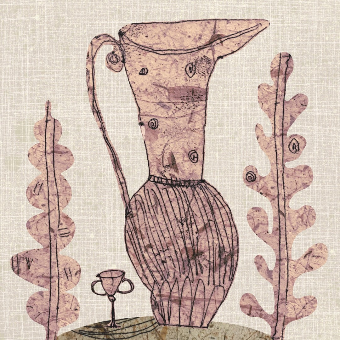 Thanks for visiting, see you next week!
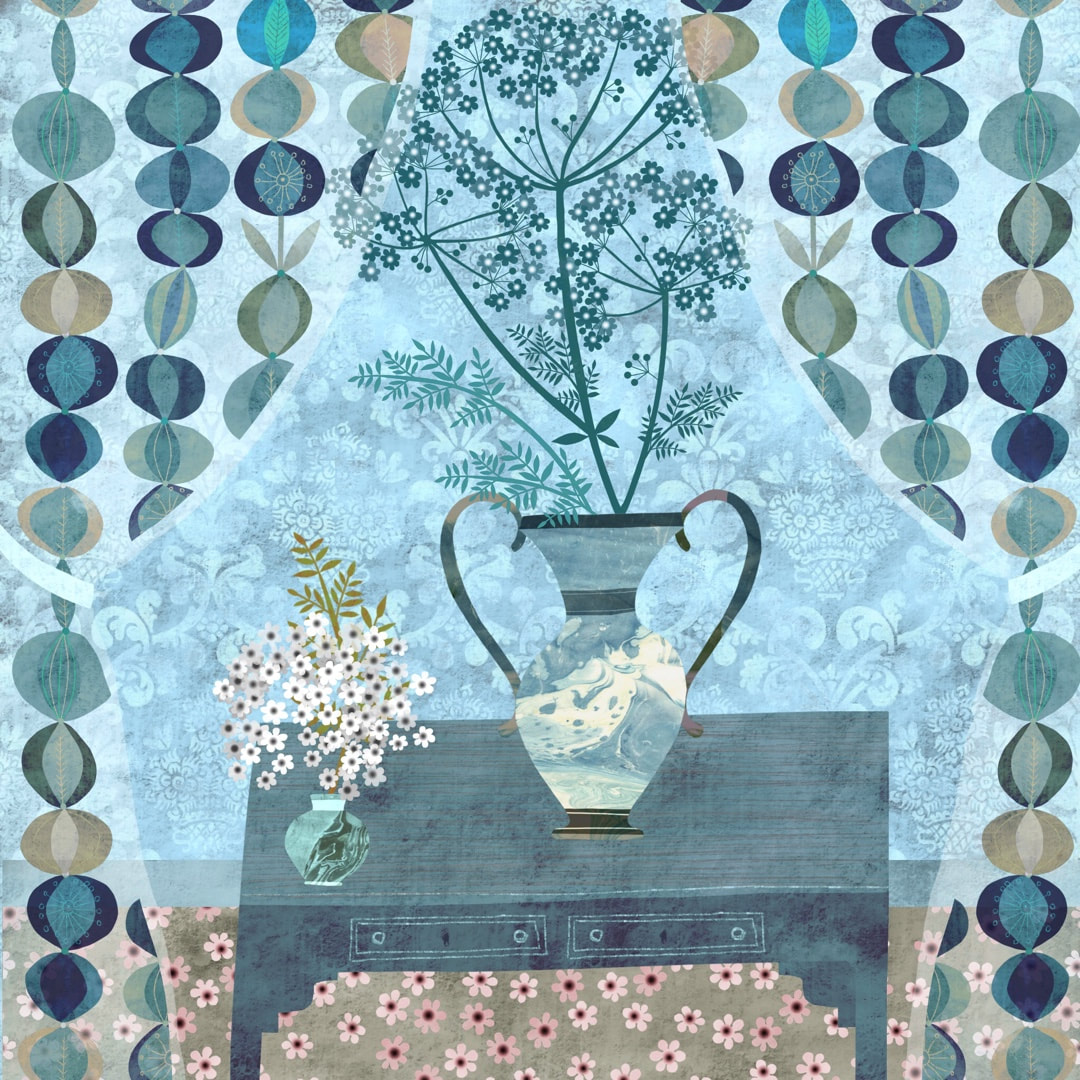
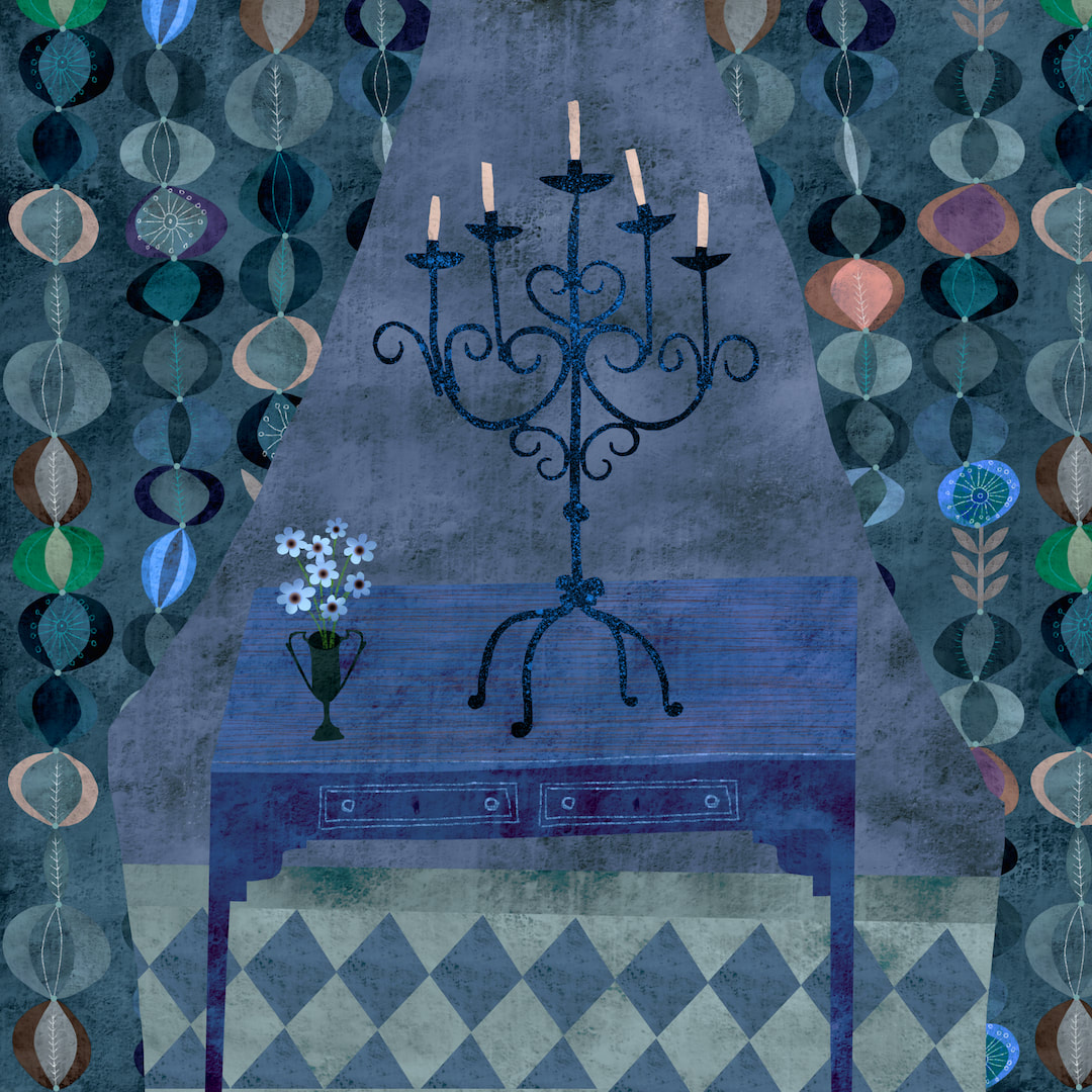 We celebrated B's 60th birthday on Wednesday, so I took 3 days off this week. Monday and Tuesday I set aside for baking, preparation and making him a special painted card/art piece. Wednesday itself was a lovely day of special foods, deliveries of gifts and balloons, and pampering B. Then it was back to normal on Thursday and Friday working on the children's book, but I found myself a bit short of blog and Instagram material to share. Normally I collect incidental bits and pieces from my illustrations and assemble them into a still life or pattern at the end of the working week, but I had nothing new I could share this time (although the illustrations are working beautifully! - watch this space). Luckily, I had started this still life in blue a few weeks ago, and all it needed was a pattern for the drapes to finish it. I had had plans for developing the pattern of ovals which I made at the beginning of February, so I worked on that today, and the still life was finished. Incidentally, I am most interested in patterns which have a block printed appearance at the moment (last week's post shows that, too). I was passionately in love with William Morris wallpapers and Indian printed textiles as a youngster in the 1970's, and it never really left me, but right now I am interested in fresh, simple shapes with lots of texture. 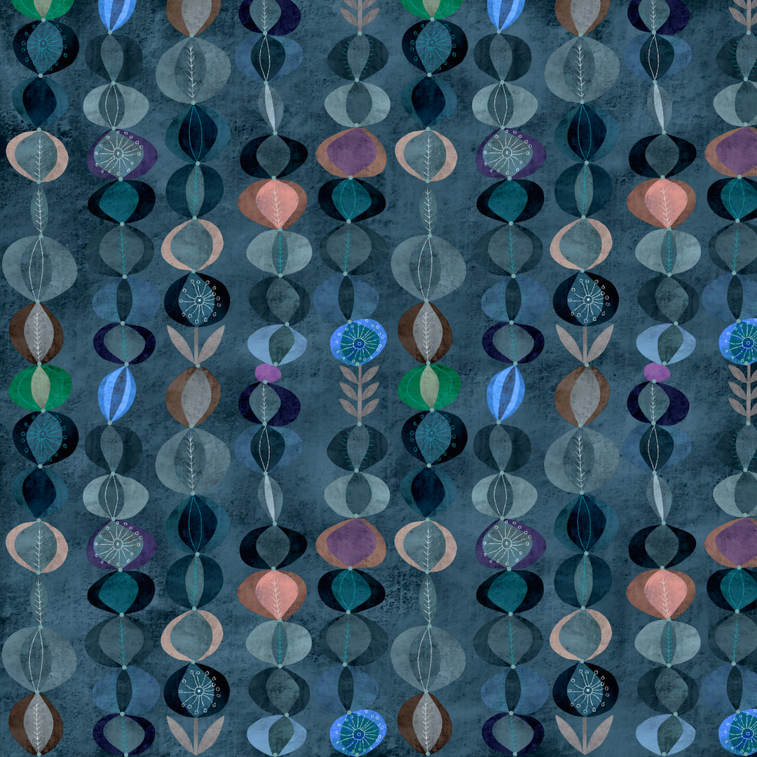 Thanks for visiting, see you next week!
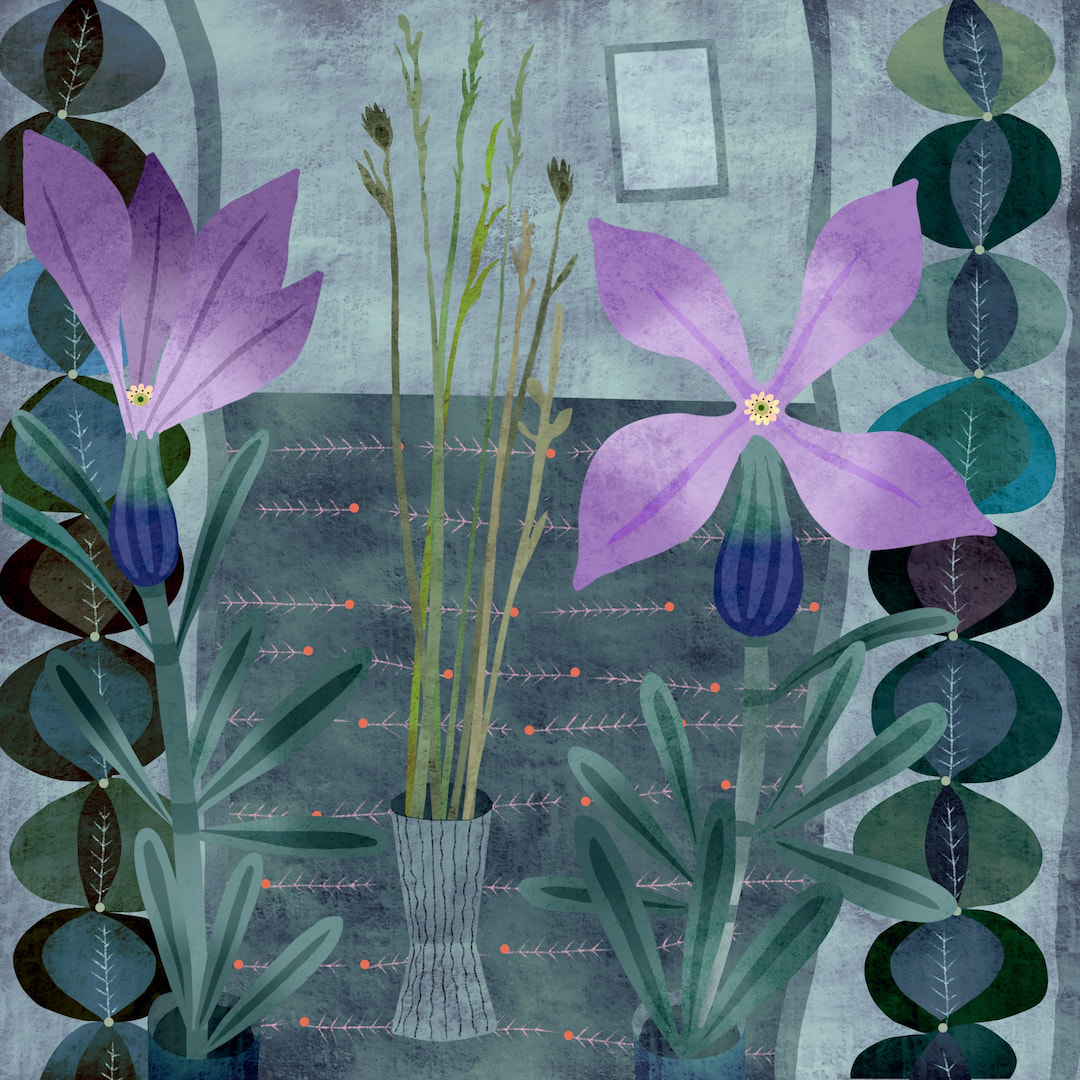 When I was at art school still life was my favourite genre, I loved going to the college wardrobes and cupboards to select objects for my paintings. Now, for the last few weeks I have been organised enough to collect elements as I work into a scrap-book file so that at the end of the week I can make a still life with them. Although this work is digital, I have noticed that the process of composing and problem solving is the same as painting and in fact the end result resembles my paintings. 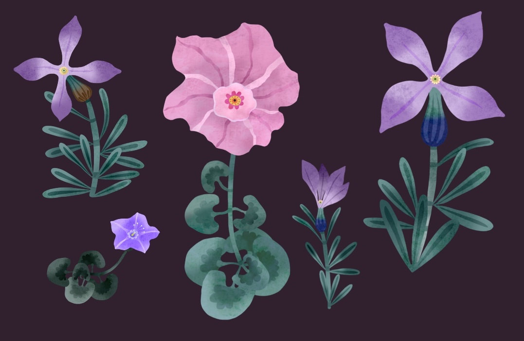 Still collecting ideas based on coastal flora to use in illustrations, I found Sea Stock this week, and on Thursday I discovered that Sea Bindweed and Beach Morning Glory are actually the same plant - I have yet to identify the little yellow flowers which I originally thought were Beach Morning Glory. I would never have known there existed such a wide variety of plants which grow on sand dunes in the UK; now I'm looking forward to visiting the beach in summertime for a good old poke around to see what I can find.
Thanks for visiting, see you next week! 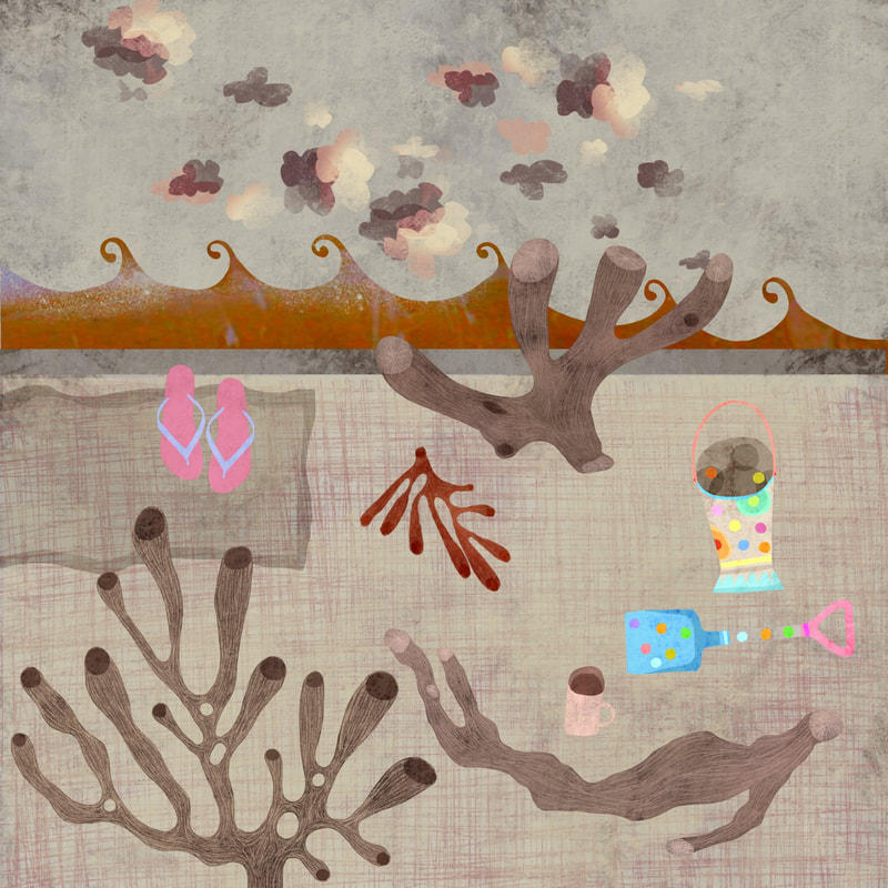 Just as storm Ciara last week influenced my choice of colour, I sheltered from storm Dennis this week in calm, bright colours; also taking comfort after a personal incident - I upset a kettle of boiling water over my knee on Monday and burnt myself badly. I found distraction from pain in lots of mark-making and gentle, small objects. The seaside theme still prevails, here we have driftwood, seaweed and coral shapes alongside those British seaside classics: flip flops, a mug of tea, a picnic blanket, and a bucket and spade.
Thanks for visiting, see you next week! 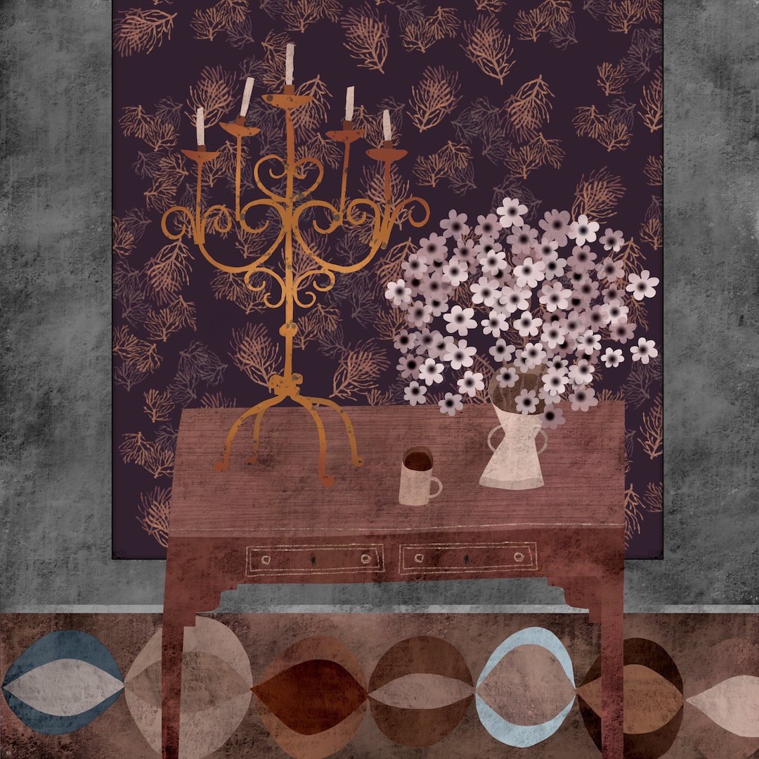 It has been a howling, windy week, and the three old sash windows in my work room have been shuddering and rattling like wild skeletons as the side of the house was buffeted by storm Ciara. The turmoil outside perhaps led me to select muted, calm colours for work. It has been a while since I made a close-toned still life. I have always loved still life painting; I always used oils at art school, where I learnt painting in the traditional Scottish manner with a slightly modernist twist using tilted perspective and beautiful colour harmonies. At the moment I am working digitally on illustrations for that children's book I keep mentioning, so the images shown here were created using textures created earlier in the week for some of the characters and their environment. 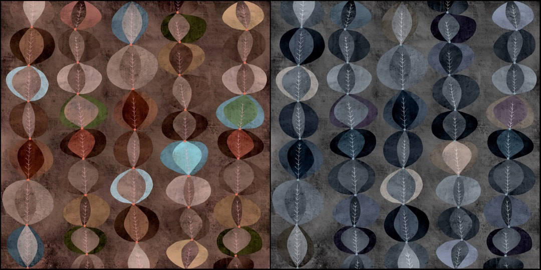 This pattern emerged from a texture made (without giving too much away) for an animal in the story. It forms the animal's skin, but I could see the pattern emerging quite clearly alongside the animal's character as I worked on him. I played with colour-ways for the pattern and was pleased with these two - earth and mineral, my favourites! When I have time I would like to refine them, I already have ideas that would look great on textiles for curtains. Or tote bags. Or cushion covers. Or blankets - I think you know where I'm going.
Thanks for visiting, see you next week! |

~~~~~~~~~~~~~~~~~~~~~~
Welcome to my illustration and patterns blog.
I illustrate under the pen-name of Binky McKee, McKee being my mother's maiden name. Binky was the name of every single cat my great-grandmother kept - allegedly about 40 of them during her 94 years of life. I changed the website address a few months ago, so some older links on previous posts are broken. If you click one of those and it takes you to a strange page, simply replace the .co.uk after the binkymckee. with weebly.com and it will work again. I hope you enjoy your visit! ~~~~~~~~~~~~~~~~~~~~~~
~~~~~~~~~~~~~~~~~~~~~~
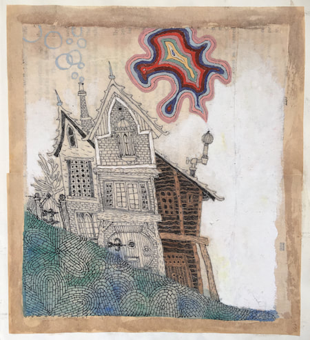
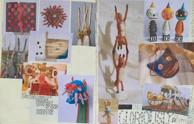
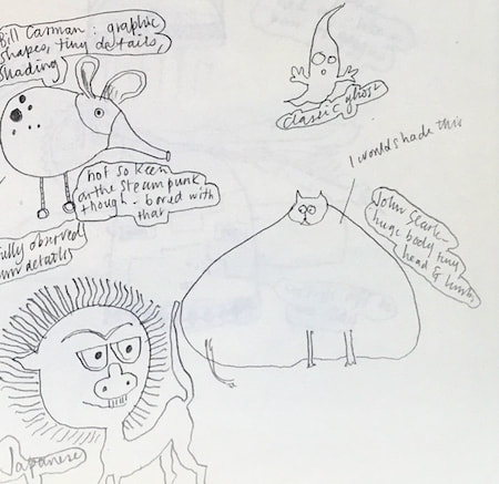
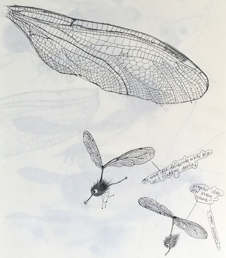
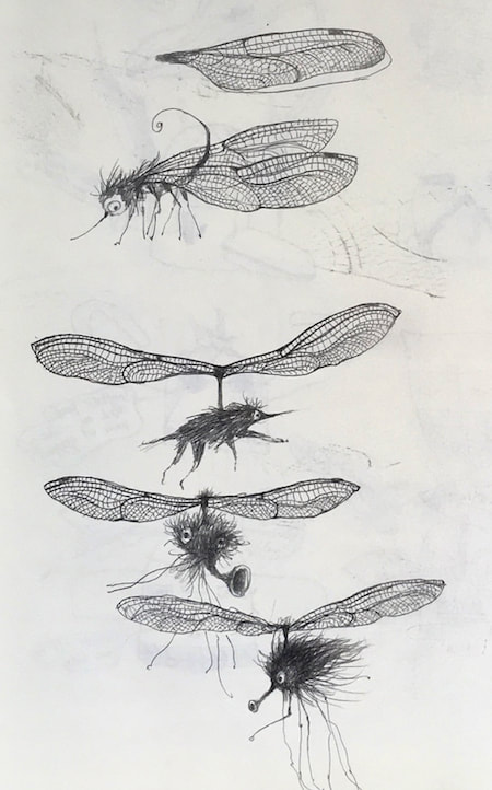
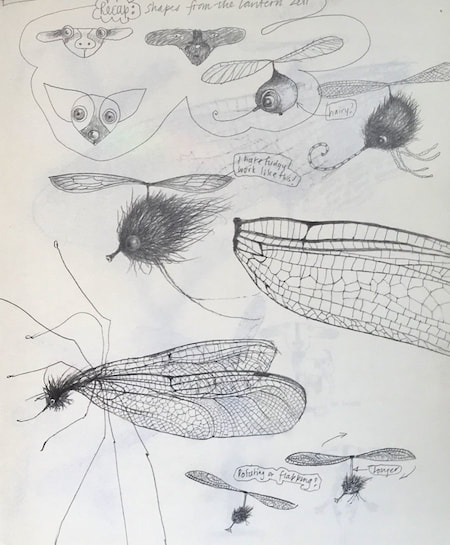
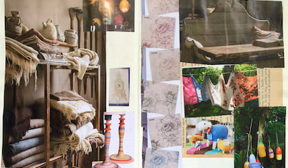
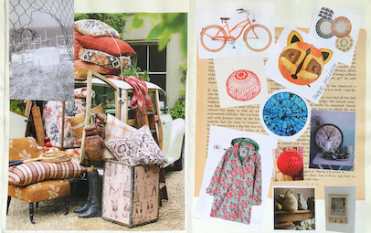
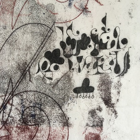
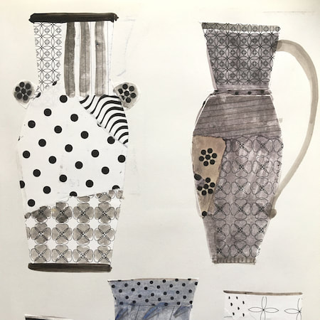
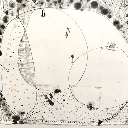
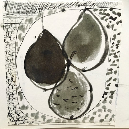
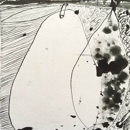
I keep lots of scrapbooks and sketchbooks where I develop ideas and design little creatures. Here's a peek inside one ...
~~~~~~~~~~~~~~~~~~~~~~
~~~~~~~~~~~~~~~~~~~~~~
As you may know, I am also known as Heather Eliza Walker.
Click the image if you would like to find out more and visit my other website. ~~~~~~~~~~~~~~~~~~~~~~ ~~~~~~~~~~~~~~~~~~~~~
~~~~~~~~~~~~~~~~~~~~
April 2024
~~~~~~~~~~~~~~~~~~~~~~
~~~~~~~~~~~~~~~~~~
All
~~~~~~~~~~~~~~~~~~~~~~
~~~~~~~~~~~~~~~~~~~~~~
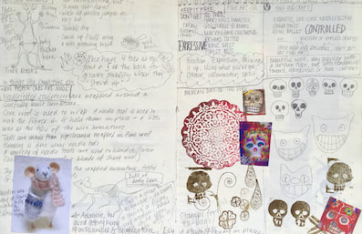
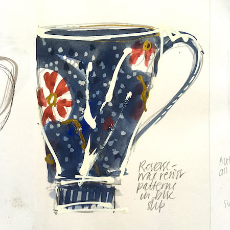
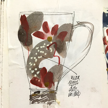
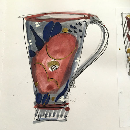
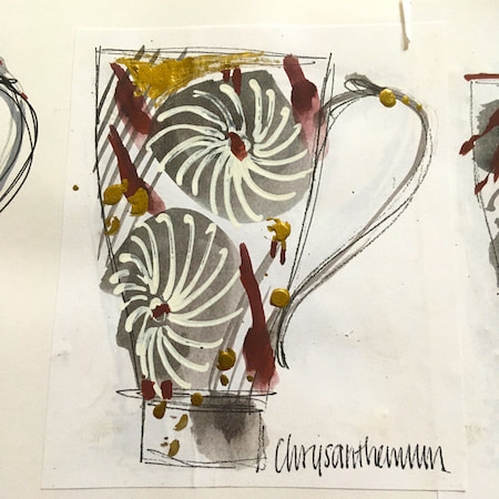
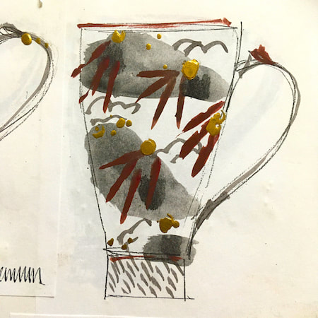
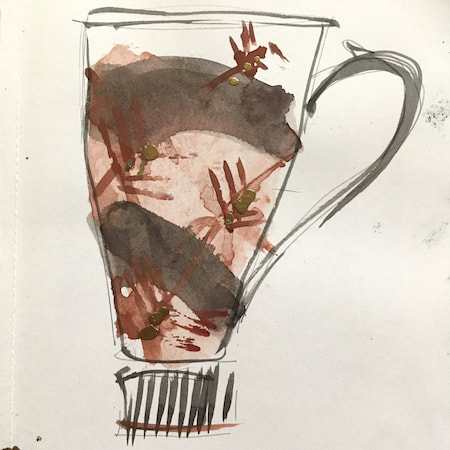
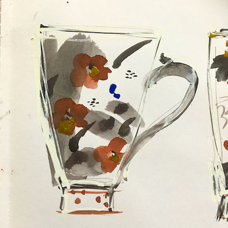
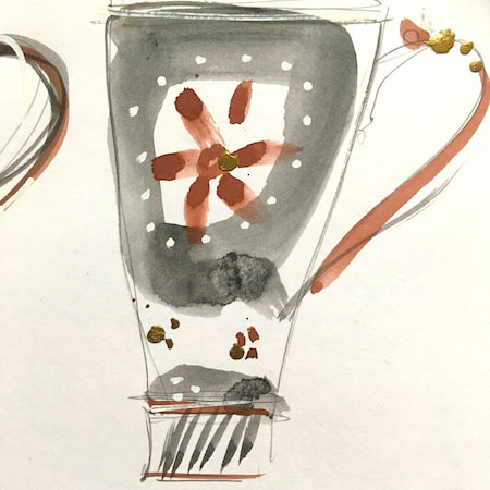
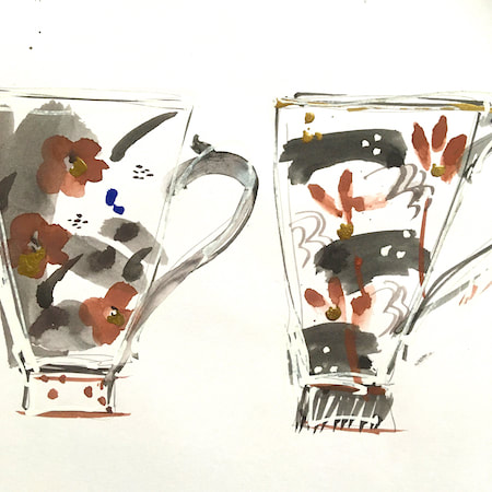
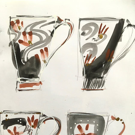
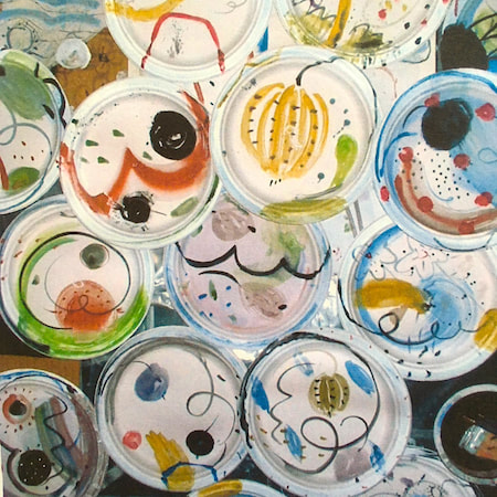
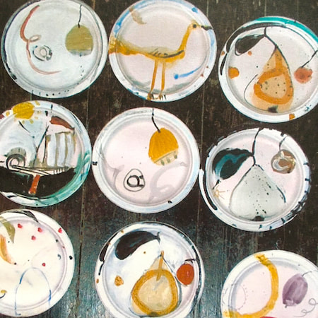
This time, take a peek into my ceramic design sketchbook. I actually made some of the mugs, but I kind of prefer the drawings! The plate designs are painted on paper plates, a most liberating process.
~~~~~~~~~~~~~~~~~~~~~~
~~~~~~~~~~~~~~~~~~~~~~
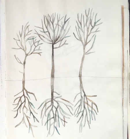
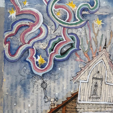
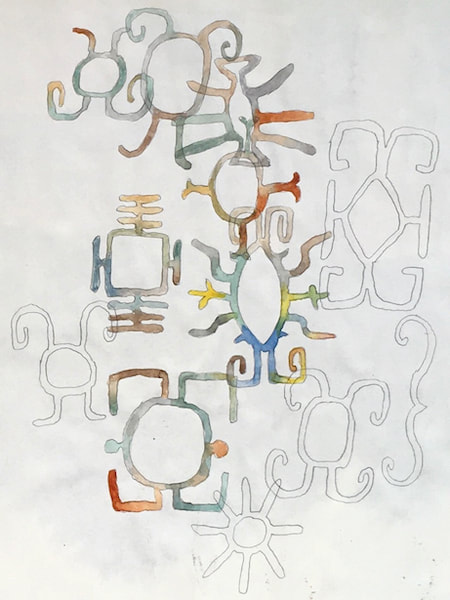
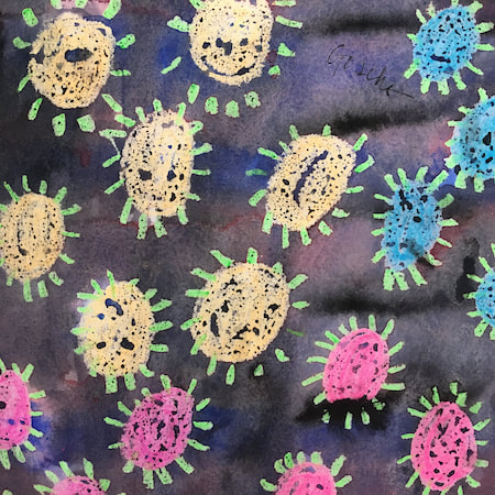
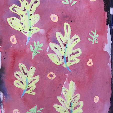
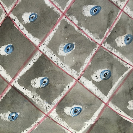
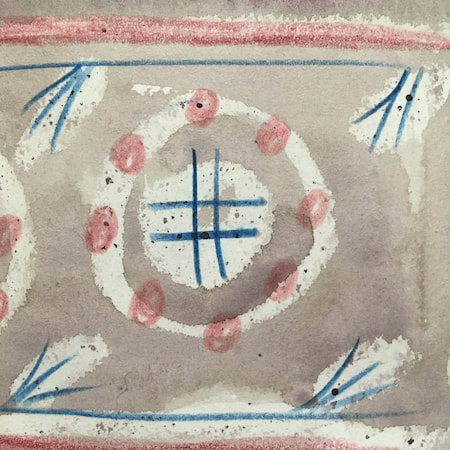
These watercolours are from my pattern sketchbook. I used coloured wax crayons to resist the washes of watercolour, also home-made rubber stamps dipped in bleach then printed on crêpe paper - the bleach takes out the paper dyes.

~~~~~~~~~~~~~~~~~~~~~~
~~~~~~~~~~~~~~~~~~~~~~
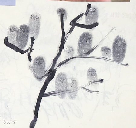
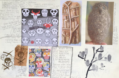
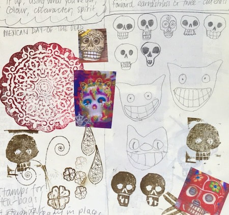
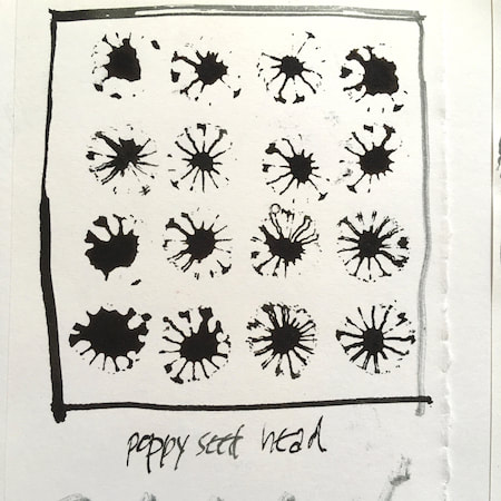
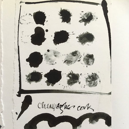
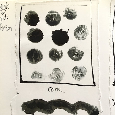
A sketchbook I used for mark-making with unusual objects - corks, seed-heads, feathers, home-made rubber stamps, my fingers and lots of flicky things ...
|
 RSS Feed
