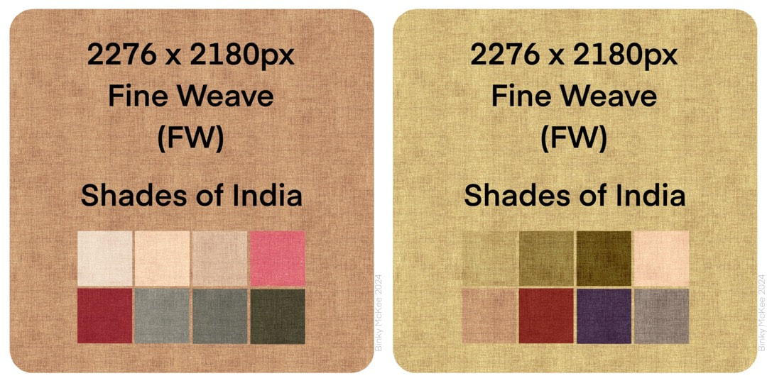
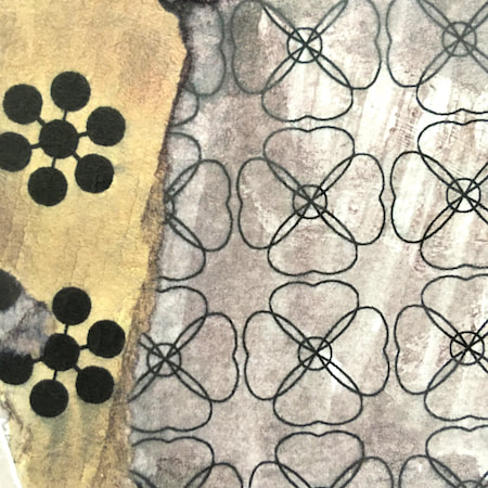
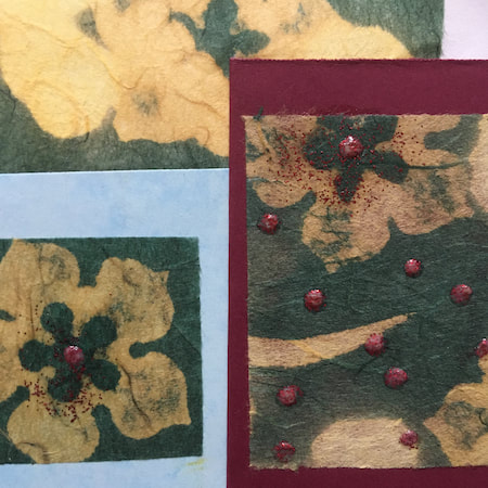
 I spent some time this week on making some linen textures for the new Voynich/Jacobean inspired pattern. It's coming along pretty well, the two images below show progress following on from the work in last week's post. Because the pattern suggests Indian block-print patterns to my mind (and I adore Indian textiles) I went for a natural dye feel in the palettes. 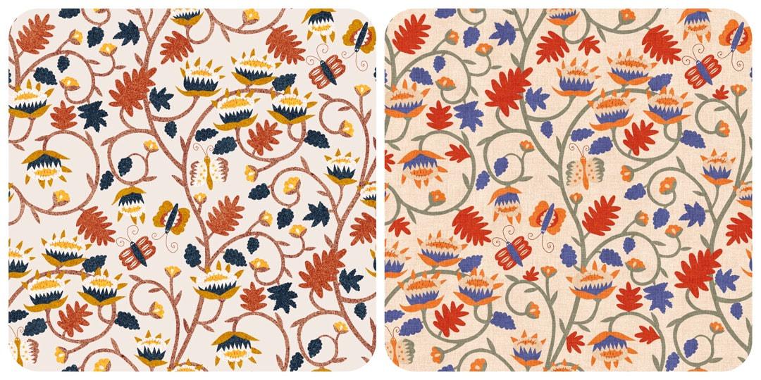 Work in Progress 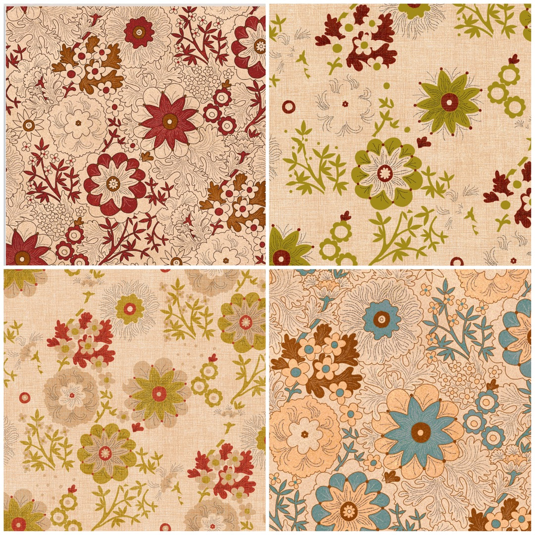 Daylight began its return this week with the sun's angle bouncing up 10 degrees higher than it was at the winter solstice, and a sudden marked increase in daylight both in the mornings and evenings. It is a joy to see, and to hear the birds waking up with tootling and whootling precursors to the dawn chorus. When the sun comes out, it really feels as though spring is just around the corner.
With this is mind, take a look at these screenshots of recent Yay Flowers work in progress: some pretty details come along while making colour separations, and these looked just like spring to me. I'll be taking a closer look at these, and maybe making some new patterns based on them soon. 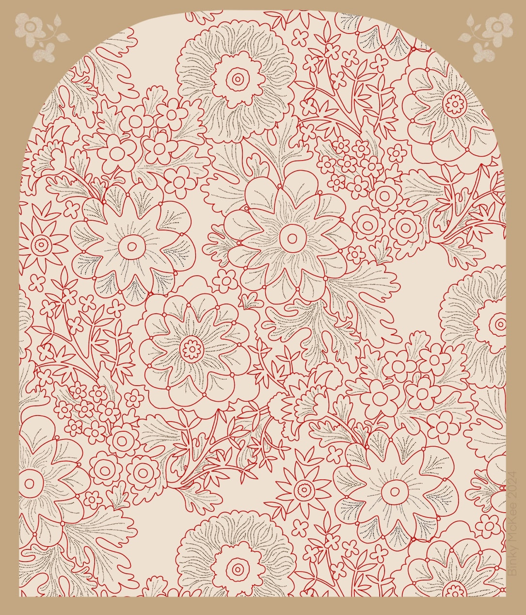 WIP half-drop version begun this week This pattern goes back quite some way, this link will take you to the previous 2021 version where you can follow links right back to its very beginning. It is a favourite of mine, so I'm happy to invest time on it. In 2021 I made the clean version (below) but it didn't occur to me to keep an outline version to make new colourways. It was early days in 'clean' work for reproduction, and I thought I could just keep colour-dropping over previous colours, but I soon discovered the outlines get degraded that way; so the only way I could change the colours was by using curves or HSB adjustments. Both methods are fine, but limited in tonal values by the original. 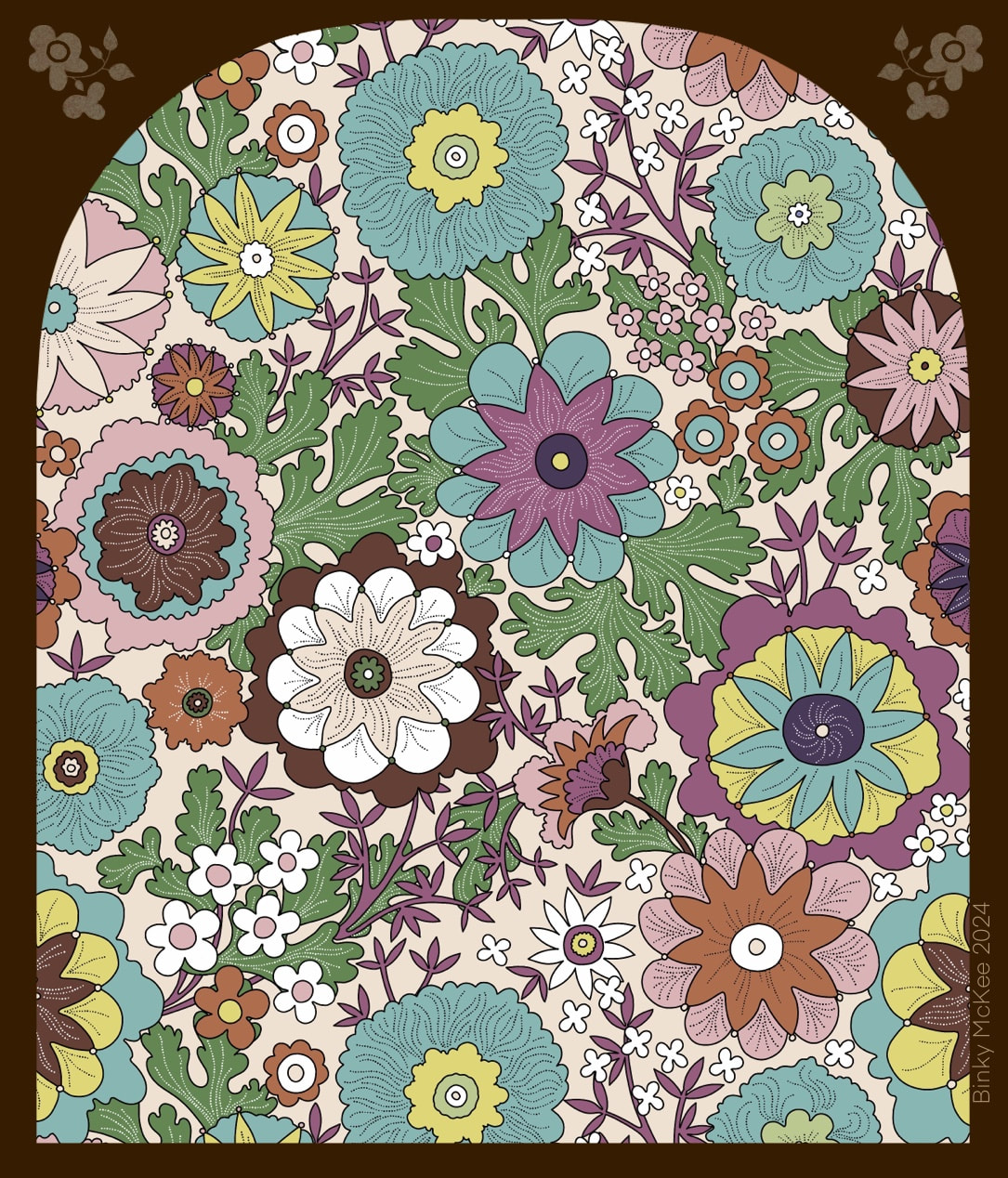 2021 version Finally, I remembered this was something I wanted to do, and it was the perfect thing for the January lull before the end of the holidays. Also, the previous pattern was a block repeat and I had always wanted to make a half-drop from it; so, at the same time as redrawing the original outlines I began work on that too. 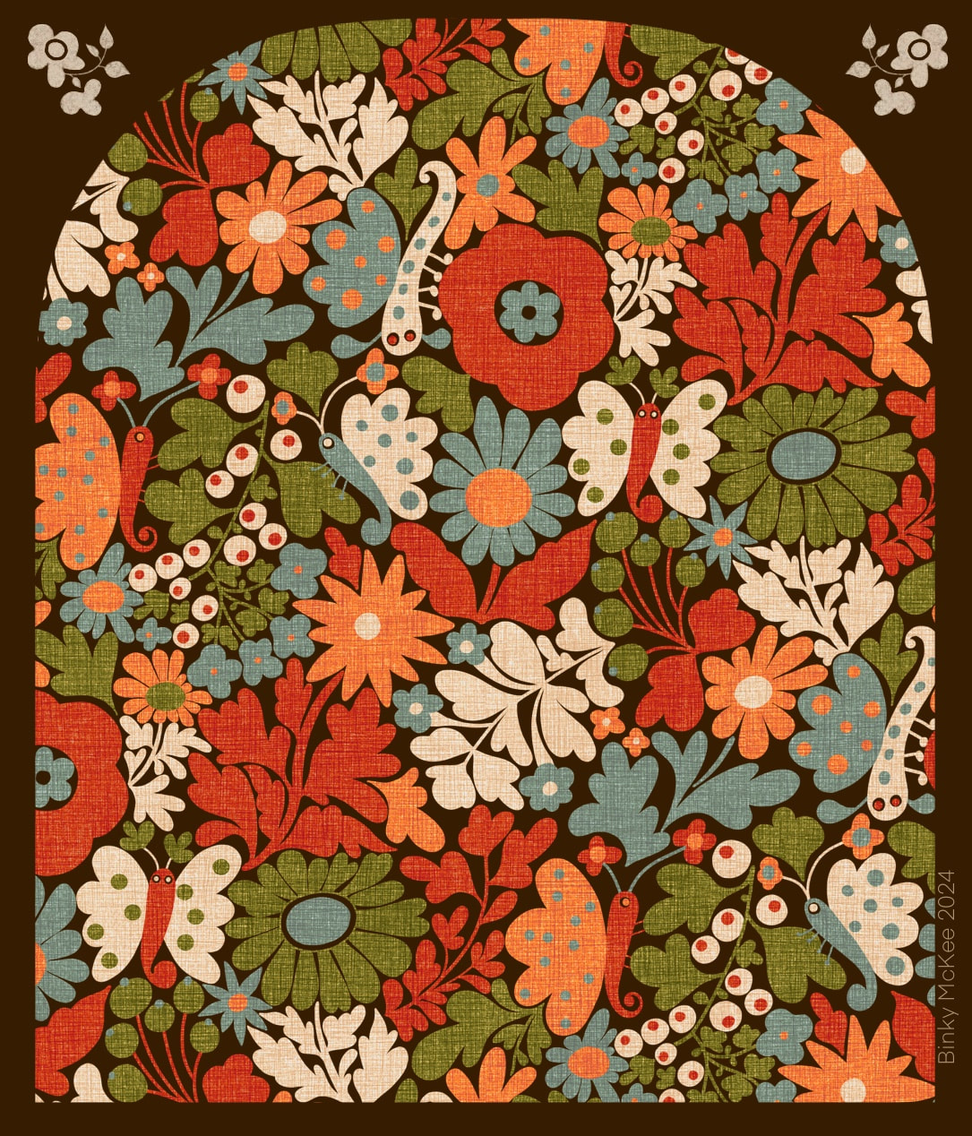 River Moth Tonight - I know, it doesn't have very much to do with rivers at all! I also made an arch-shaped clipping mask for blogs and Instagram posts to make patterns look more interesting (otherwise the feed just looks like a pattern-book) which I liked so much I have probably over-used it here, but above is my 'River Moth Tonight' pattern (still haven't thought of a better name) looking very bonny in its archway!
 I made this drawing in coloured inks in March 2019, with pattern-making in mind: I blogged about its early stages here. The drawing is a little chaotic in this state and I didn't know how to go about using it at the time, but I thought I made a start on basing a design on it a couple of weeks ago. 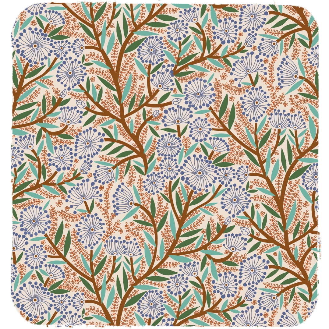 This is the start: the colour scheme was just for clarity, not intended as a final colourway. The half drop was too shallow for such a busy design, the stems stumpy, and I wasn't keen on the lean at this stage. 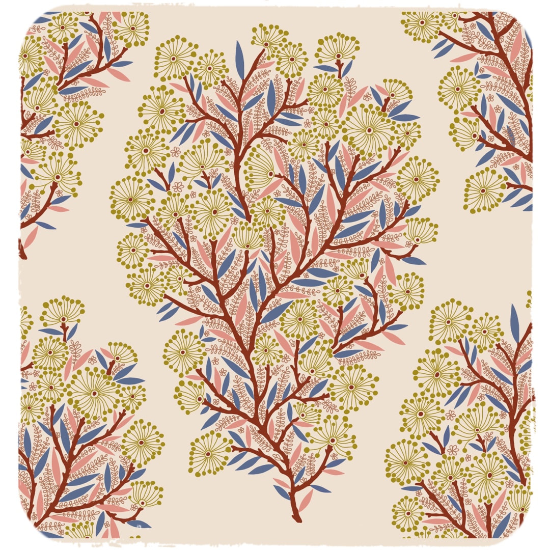 I picked out which was to form the main tree-like motif and redrew the stems to make them more slender and a bit knobbly. I also set it more upright to get rid of the lean, and made improvements to the frondy bits sprouting from the stems. Here is the first stage of the new repeat, quite a pretty motif on its own, but I wanted it to cover the whole surface, so at this stage work had to be done to make it into a continuous flow. 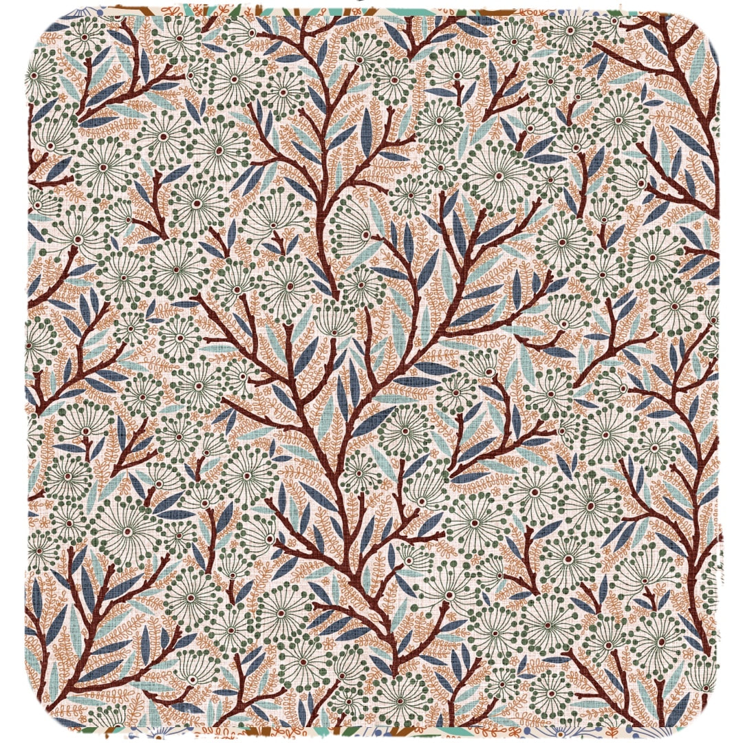 This is how the pattern looks now after additional elements were inserted and interwoven with the main motif. I tried it out with a repeating linen texture I have been working on, and it looks very nice. It makes me think of willows with catkins gently swaying in the breeze beside a big old river. However, the story of this pattern doesn't stop here ... To be continued ...
 Hurrah! I have been given a holiday from work. I put in for one and a half days next week to get some things done around the house, but was told by my manager that I had too many hours of holiday remaining and had to use up more. I ended up with nearly two weeks, beginning last Wednesday! So I'm celebrating some of the joyful chaos here which happens 'behind the scenes' during designing patterns: above, what it looks like mid-flip while designing a repeat, and below is the colourful mess when a clipping mask is unclipped - or unhinged, rather! I love the child-like fat lines and the graffiti feel, it would make a great painting.  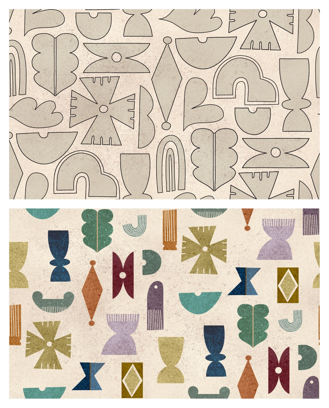 Shapes - new design, top, January version underneath. A return to geometrics, designing a pattern with some simple shapes I made back in January (the first artwork of the year). I quickly threw together a few ideas at the time which I have been waiting to explore, and this week seemed to be a good time to start.
The new version shown here is tighter than January's: I weeded out some elements, introduced a couple of new ones, and rearranged the composition to suit. I tested the pattern with a single tone to see how it holds together - some colour experiments will be coming soon. My full time job is busy at the moment, and lots of my spare time is being spent outside gardening with B in the fair weather, so I'm just taking it easy inching along with the artwork for now. 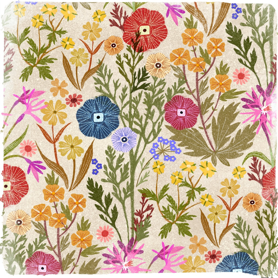 Collage sketch for pattern design in Procreate, 2021 I began work tracing this favourite pattern sketch in March. I put it to one side for a while and picked it up again this week, got a bit obsessed with it, and have probably spent way too much time on it by now! It looks really pretty as a sketch, but presented a few unexpected problems when I put my new outline drawing into repeat. First, there was a pronounced vertical caused by the pink ragged-robin flower directly underneath the main poppies element running into each other; also, the leaf and bud section belonging to it was clumsy. The pattern was overcrowded and needed more flow and space, so the ragged-robin, much as I loved it, was the first to go. 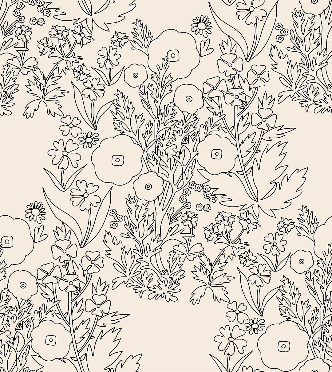 Introducing a curve in the main poppy stem and removal of element to correct rigid vertical Now there was that awkward extra space to be filled with another element. I came up with these two ideas: 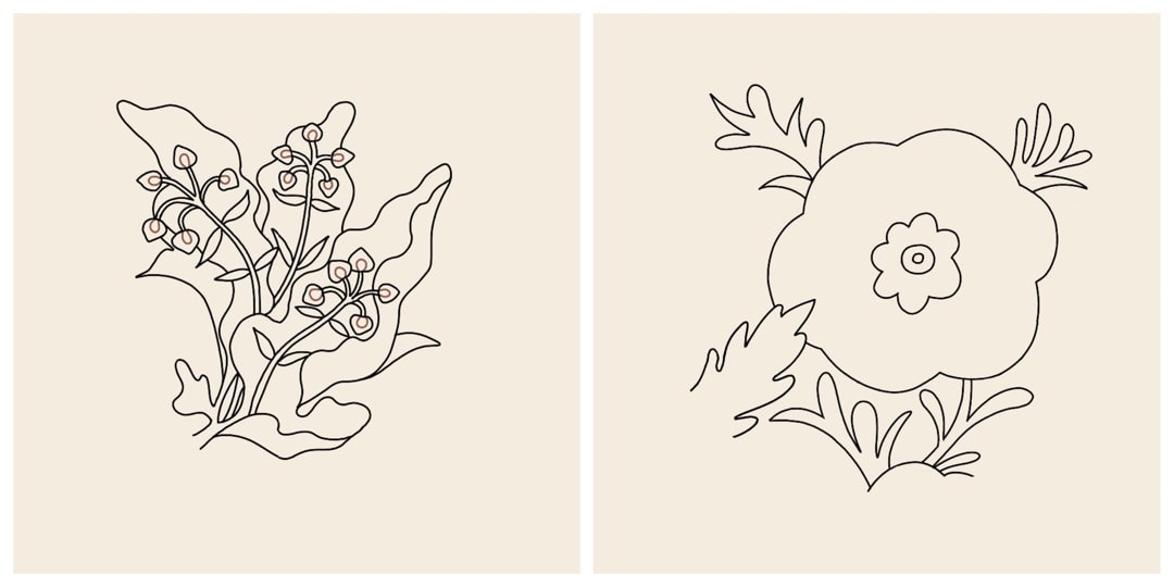 New dock and poppy elements - I went for the poppy in the end 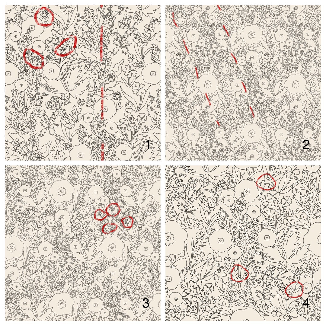 More challenges presented themselves on the way, the kind I enjoy digging away at to get a pattern to work. These are the four last stages before reaching the final design:
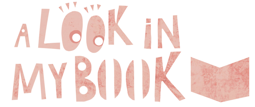
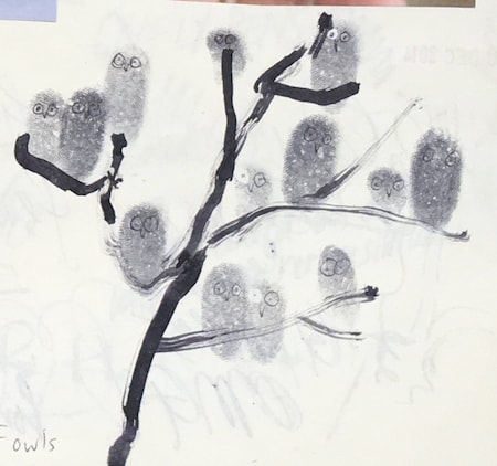
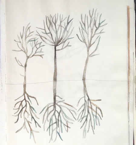
1. The dock plant element, as well as not being as simple as I wanted for the fill, presented another unwanted vertical; also marked here for amendment are daisy elements whose style didn't match the overall look, and some line clustering like ink blots to be cleaned up. 2. Switched to the simpler poppy element, but eek! Now I have an unwanted strong diagonal from one of the other elements. 3. I flipped and refitted the offending element to disrupt the diagonal and improve the overall flow; I wanted to suggest a relaxed meadow ruffled by gentle breezes rather than a countryside march! In addition I found three more 'ink-fill' areas to simplify. 4. The final stage, indicating areas for further decluttering to clarify the line. So, there we have it; the outline pattern now fits well and is flowing nicely. The next step is to try colouring it, and see how it looks after that. Thanks for visiting, see you next week! |

~~~~~~~~~~~~~~~~~~~~~~
Welcome to my illustration and patterns blog.
I illustrate under the pen-name of Binky McKee, McKee being my mother's maiden name. Binky was the name of every single cat my great-grandmother kept - allegedly about 40 of them during her 94 years of life. I changed the website address a few months ago, so some older links on previous posts are broken. If you click one of those and it takes you to a strange page, simply replace the .co.uk after the binkymckee. with weebly.com and it will work again. I hope you enjoy your visit! ~~~~~~~~~~~~~~~~~~~~~~
~~~~~~~~~~~~~~~~~~~~~~
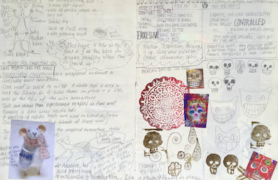
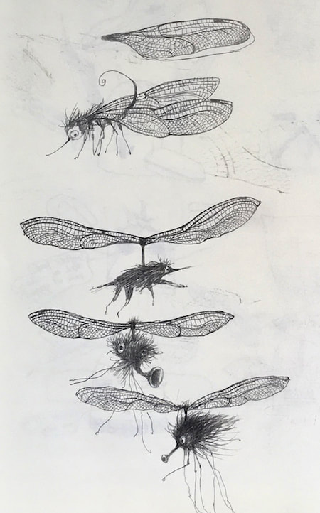
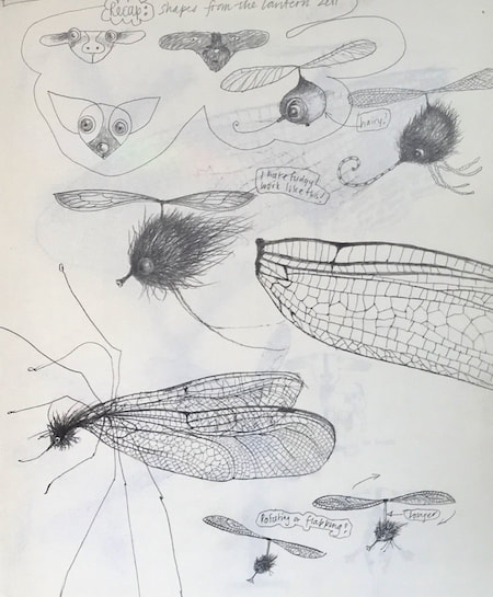
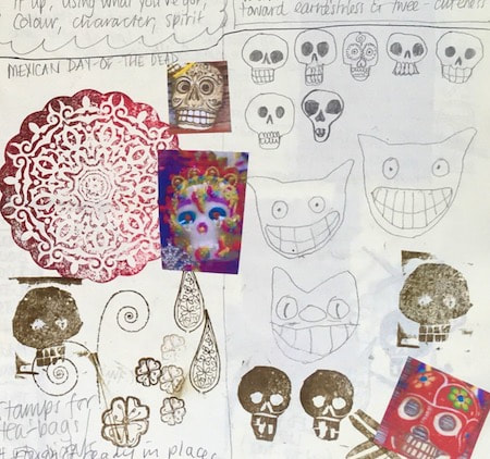
I keep lots of scrapbooks and sketchbooks where I develop ideas and design little creatures. Here's a peek inside one ...
~~~~~~~~~~~~~~~~~~~~~~
~~~~~~~~~~~~~~~~~~~~~~
As you may know, I am also known as Heather Eliza Walker.
Click the image if you would like to find out more and visit my other website. ~~~~~~~~~~~~~~~~~~~~~~ ~~~~~~~~~~~~~~~~~~~~~
~~~~~~~~~~~~~~~~~~~~
April 2024
~~~~~~~~~~~~~~~~~~~~~~
~~~~~~~~~~~~~~~~~~
All
~~~~~~~~~~~~~~~~~~~~~~
~~~~~~~~~~~~~~~~~~~~~~
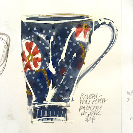
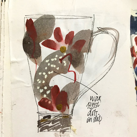
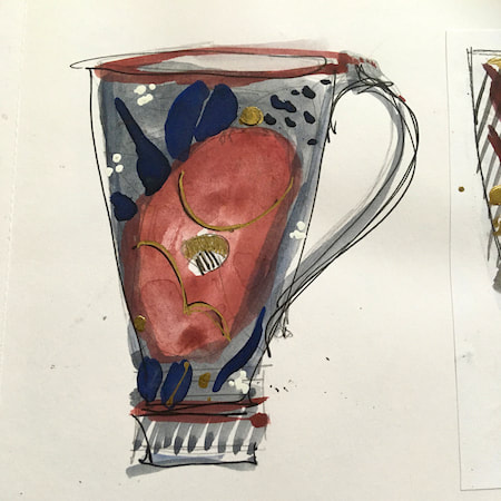
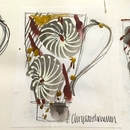
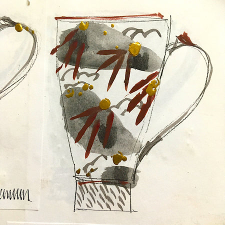
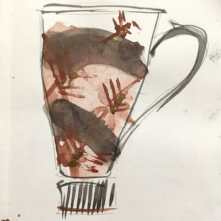
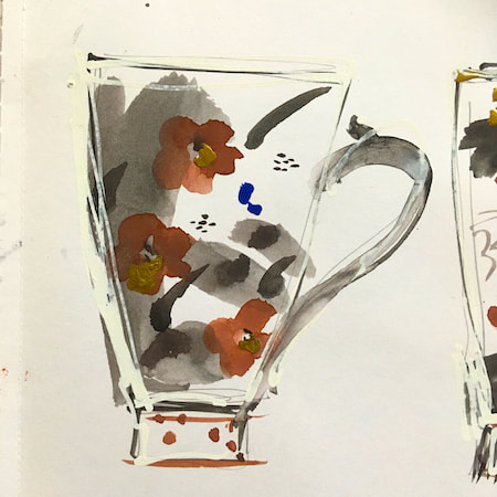
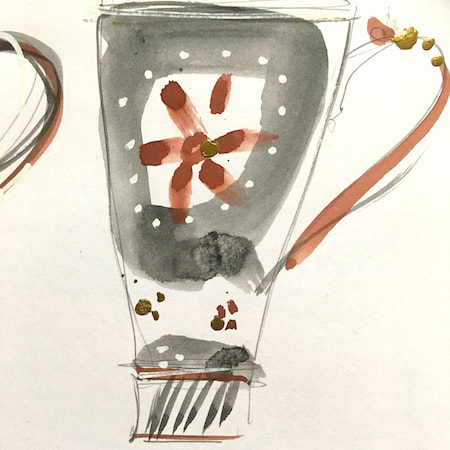
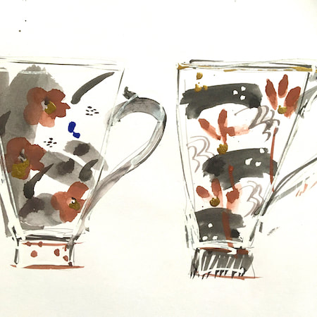
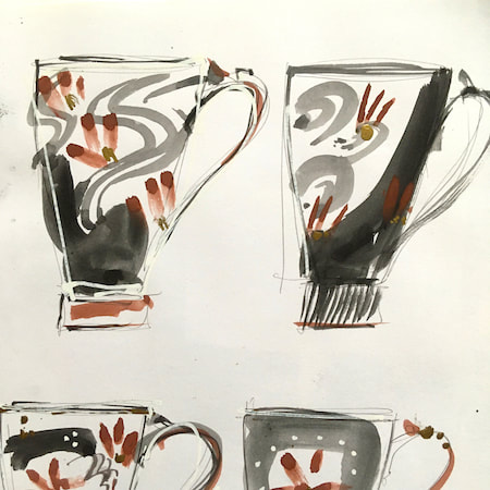
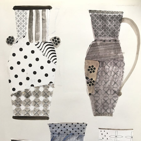
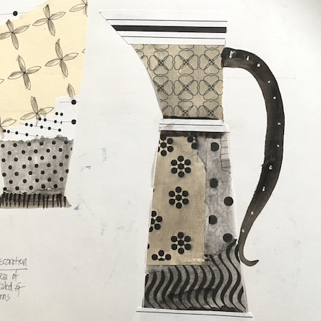
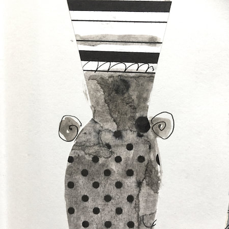
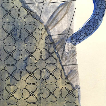
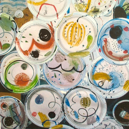
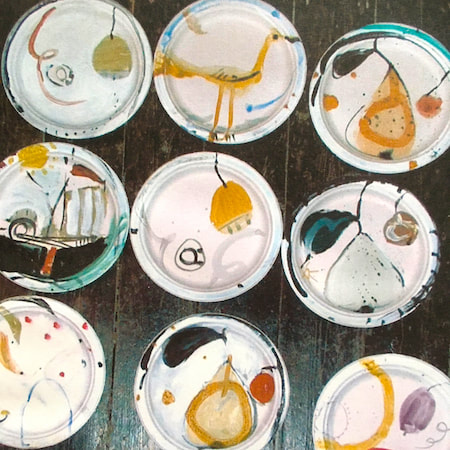
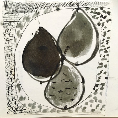
This time, take a peek into my ceramic design sketchbook. I actually made some of the mugs, but I kind of prefer the drawings! The plate designs are painted on paper plates, a most liberating process.
~~~~~~~~~~~~~~~~~~~~~~
~~~~~~~~~~~~~~~~~~~~~~
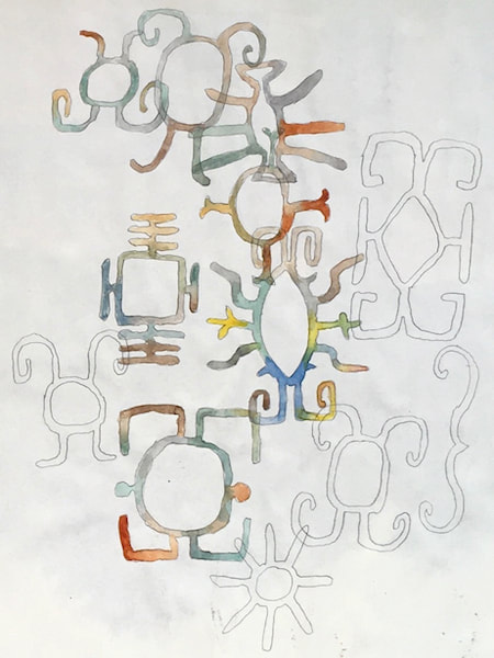
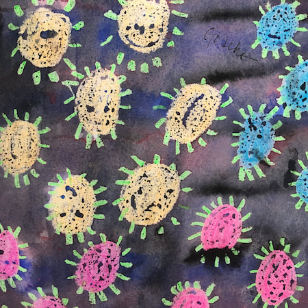
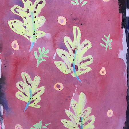
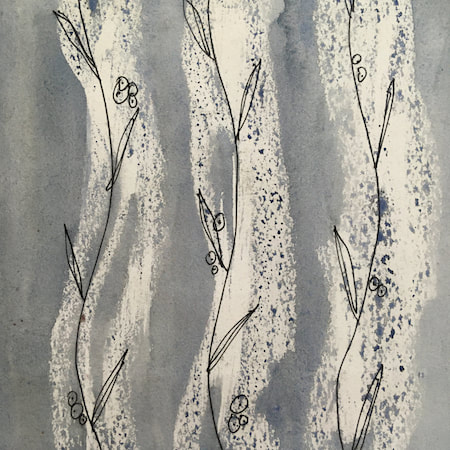
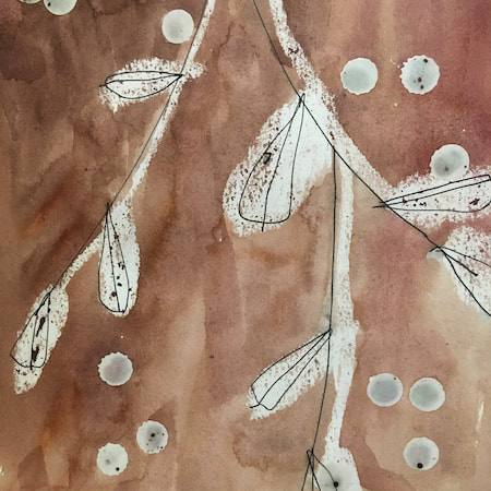
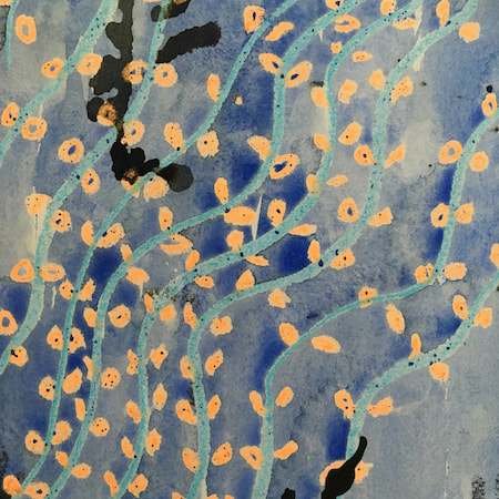
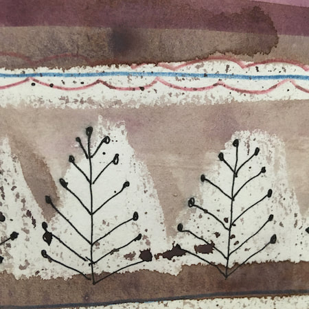
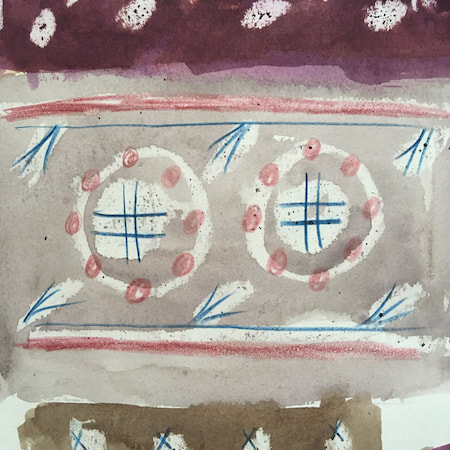
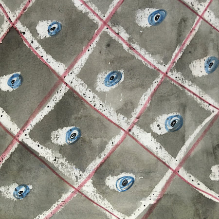
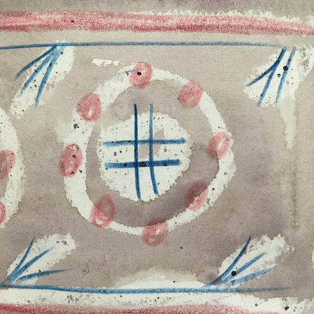
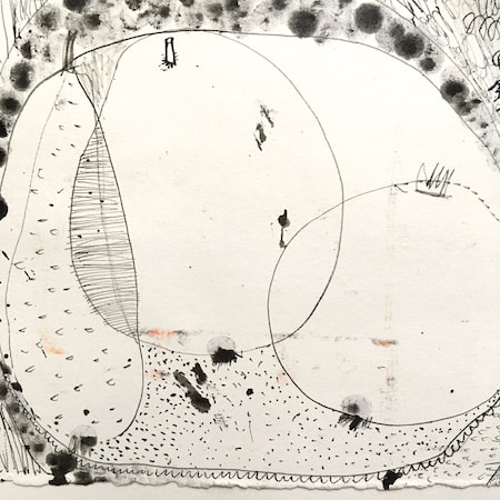
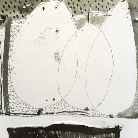
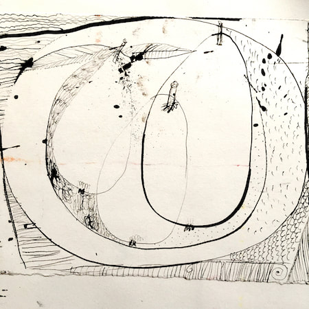
These watercolours are from my pattern sketchbook. I used coloured wax crayons to resist the washes of watercolour, also home-made rubber stamps dipped in bleach then printed on crêpe paper - the bleach takes out the paper dyes.
~~~~~~~~~~~~~~~~~~~~~~
~~~~~~~~~~~~~~~~~~~~~~
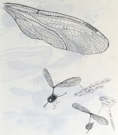
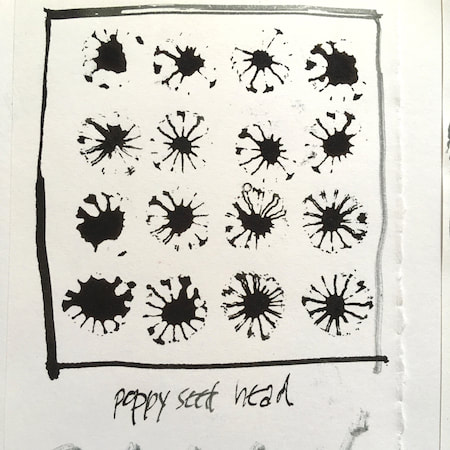
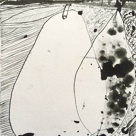
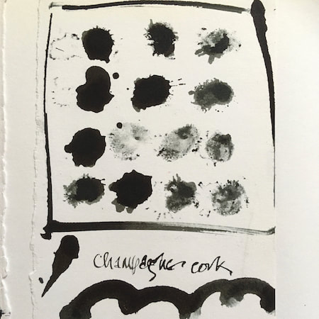
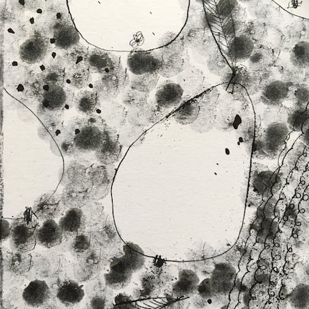
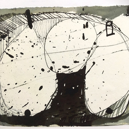
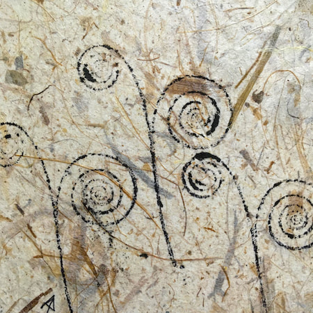
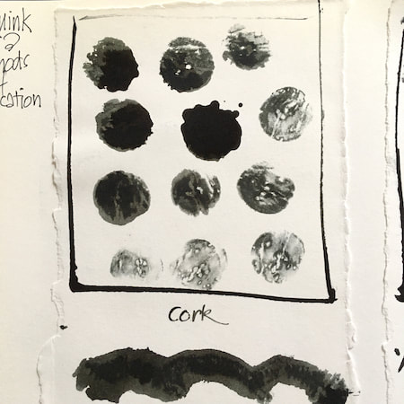
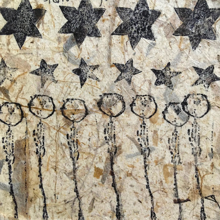
A sketchbook I used for mark-making with unusual objects - corks, seed-heads, feathers, home-made rubber stamps, my fingers and lots of flicky things ...
|
 RSS Feed
