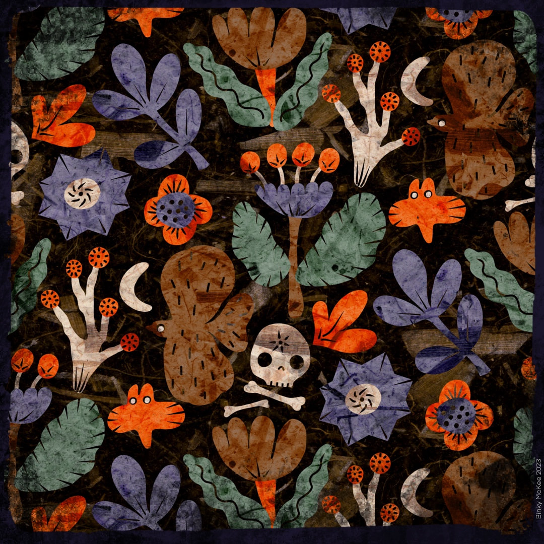
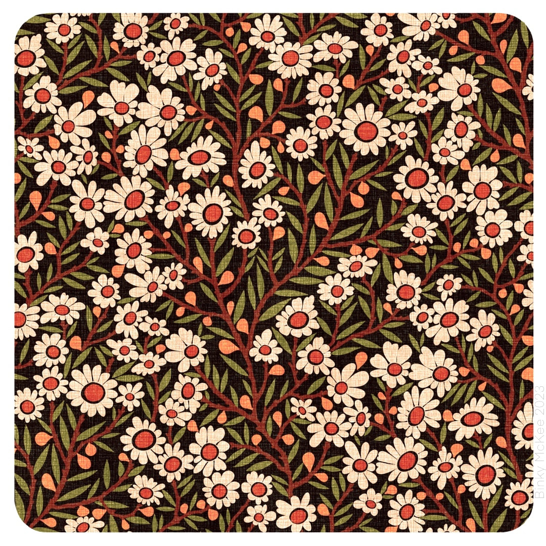
 Pumpkin colours, the night, bats, skulls and bones, ghostly trees and the moon. That's Hallowe'en! 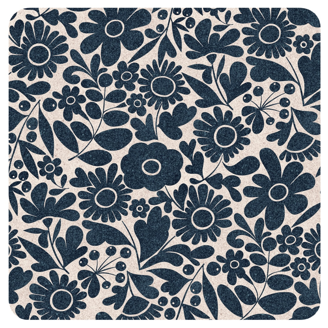 A redesign of my Crazy Daisies pattern for single colours. Shown here are versions in indigo on stone, and cream on chocolate which is based on a mono version of my vintage tie daisy pattern which I made in 2021. 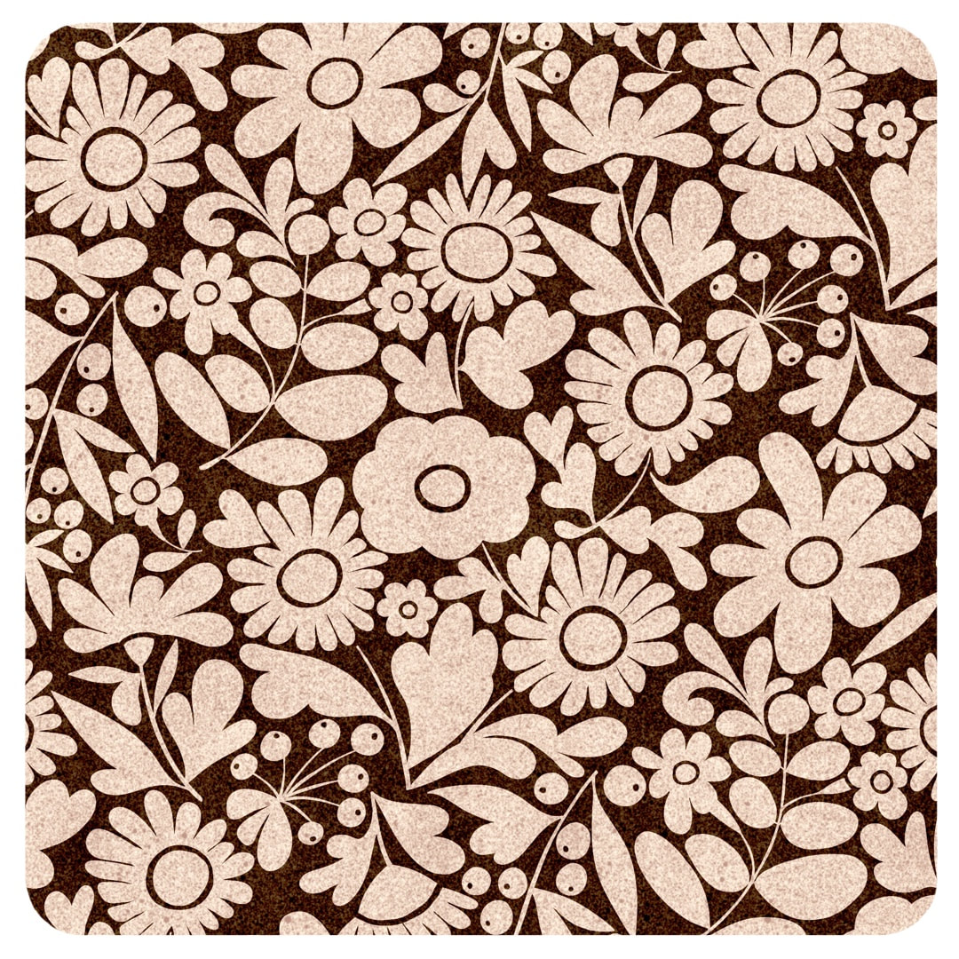 I thought I had posted an entry with the monochrome version of the vintage tie pattern when I made it, but when I went back through the archives to link to it I found I hadn't, so I have put it below. I made it in Procreate using the charm of a crayon brush, but later I made pristine versions of both the coloured and monochrome versions for printing on fabric. 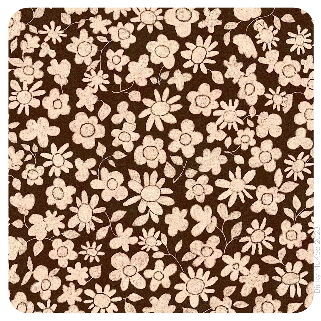 Vintage Tie Daisies, 2021 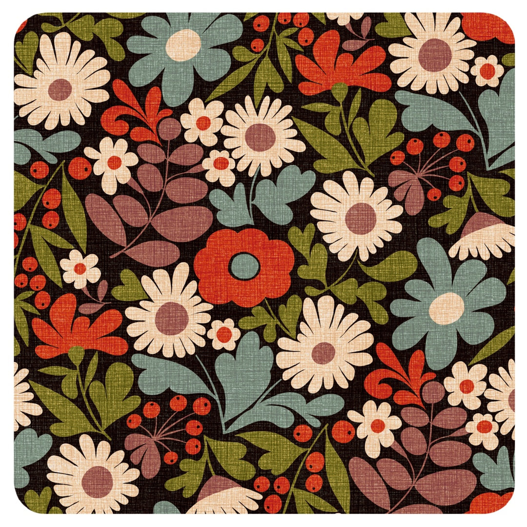 During the week I got out my Crazy Daisies pattern again to make an autumnal colour version in a speckled texture. I made a slight change to the colour separations at the same time, moving the eye of the red flower in the centre onto a different layer (blue-grey as seen here). 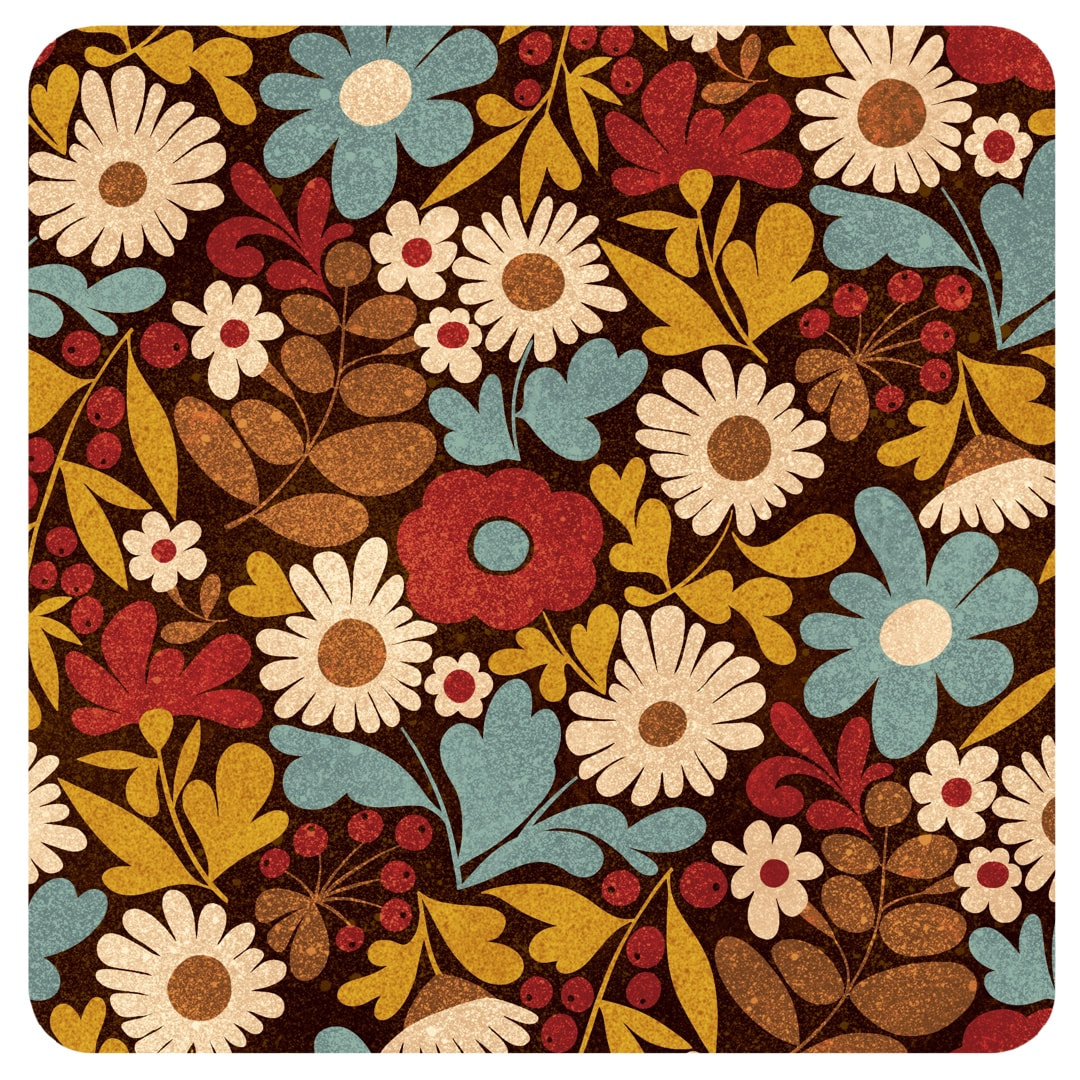 In the process, I copied each colour layer into a fresh document and spotted a missing leaf. I guess while I was designing it I must have added a leaf and forgot to put it into the repeat (no automated technology here!) I'm just amazed I didn't notice it before now. I think it pays to put work to one side for a while before examining every angle of the repeat, sometimes I'm too excited with a new design to notice flaws at the time. All versions of Crazy Daisies have now been amended. 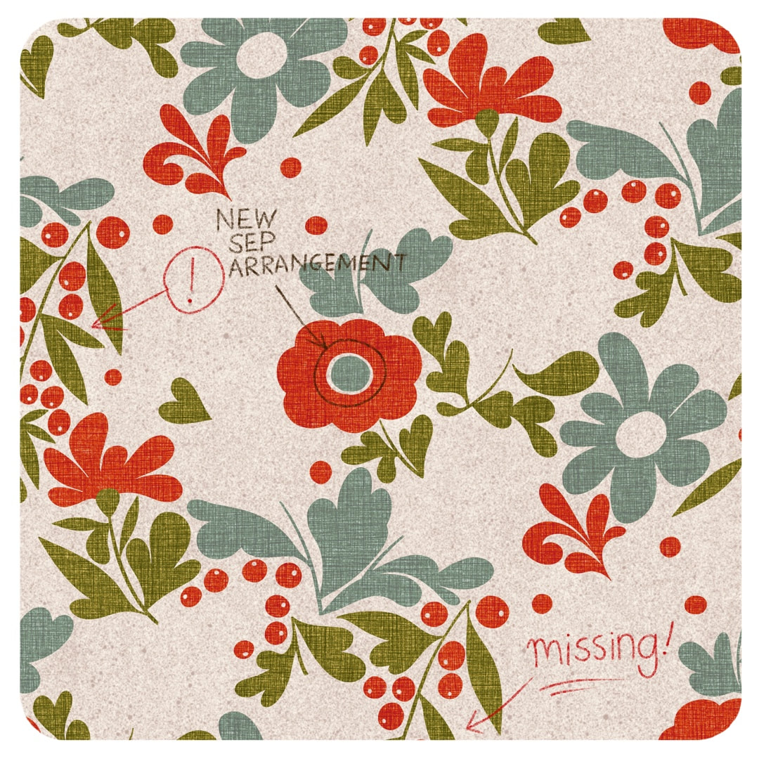 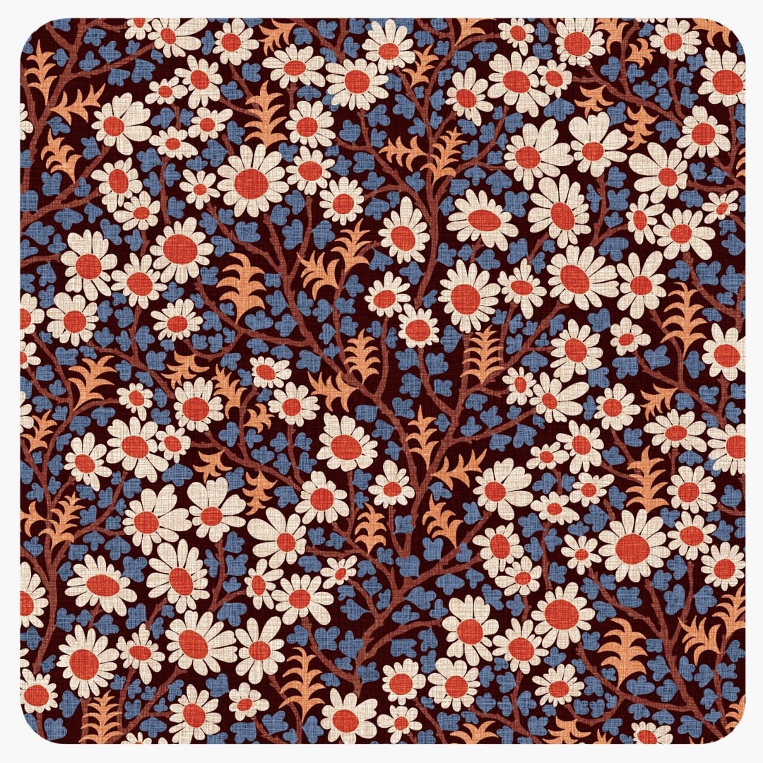 Happy with this one! Quite a few permutations on since I began with the first willow pattern, we now have the expanded blossoms together with cute rounded leaves and some spiky christmas-cactus-like shoots, shown here in two colourways. Above shows a new, smoother linen texture in Peru-inspired colours; I tweaked the colours in the version below for a pastel colourway. 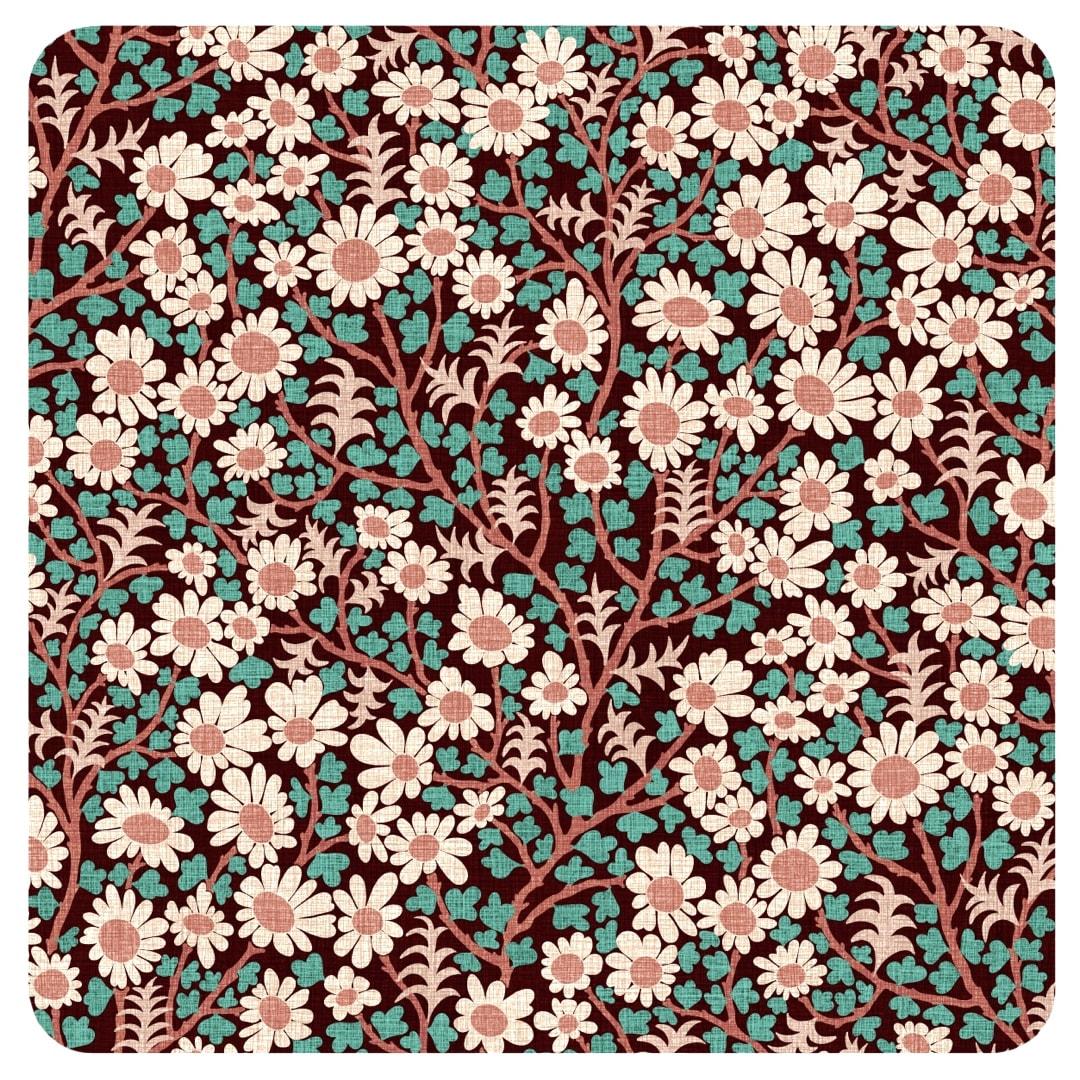 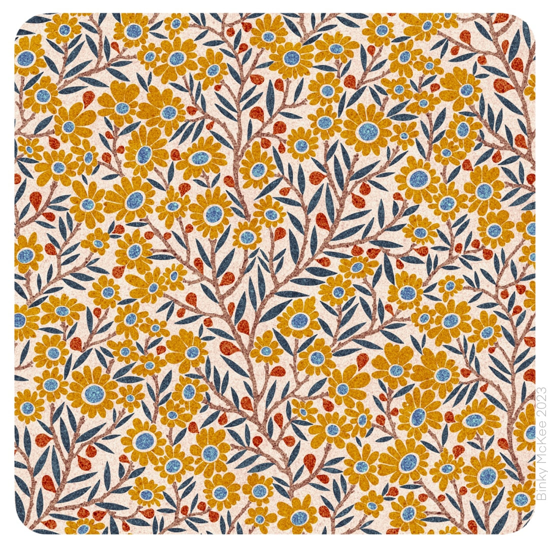 I settled on the version which uses all the flower centres in the same colour for these two colourways, liking the inky effect speckle texture I made for the catkins pattern a couple of weeks ago so much that I added new colours to the palette. All based on earthy ink pigments, here are ochre and sienna beside the original indigo and blue. 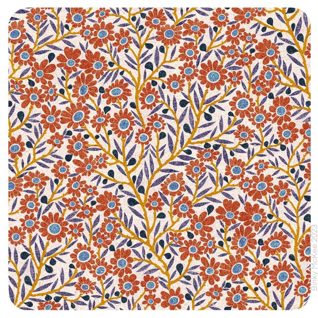 I think the speckle texture suits these patterns, it's not ideal for everything but sits well on smaller elements like these; I imagine them printed on soft cotton.
 My tree now started sprouting in a different direction with blossom flowers and tiny fruits! In a similar way to Crazy Daisies, I extended blossom petals to fit the space around them. I made two versions with different colour separation arrangements. I can't decide which one I like the best, but I feel the version pictured above is easier on the eye, being more organised with the flower eyes all red and the leaves all green. 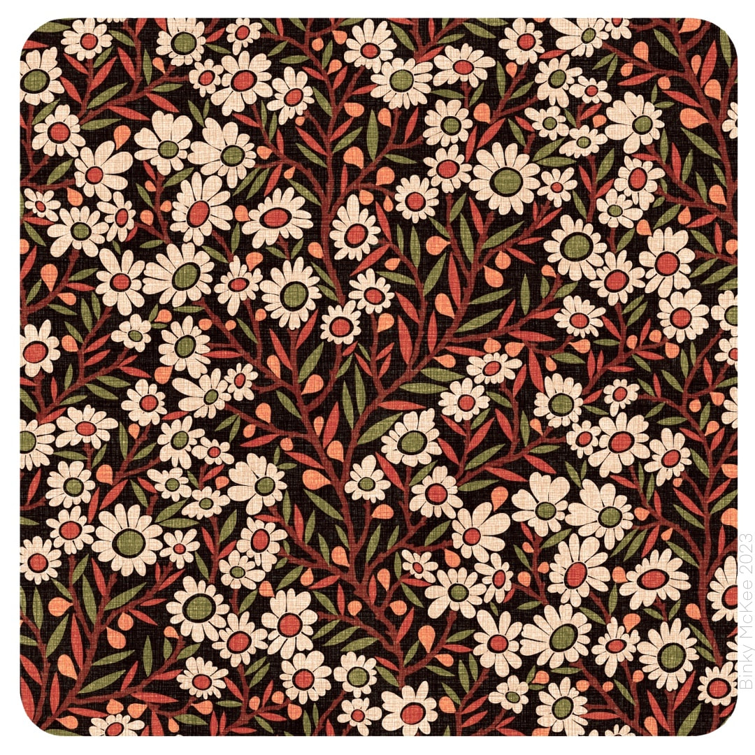 This version split the colour separations so the leaves and eyes of the flowers are together on the same colour, so there are green and red eyes and green and red leaves in a jolly arrangement. You have to imagine the effect flowing across fabric as it moves, say on a dress or curtain material - I really am undecided, perhaps I'll use both for different palettes in the end.
|

~~~~~~~~~~~~~~~~~~~~~~
Welcome to my illustration and patterns blog.
I illustrate under the pen-name of Binky McKee, McKee being my mother's maiden name. Binky was the name of every single cat my great-grandmother kept - allegedly about 40 of them during her 94 years of life. I changed the website address a few months ago, so some older links on previous posts are broken. If you click one of those and it takes you to a strange page, simply replace the .co.uk after the binkymckee. with weebly.com and it will work again. I hope you enjoy your visit! ~~~~~~~~~~~~~~~~~~~~~~
~~~~~~~~~~~~~~~~~~~~~~
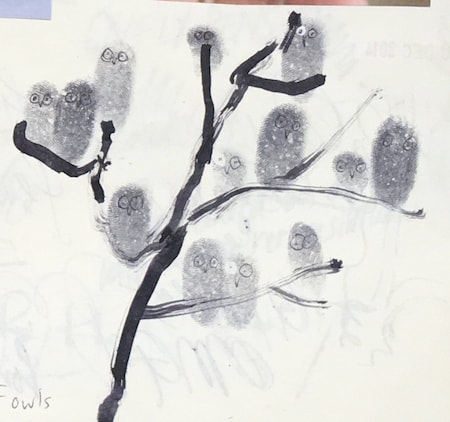
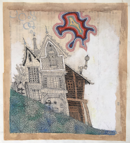
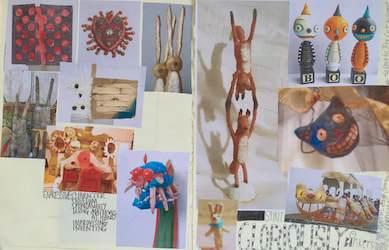
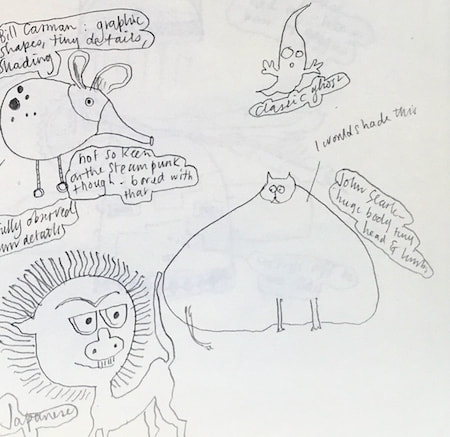
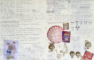
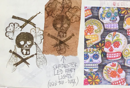
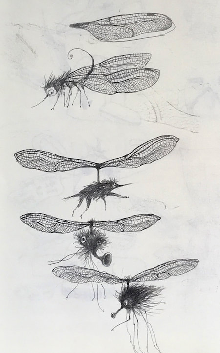
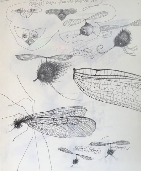
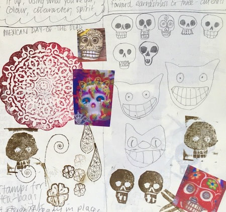
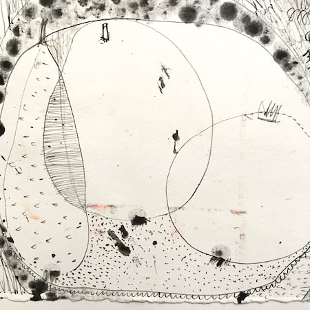
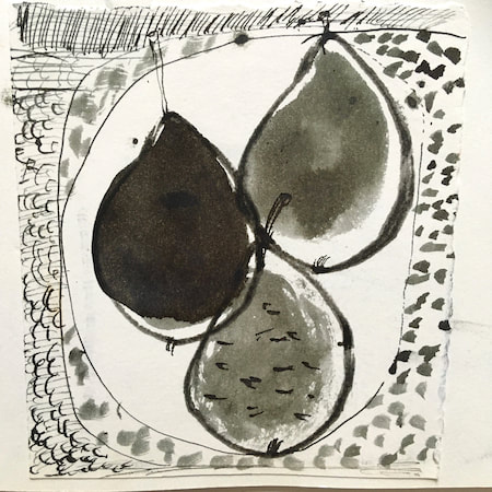
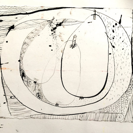
I keep lots of scrapbooks and sketchbooks where I develop ideas and design little creatures. Here's a peek inside one ...
~~~~~~~~~~~~~~~~~~~~~~
~~~~~~~~~~~~~~~~~~~~~~
As you may know, I am also known as Heather Eliza Walker.
Click the image if you would like to find out more and visit my other website. ~~~~~~~~~~~~~~~~~~~~~~ ~~~~~~~~~~~~~~~~~~~~~
~~~~~~~~~~~~~~~~~~~~
April 2024
~~~~~~~~~~~~~~~~~~~~~~
~~~~~~~~~~~~~~~~~~
All
~~~~~~~~~~~~~~~~~~~~~~
~~~~~~~~~~~~~~~~~~~~~~
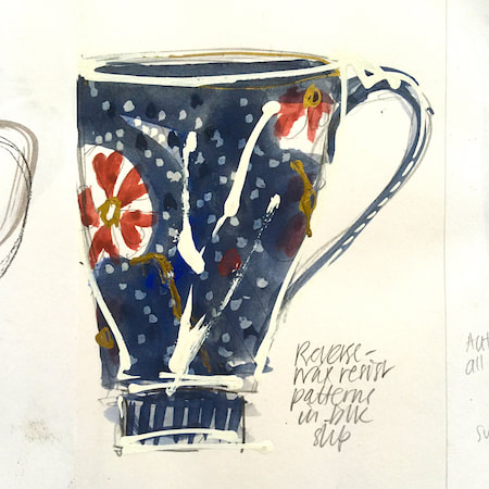
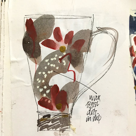
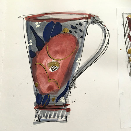
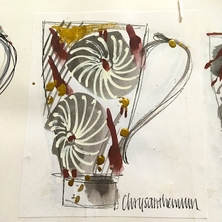
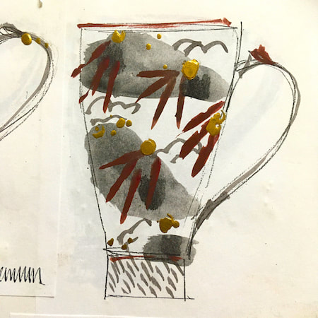
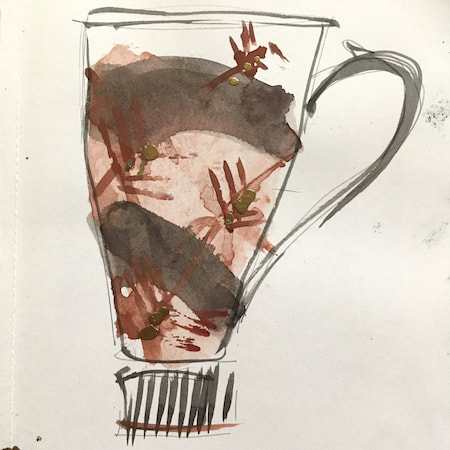
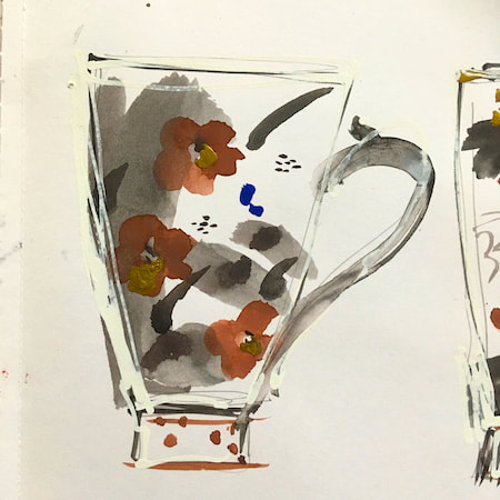
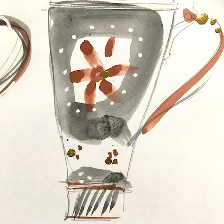
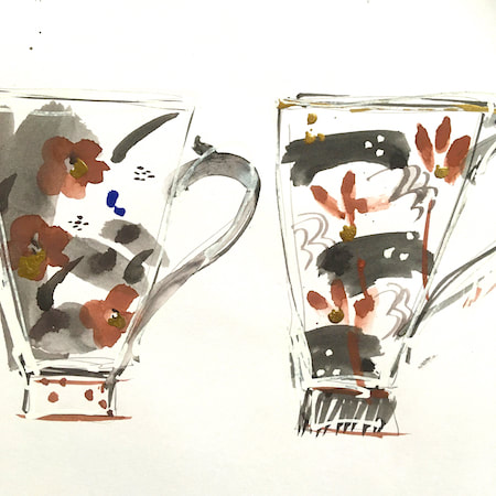
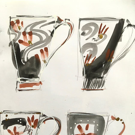
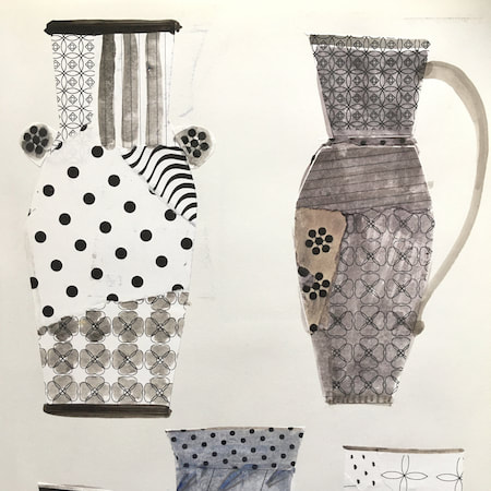
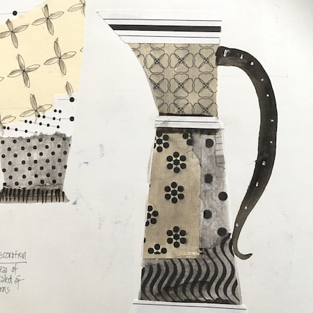
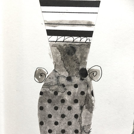
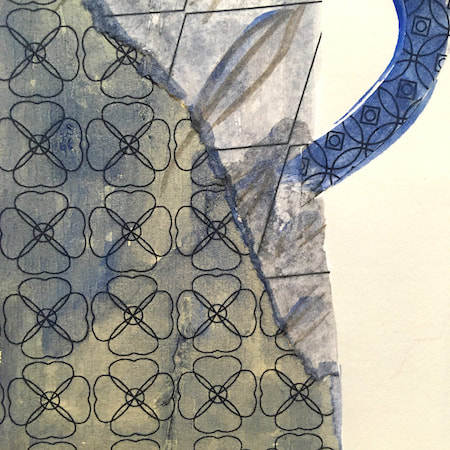
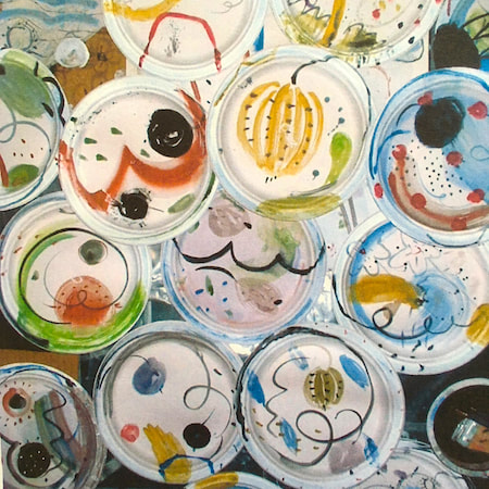
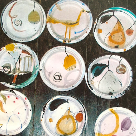
This time, take a peek into my ceramic design sketchbook. I actually made some of the mugs, but I kind of prefer the drawings! The plate designs are painted on paper plates, a most liberating process.
~~~~~~~~~~~~~~~~~~~~~~
~~~~~~~~~~~~~~~~~~~~~~
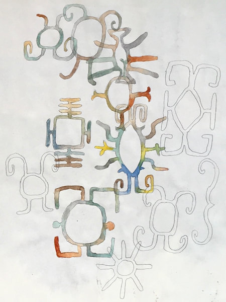
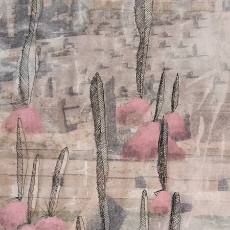
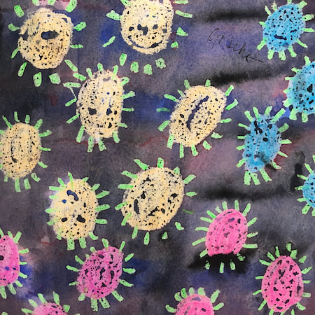
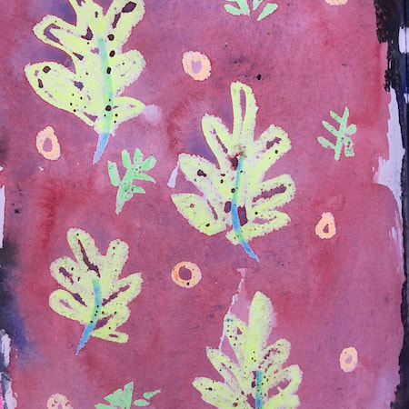
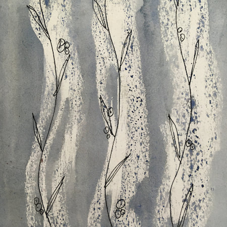
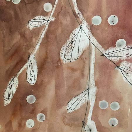
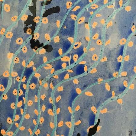
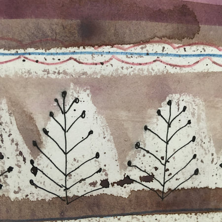
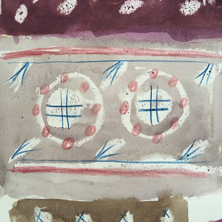
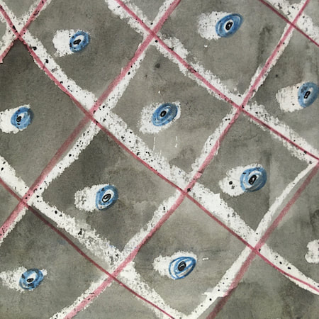
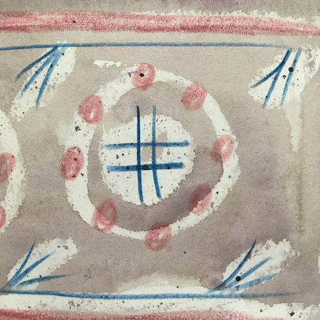
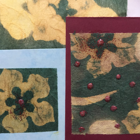
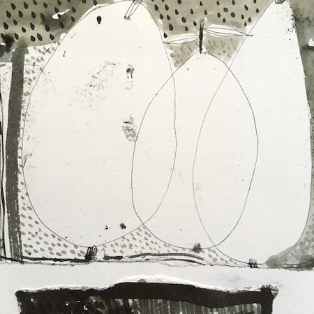
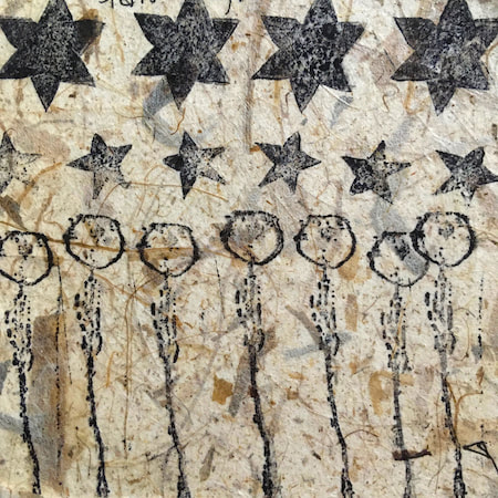
These watercolours are from my pattern sketchbook. I used coloured wax crayons to resist the washes of watercolour, also home-made rubber stamps dipped in bleach then printed on crêpe paper - the bleach takes out the paper dyes.
~~~~~~~~~~~~~~~~~~~~~~
~~~~~~~~~~~~~~~~~~~~~~
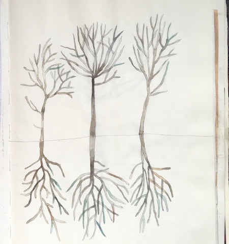
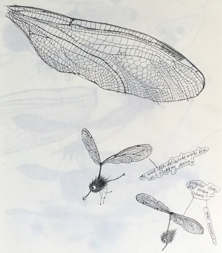
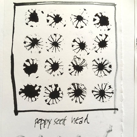
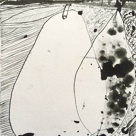
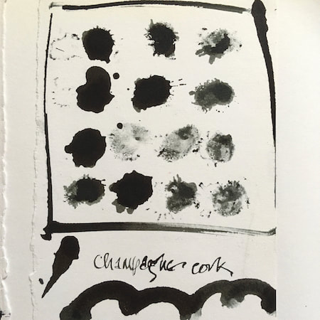
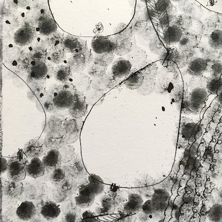
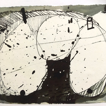
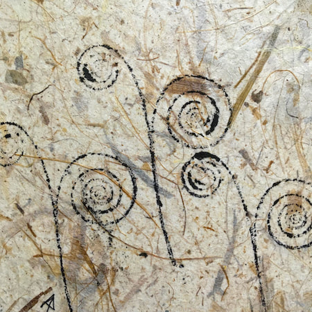
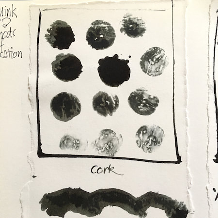
A sketchbook I used for mark-making with unusual objects - corks, seed-heads, feathers, home-made rubber stamps, my fingers and lots of flicky things ...
|
 RSS Feed
